Disclaimer – Please read this disclosure about my use of affiliate links which are contained within this post.
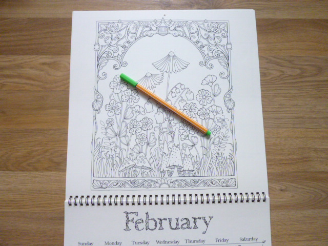
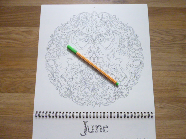
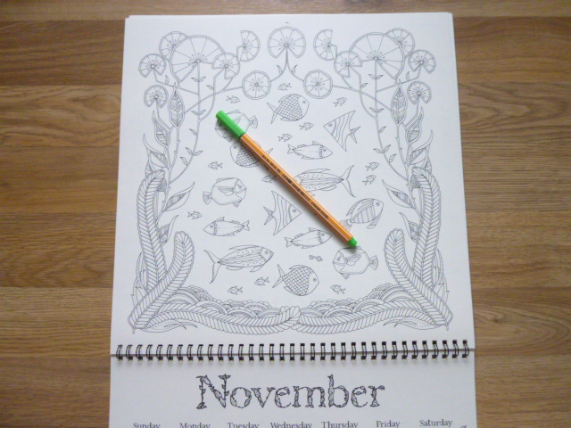
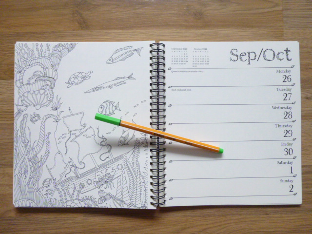
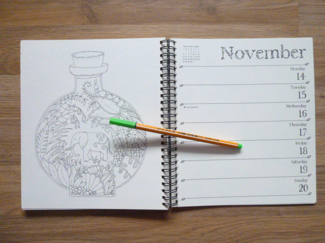
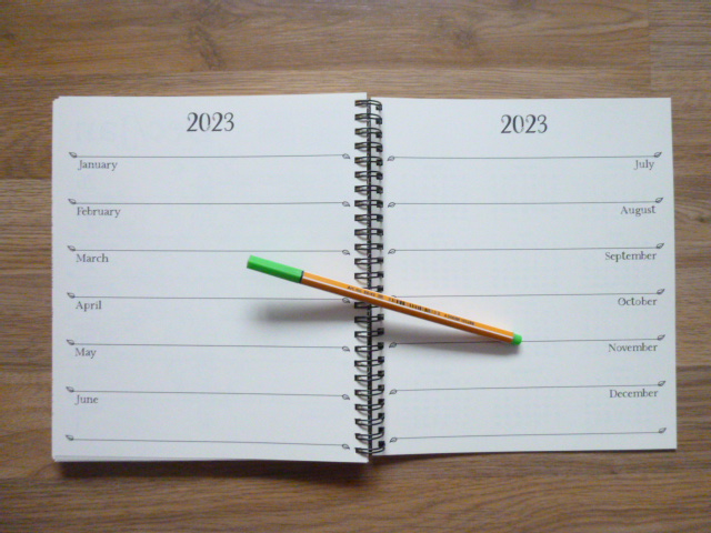
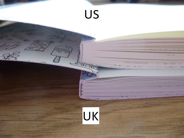
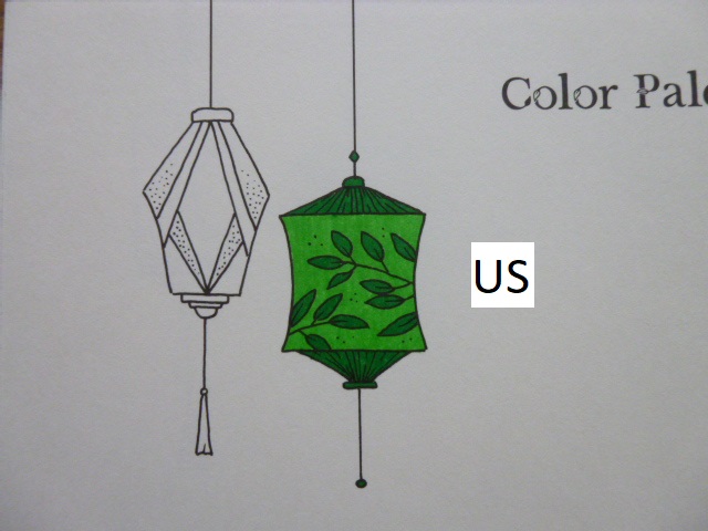
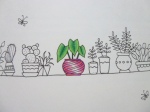
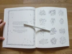
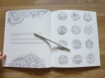
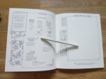
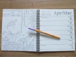
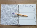
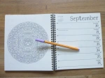
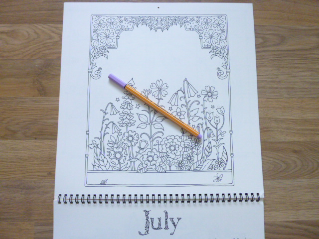
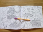
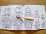
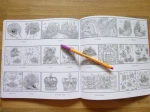
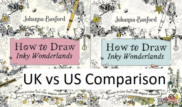
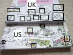
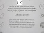
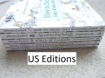
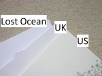
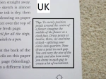
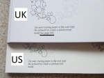
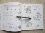
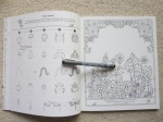
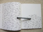
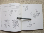
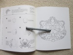
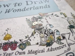
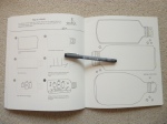
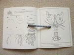
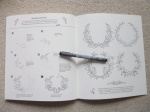
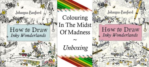
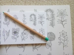
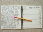
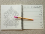
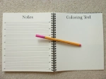
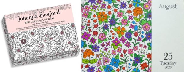
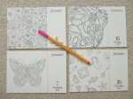
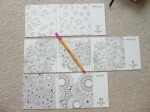
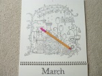
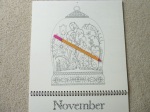
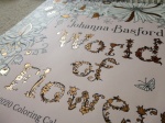
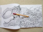
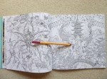
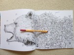
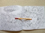
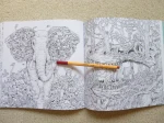
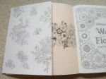
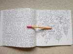
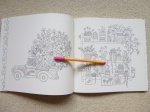
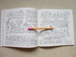
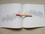
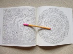
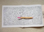
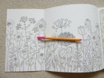
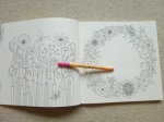
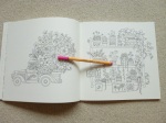
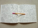
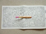
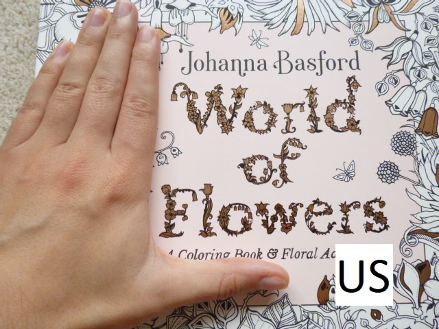
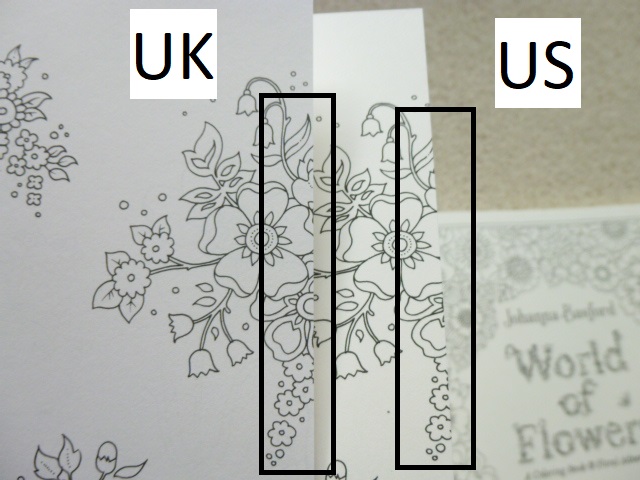
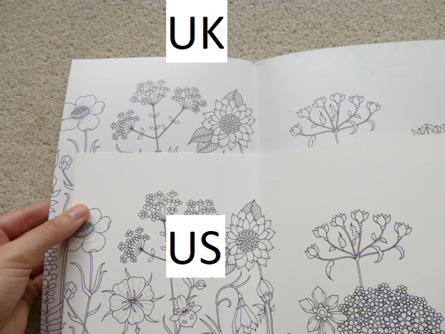
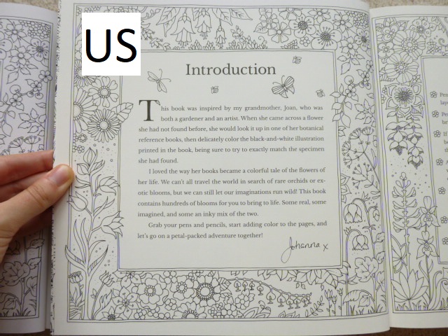
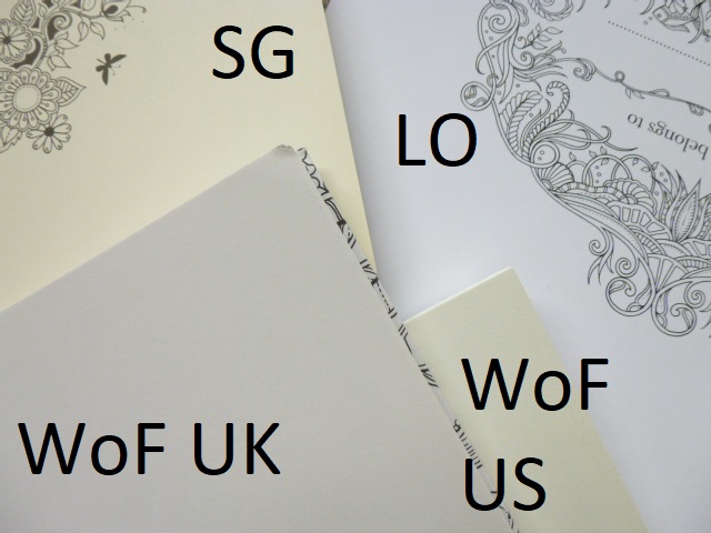
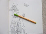
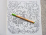
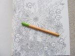
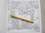
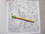
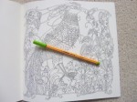
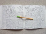
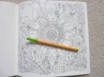
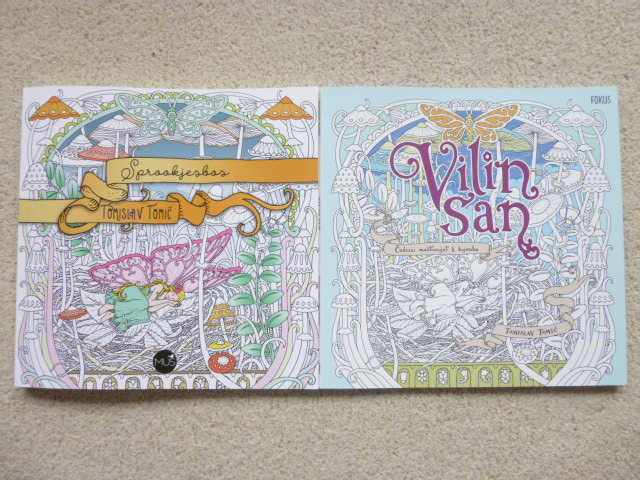
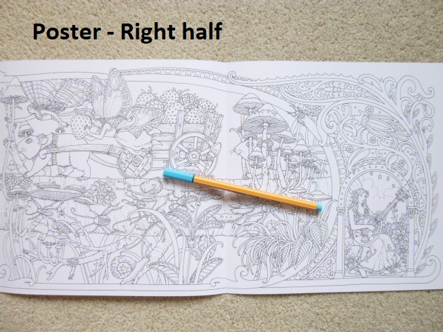
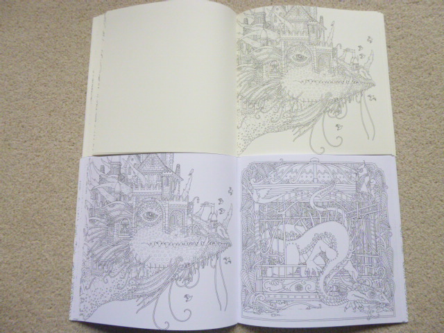
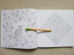
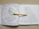
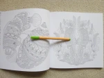
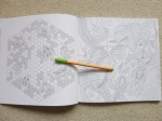
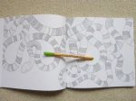
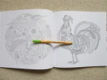
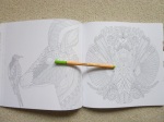
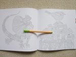
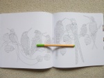
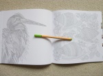
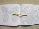
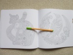
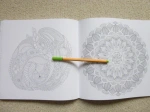
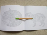
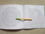
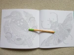
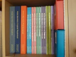
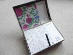
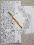
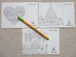
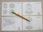
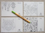
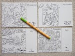
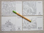
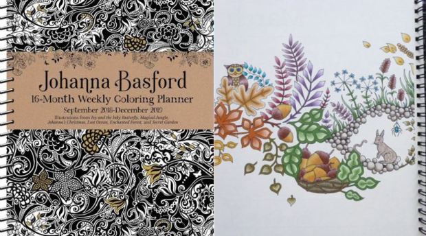
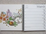
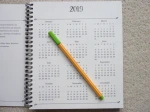
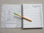
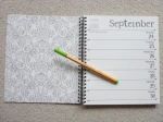
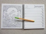
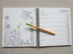
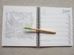
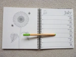
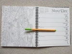
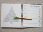
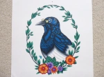
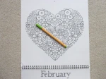
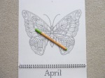
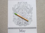
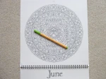
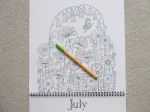
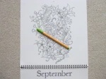
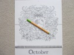
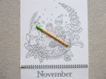
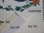
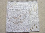
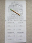
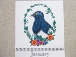
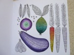
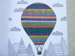
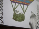
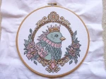
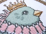
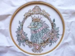
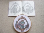
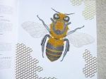
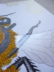
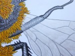
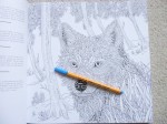
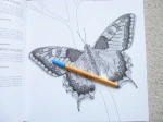
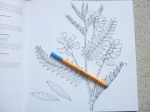
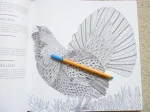
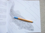
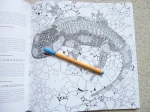
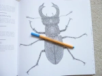
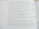
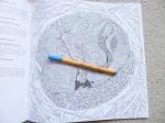
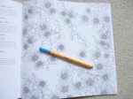
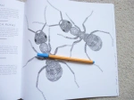
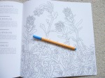
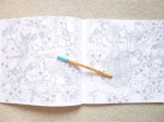
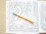
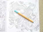
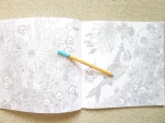
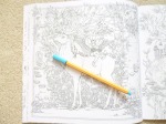
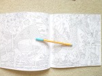
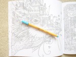
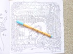
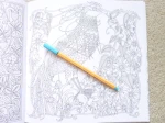
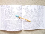
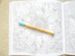
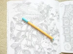
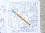
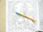
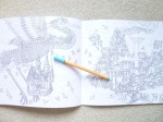
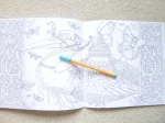
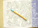
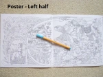
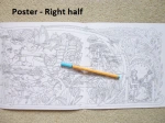
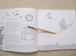
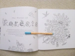
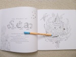
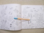
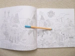
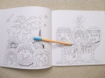
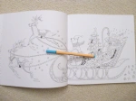
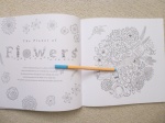
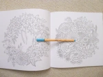
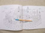
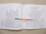
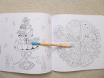
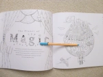
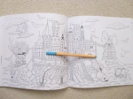
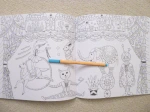
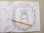
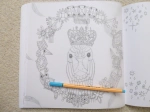
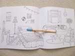
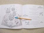
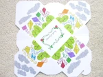
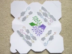
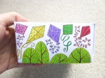
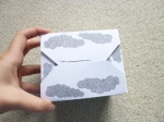
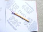
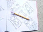
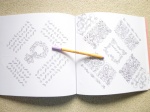
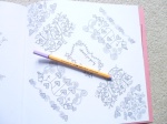
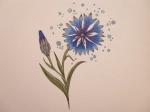
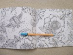
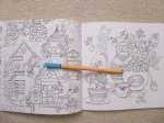
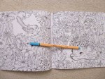
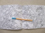
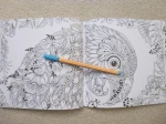
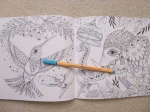
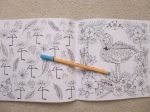
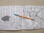
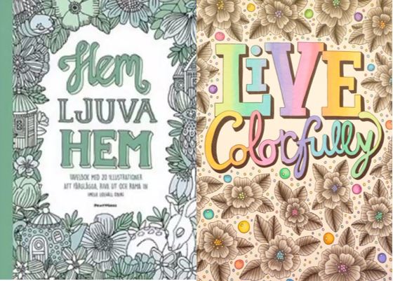
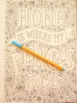
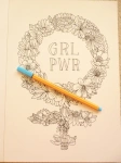
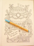
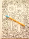
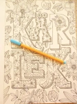
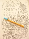
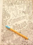
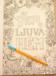
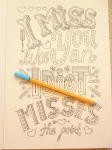
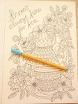
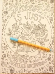
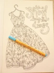
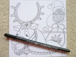
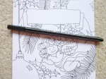
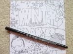
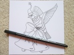
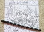
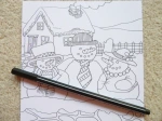
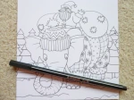
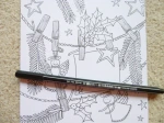
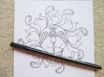
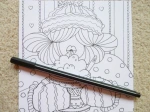
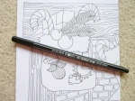
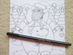
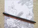
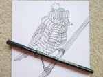
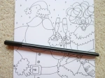
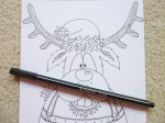
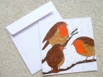
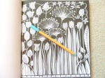
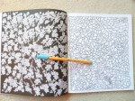
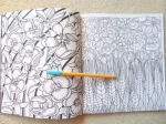
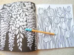
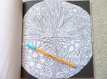
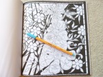
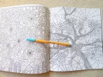
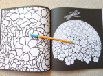
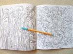
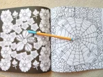
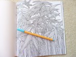
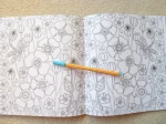
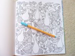
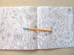
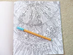
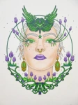
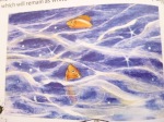
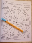
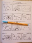
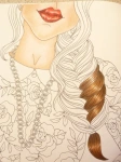
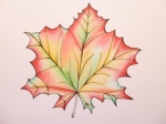
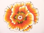
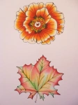
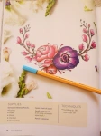
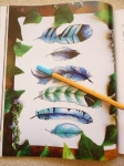
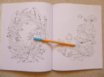
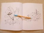
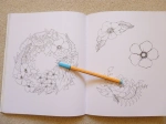
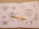
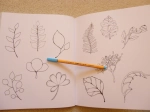
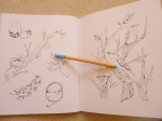
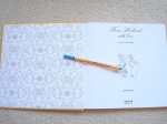
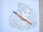
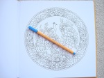
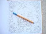
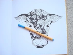
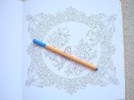
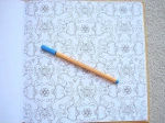
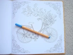
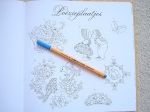
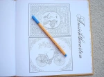
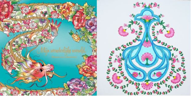
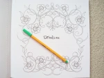
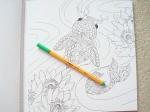
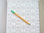
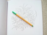
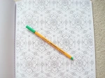
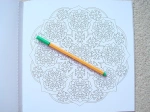
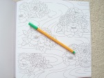
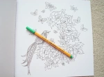
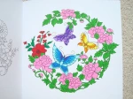
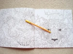
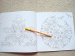
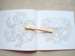
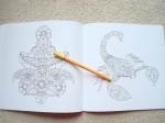
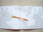
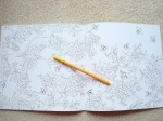
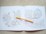
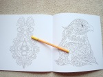
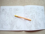
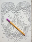
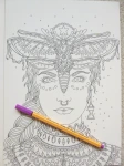
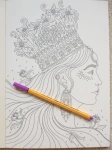
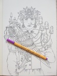
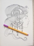
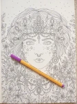
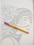
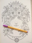
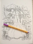
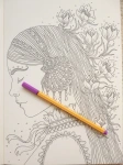
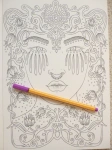
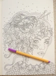
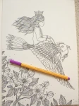
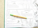
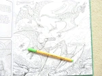
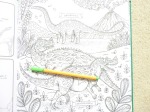
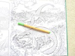
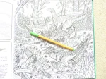
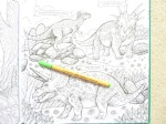
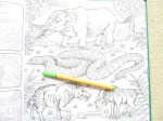
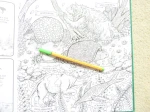
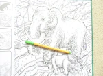
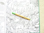
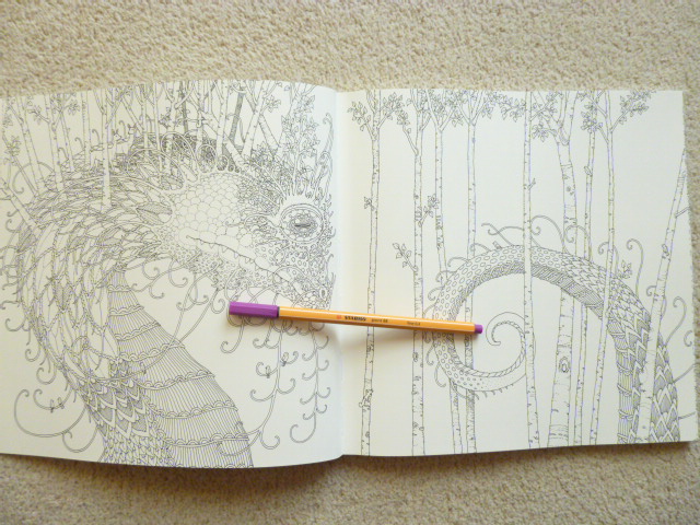
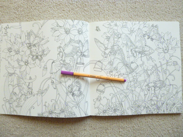
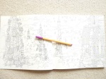
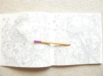
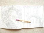
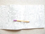
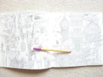
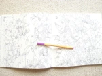
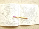
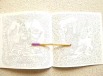
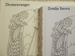
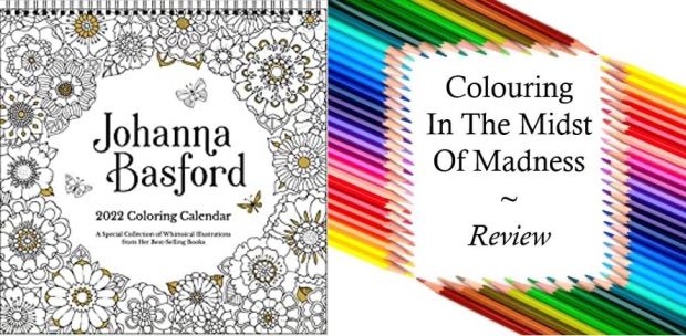
Johanna Basford 2022 Colouring Wall Calendar is published and was very kindly sent to me to review by Andrews McMeel Publishing. This calendar is beautiful and is the same format as the previous JB wall calendars. The calendar itself is the same size as most others at 12 inches square, making it significantly larger than Johanna’s books. Unlike the books, there are no other language or location editions, this US version is the only one. It includes 13 of Johanna’s drawings and this time, rather than being from one book, they’re from various titles she’s produced excluding How to Draw Inky Wonderlands, Worlds of Wonder and 30 Days of Creativity. As far as I’ve worked out, the images break down to: 2 Secret Garden, 2 Enchanted Forest, 2 Lost Ocean, 2 Magical Jungle, 1 Johanna’s Christmas, 2 Ivy and the Inky Butterfly, and 2 World of Flowers. This calendar doesn’t include any new images but as far as I’ve checked, none have been in any of her calendars before. There is one illustration for each month of the year and one at the beginning for a 4-month overview of September to December 2021. I have included pictures of all of the calendar pages below so that you can decide if this is for you.
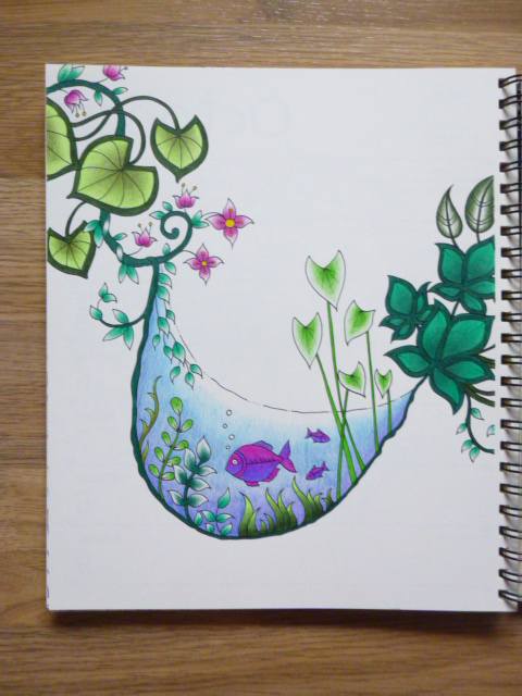
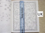
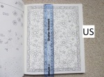
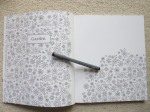
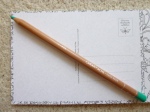
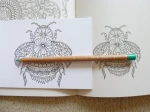
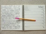
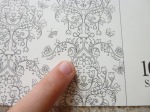
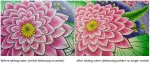
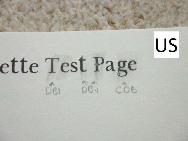
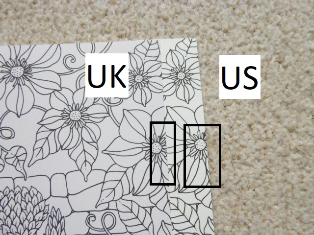
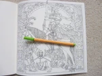
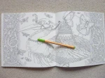
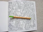
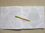
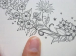
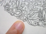
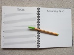
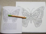
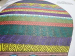
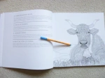
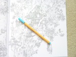
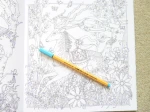
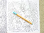
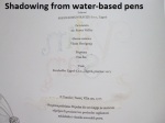
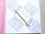
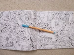
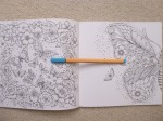
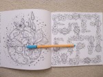
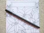
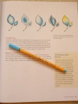
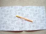
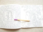
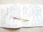
The whole calendar, including the covers, is made of thick pale cream paper which is good quality (it is less yellow than the Secret Garden book paper and more cream than the ivory paper in Johanna’s newer books) – I thought it was going to bleed with water-based pens and watercolours but there was no bleed-through at all and only some shadowing when using my darker fineliners (in previous year’s calendar) and no bleed-through or shadowing with Derwent Inktense pencils activated with water. Do bear in mind, when writing on the calendar I’d strongly advise using pencil so that you don’t get bleed through onto the next month’s image, or indentation from using a biro. The images are printed much larger in the calendar than in the books so this is a great purchase for those of you who find Johanna’s books just a little too detailed and small. You definitely can’t use alcohol markers because the images are all printed double-sided with the dates for the previous month on the back of the page which will get ruined by bleed-through if you colour ahead but would be fine if you colour month by month. The paper is quite smooth but has a little tooth and I didn’t have any issues with getting a few layers built up with my Caran d’Ache Luminance pencils in a previous edition.
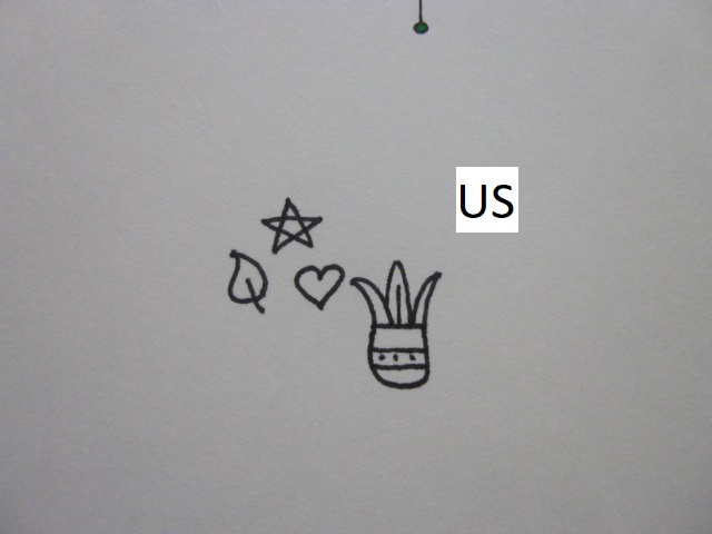
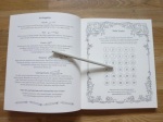
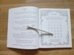
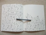
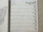
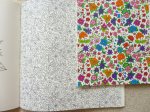
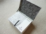
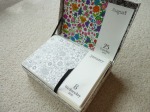
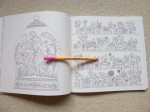
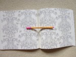
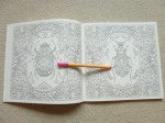
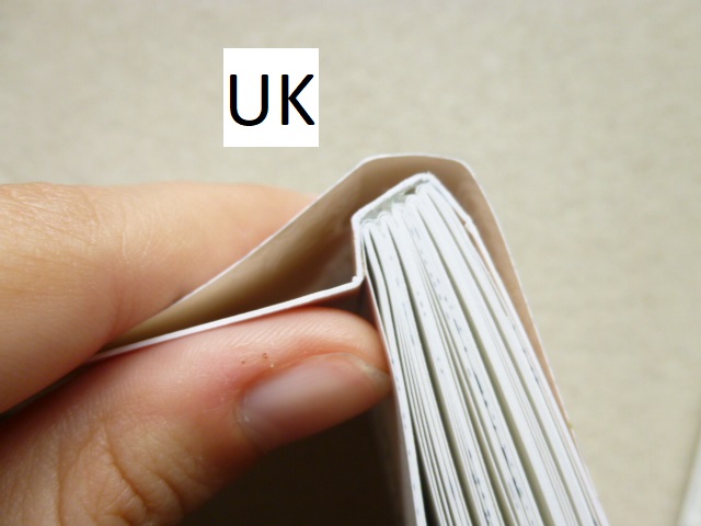
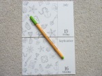
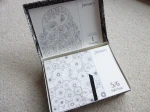
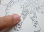
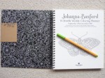
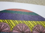
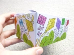
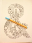
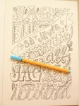
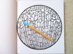
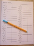
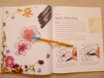
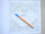
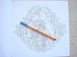
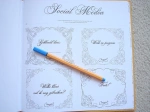
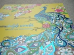
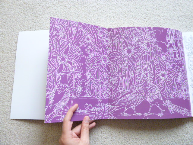
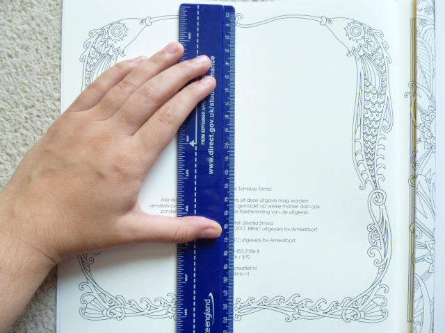
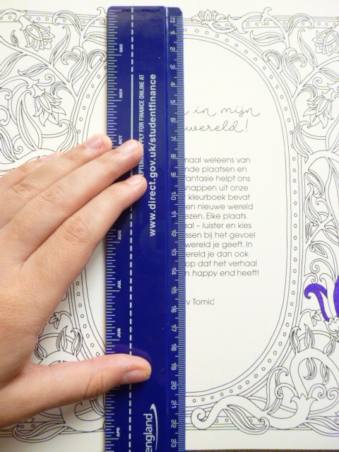
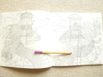
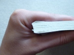
The calendar is spiral-bound so you can easily fold it back on itself for easier colouring as it’s a little unmanageable when it’s not folded in half. Each page has a small hole at the top, this is smaller than on normal calendars and doesn’t fit a nail through it so you’ll have to very carefully hang it up with string (be careful so you don’t rip the pages) or, use a Christmas tree hanger or unbent paperclip. The cover has signature gold foil accents and is fully colourable, as always, and each calendar page has lots of tiny leaf accents and each month has a leafy lettering title. My only issue with the whole calendar is the foiling from the front cover, it’s embossed which therefore leaves debossed sections on the first image which is printed on the inside cover above the 4-month 2021 overview, it’s fine to colour if you use wet media like pens or Derwent Inktense activated with water or other watercolour media but if you use regular pencils then you’re likely to struggle because the colour doesn’t apply evenly over these sections and looks like you’ve coloured over something, a similar effect to when you do brass or bark rubbing so just be mindful of this when colouring the first image.
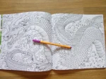
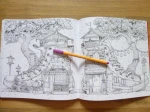
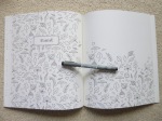
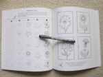
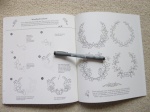
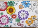
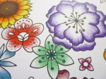
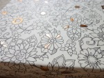
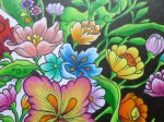
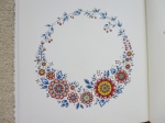
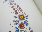
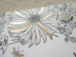
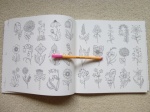
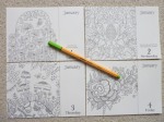
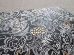
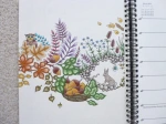
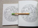
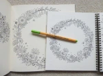
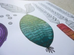
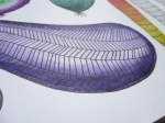
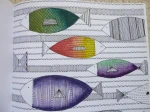
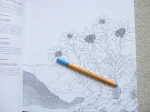
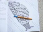
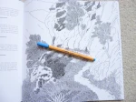
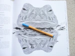
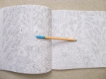
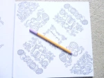
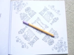
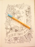
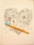
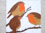
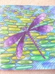
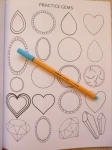
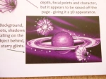
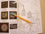
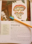
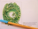
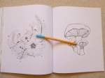
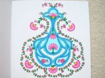
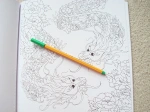
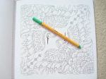
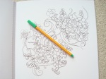
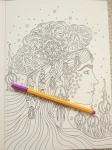
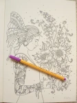
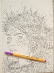
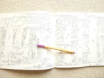
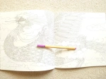
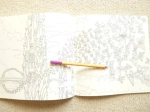
In terms of mental health, this calendar is ideal because not only does it give you hours of colouring fun and distraction, you can also easily display it on your wall to brighten up even the darkest of days and you’ll get satisfaction every day looking at all of your beautiful hard work. The larger image size means it’s more suitable for those of you who don’t have perfect vision or fine motor control. It’s a great project that will help motivate you with a deadline of making sure each image is ready for the first day of the following month. The pages could also be removed at the end of the year once you’re done with the calendar and could be easily framed or gifted to others to bring enjoyment for years to come. The levels of intricacy are varying across the pages from larger open spaces in some of the pages from Magical Jungle and Ivy and the Inky Butterfly but much more intricate in those from Lost Ocean and World of Flowers so there’s a good mix and range for good and bad days. As ever, the images are heavily nature-focused which is ideal for calming you down and allows for so much creativity with colour palettes. Johanna’s images are really good for practising mindfulness techniques because many require a lot of focus and time to complete meaning this calendar is ideal for those of us who are mentally ill and needing to zone out. The line thickness is medium/thin throughout so there is some leeway when colouring.
I would highly recommend this for any colouring fan who needs a calendar in their life. Johanna fans won’t be disappointed with this calendar, it’s beautiful with a lovely selection of designs and great paper quality and it will brighten up the darkest of rooms and moods. It would make a fabulous gift either as it is, or fully coloured for someone and it’s not only useful for the coming year as a calendar, but for years to come when you can frame your pictures to continue the joy.
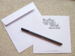
If you’d like to purchase a copy it can be found here:
Amazon UK – Johanna Basford 2022 Coloring Wall Calendar
Book Depository Worldwide – https://tidd.ly/3GtKdTg