Disclaimer – Please read this disclosure about my use of affiliate links which are contained within this post.
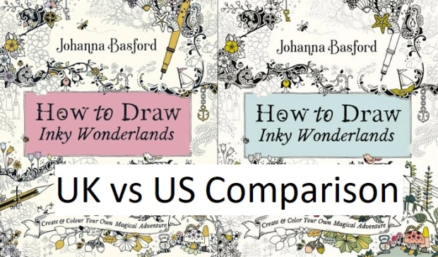
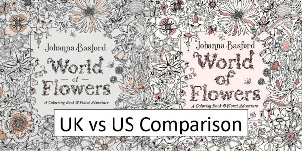
30 Days of Creativity is the latest book by Johanna Basford, it’s being published imminently and I have been lucky enough to be sent a copy of the UK and US edition by Johanna Basford in order to write this comparison post for you all. Every time Johanna releases a new book there are huge online debates about which edition is ‘best’ to buy, what the similarities will be and what will be different and so I’m here to tell you about each and every difference so that you can make an informed choice. I have reviewed the UK edition here and the US edition here.
This is a long post because there are so many pictures included to illustrate each point but please bear with me because a lot of time and effort has gone into being as thorough as possible. If you’d prefer to watch a video where I talk through and show all of the differences then scroll all the way to the bottom of the post where it’s embedded. Most of the things I’ve noticed don’t affect the enjoyment or use of the book, they’re just differences but there are a few items that are fundamentally different and do affect use so keep an eye out for those, they’re summarised at the bottom. Some of the very noticeable differences include the cover design, book size, binding and paper type, so here goes with the most comprehensive list of similarities and differences that you’re likely to find online!
If you want to just skip ahead to the most crucial differences then look at points 1, 7, 9, 10, 17, 27, and 29, and the summary section at the bottom.
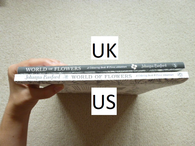
- Book Size – Both books are rectangular and not square (the same size as How to Draw Inky Wonderlands and Ivy and the Inky Butterfly), they are each the same height as all of Johanna’s other titles published in the same country. The UK edition is almost half a centimetre smaller in both directions than the US edition.

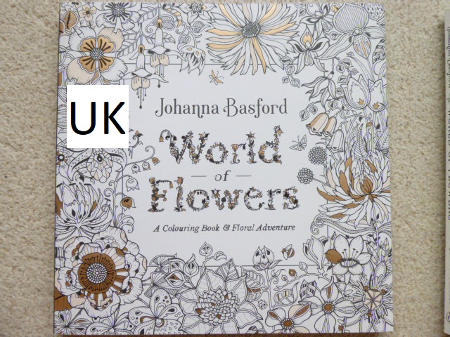
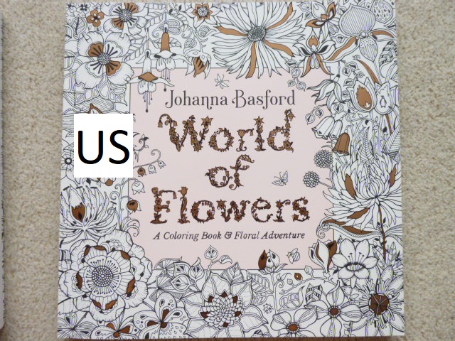
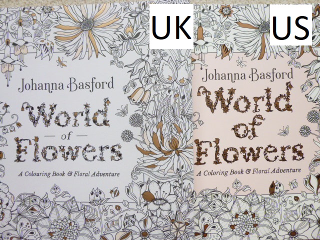
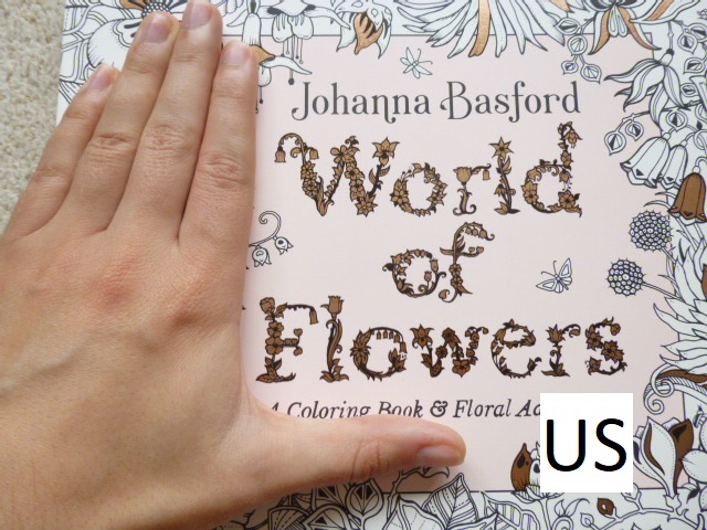
- Cover Design – Both editions have the same floral pattern with art supplies interspersed centrally but the UK edition has much more empty space around the corners and edges whereas the US edition has more floral pattern filling these gaps. This also means that 2 of the butterflies are placed slightly differently on the covers.

- Cover Colour – The books are both a beautiful pale blue colour but they’re not exactly the same, the UK edition is a slightly purer blue and the US edition is a slightly purpler blue.

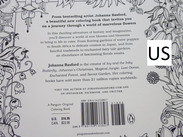
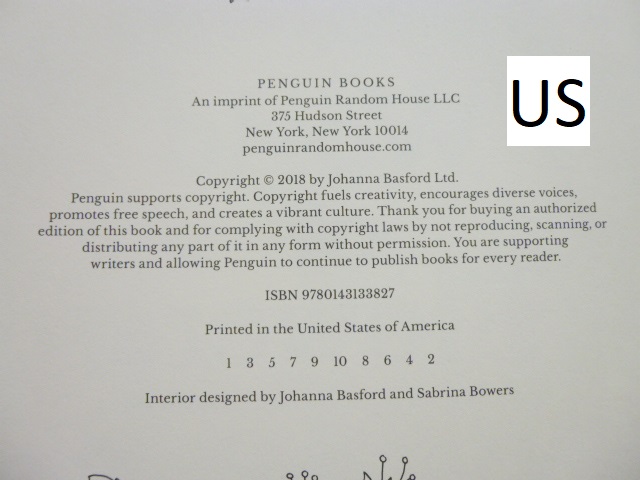
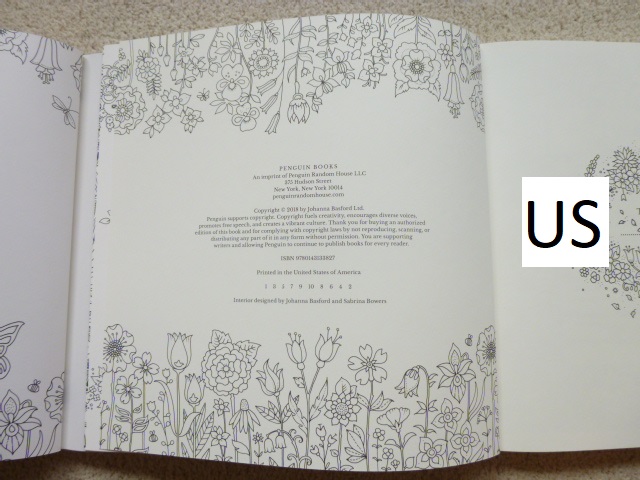
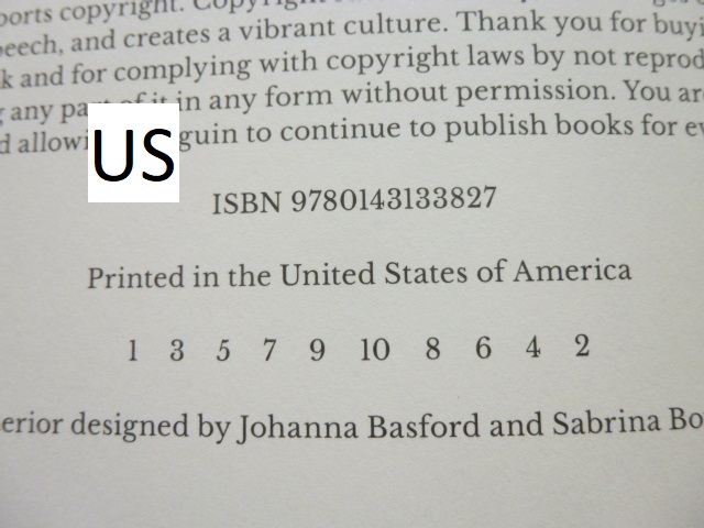
- Penguin Logo – The US edition has the Penguin Publishing logo subtly placed on the left in the middle. The US edition is published by Penguin, the UK edition is published by Ebury Press.

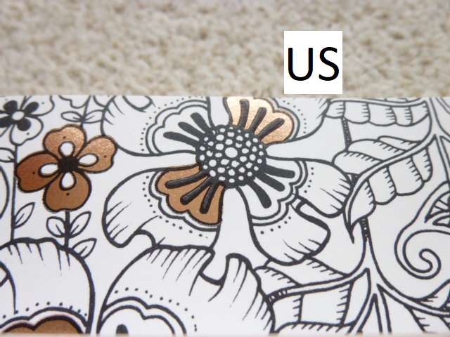
- Foiling Colour – The foil colour is gold on both but it’s ever so slightly yellower on the US copy.

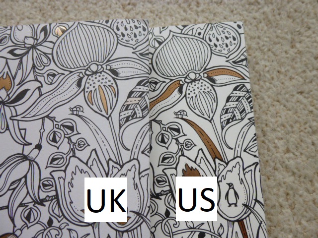
- Foiling Aspects/Amount – Both editions have the same aspects foiled apart from at the very bottom where on the US edition a flower on the left is foiled and on the UK edition a flower on the right is foiled.


- Spelling – As ever, this is one of the most noticeable differences and it’s a really easy way to identify which edition you’re looking at because of the spelling of the word “colour” in the subtitle. Throughout the book there are various different spellings between the US and UK editions including favorite/favourite.

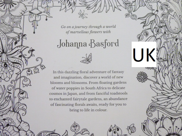
- Blurb – The UK and US editions have very slightly different blurbs with half a sentence extra on the US edition compared to the UK edition. The text is formatted into more paragraphs on the UK edition.


- Spine – Usually the book spines are black in the UK and white in the US. This time (as with Ivy and the Inky Butterfly and How to Draw Inky Wonderlands), both are white with black text, it’s printed a little blacker on the US edition. The fonts for the text are different on each and the US title is written in capitals whereas the UK edition has capitalised words. The UK edition has the subtitle written on the spine too but the US edition doesn’t. The text is much larger on the US edition than the UK and the font remains consistent throughout the spine on the US edition whereas the subtitle is written in italics on the UK edition. Finally, the UK edition has the Ebury Press logo and the US edition has the Penguin Books logo.


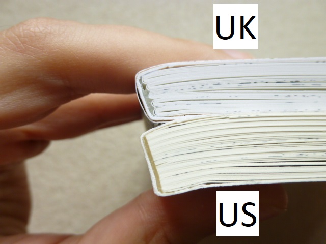
- Binding – The UK edition is stitched and glue-bound whereas the US edition is only glue-bound. This makes the US edition less durable and can lead to pages falling out. The spine of both editions has to be worked in order to get the book to lie flat and if you work the spine too much, the US edition may fall apart whereas the UK edition will be much more durable.

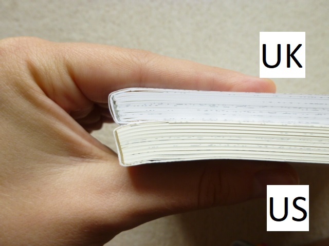
- Thickness – Due to the paper in the US edition being thicker (see point number 17), the book is thicker overall too.

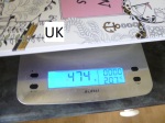
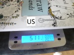
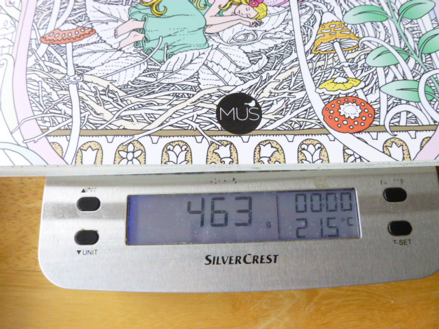
- Weight – The UK edition weighs less than the US edition at 402g vs 432g. A 30g difference.


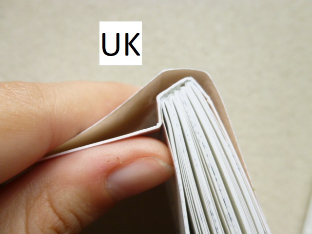
- Dust Jacket – This is usually one of the biggest differences between the editions, with the UK edition usually having a removable dust jacket and the US edition having it attached. This time (as with Johanna’s Christmas, Ivy and the Inky Butterfly, How to Draw Inky Wonderlands, and Worlds of Wonder), neither of them have removable dust jackets. This is probably a very sensible choice as they’re prone to getting damaged and with this being an activity book that’s meant to be worked in, you need to be able to work in it unhindered, however, I’m personally a little sad because I do really love the removable dust jackets but at least it’s one fewer thing to have to choose between when deciding which edition you want to purchase. The covers are made of thick card folded into ½ French Flaps inside. The card used for the UK cover is a little thicker and less bendy than the card used for the US cover.

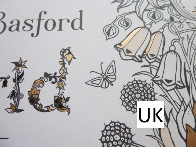
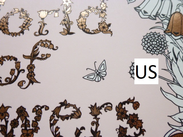
- French Flaps – Both editions have ½ size French Flaps, they have the same illustrations at the front and both have pictures of Johanna’s previous titles on the back flap but these are printed fully black and white in the US edition and with colour where the gold foil accents are in the UK edition.


- Cover Attachment – The covers are attached to a little more of the first and last page on the UK edition compared to the US edition, this makes it a little harder to get the UK edition to lie flat at first but this eases up over time.


- Inside Cover Images – The illustration on the inside covers is printed the same size on both editions so there is a little extra shown on the US edition than the UK edition.

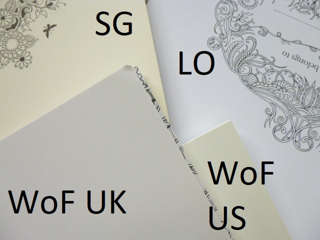
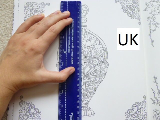
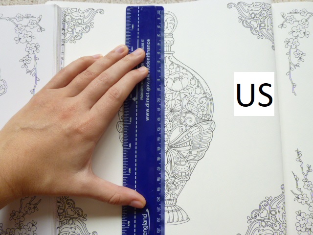
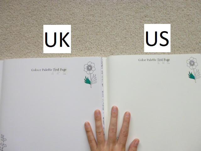
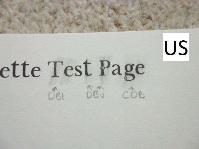
- Paper – This is one of the biggest differences between the two editions. The paper is not identical and is unique to each country. Johanna changed papers when Magical Jungle was published and her specially created ivory paper that was named after her is in all US copies of Magical Jungle, Johanna’s Christmas, Ivy and the Inky Butterfly, World of Flowers, How to Draw Inky Wonderlands, Worlds of Wonder, and now 30 Days of Creativity. In the UK we have a whiter ivory paper which Johanna and her team scoured the globe for and this is in all UK editions of the books previously listed. The UK paper is a similar thickness to the paper in Secret Garden and Enchanted Forest and significantly thicker than the paper in Lost Ocean, it has a little tooth but does burnish after a few layers of Polychromos and Prismacolor Premiers. The US paper is ivory but a more cream colour though it’s still paler than the cream colour of Secret Garden and Enchanted Forest. The paper is the thickest yet and has a more visible tooth, it takes far more layers for blending. In both editions water-based pens behave the same way and the paper in both is beautiful to colour on with pens as they glide really well with no feathering or spreading at all. For drawing, I tested out the Staedtler Pigment Liners that Johanna recommends and uses herself. They worked well on both papers however they seemed to spread a little on the US paper. My partner and I tried it in case it was user error on my part and we both experienced the same thing. Pencil erased well in both books but was significantly easier to erase in the US edition.


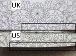
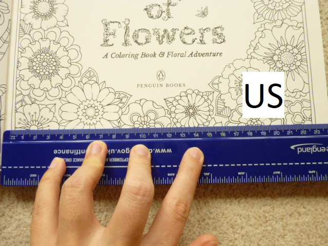
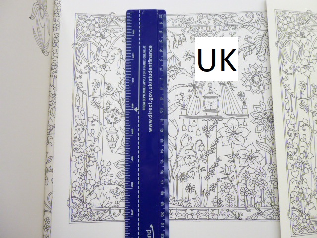
- Title Page Image Size – The floral border in the US edition is 0.5cm larger than the UK edition.


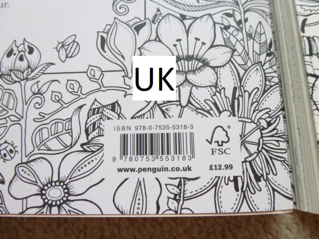
- Copyright Page Information – There is different information on the copyright pages in each of the editions and they have different ISBNs. This information is also laid out differently.


- Printing Location – The UK edition is printed in China, the US edition is printed in the USA.


- Language Differences – A few words are written differently across the editions e.g. popsicles (US) vs ice lollies (UK), cup measurements (US) vs grams (UK), self-rising flour (US) vs self-raising flour (UK).


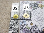
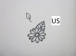
- Tips Bee/Butterfly – The bullet point illustrations are identical in each edition apart from point 4 where in the UK edition the bee picture is repeated whereas in the US edition there is a butterfly.


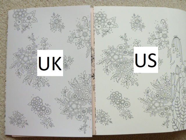
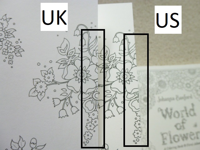
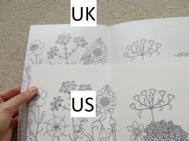
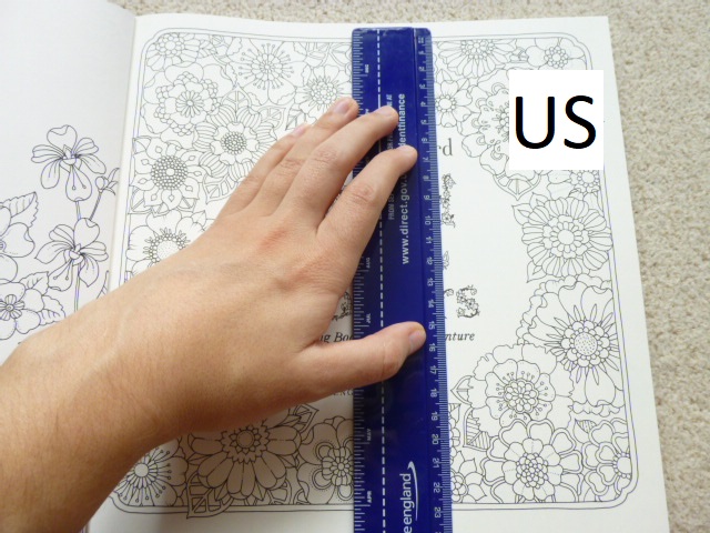
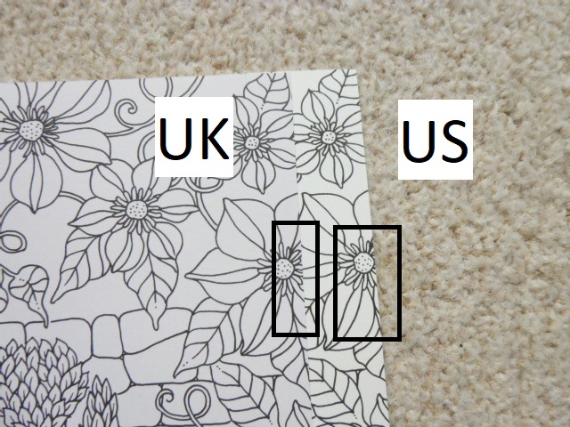
- Image Size – Some of the images are printed larger in the US edition than the UK edition but the amount of variance isn’t consistent throughout and only ranges up to a maximum of 1cm in each direction. Many are just a few millimetres if that.


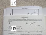
- Happy Quote Page – In the text in the US edition on this page the word ‘like’ is missing from the sentence “If it feels ‘like’ trudging through honey, stop.” It isn’t missing in the UK edition.


- Every Child is an Artist Quote Page – On the UK edition quote page, the quote is attributed to Picasso and his name is there and able to be coloured. It is not present on the quote page in the US edition.

- Pencils page – In the UK edition this page has a much larger space for the gutter of the book, than the US edition which therefore shows a little more of the repeating pencil pattern.

- Page Ink Permanency – The ink is pretty permanent on both books. There was no movement of pigment in the UK edition with a Caran d’Ache Blender Pencil but there was a little movement using the same on the US edition so do be a little careful on the colouring pages.

- Publication Date – The US edition publishes on Tuesday the 26th of October, the UK edition publishes on Thursday the 28th of October.
- Availability – Normally it’s very easy to get hold of whichever of these editions you wish to purchase and I’m hoping that will return to being the case. However, currently, at least in the UK it’s only possible to get the UK edition because the US edition isn’t listed on Amazon UK and it’s currently unavailable on Book Depository here. I’m hoping that this will change soon and if it does, I’ll be sure to update this post but currently the US edition is proving difficult to get hold of outside America and Canada.
- Treasure Hunt – This isn’t a difference between the books but it is different from Johanna’s earlier titles. There is no treasure hunt contained within this book. Though of course you could create your own with the drawing skills that you’ll have learnt!
Although there are a lot of differences, the ones that will affect your enjoyment and therefore impact your decision are the paper, the binding and having a matching set. This book matches the previous titles less than usual and so it will stick out a little on the shelf anyway as it’ll only directly match Ivy and the Inky Butterfly and How to Draw Inky Wonderlands. I think both papers are equally lovely but because of my issues with slight spreading of ink on the US edition, I would recommend the UK edition. I would also highly recommend the UK edition for the binding after numerous reports of US editions of previous titles falling apart. Mostly though, I’d advise getting whichever copy is easiest to get hold of because very few of these differences will hinder enjoyment or use enough that you wouldn’t want a copy.
Please do let me know in the comments section below which edition you’ll be purchasing and why!
UK Edition
Amazon UK – 30 Days of Creativity
Book Depository Worldwide – https://tidd.ly/2YV2lVE
US Edition
Amazon UK –
Book Depository Worldwide – https://tidd.ly/3vRrhJJ
Video Comparison