Disclaimer – Please read this disclosure about my use of affiliate links which are contained within this post.
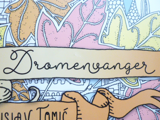
Vilin San was published in January 2018 and illustrated by Tomislav Tomic, it’s the second book he’s illustrated and one of the most beautiful colouring books I’ve ever seen. It was published in Croatia by Fokus and has been notoriously difficult to get hold of, it has almost exclusively been acquired through the publisher’s website which my Facebook fan group runs international group orders from. This is no longer necessary for this book because Sprookjesbos will be available worldwide at a really reasonable price and with much cheaper Worldwide shipping and hopefully it’ll eventually be available on Amazon UK (and possibly other places) like Dromenvanger (the Dutch edition of Zemlja Snova) is now. The artwork is the same in both books but there are a number of subtle publication differences between the two editions which I’ve listed and detailed below, there are three very large differences too which definitely affect enjoyment of the book. If you’d rather watch a video version then scroll all the way to the bottom where the video is embedded at the end of this post.
-
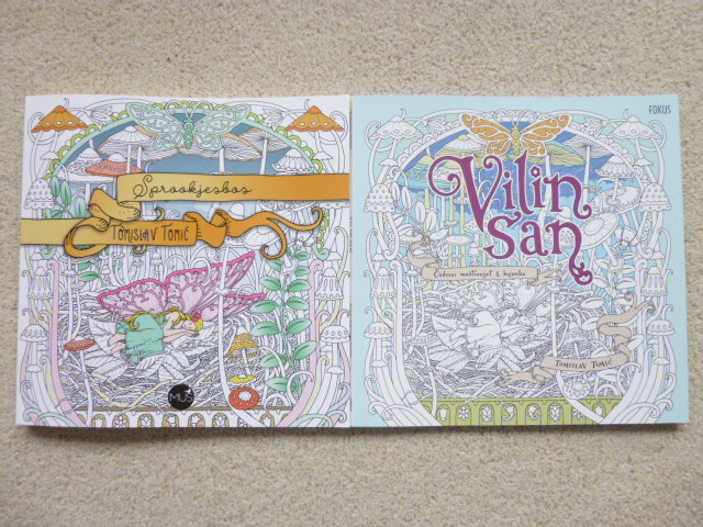
- Covers – Sprookjesbos also has a soft-feel cover with glossy accents on the title, artist name and publishing logo. Vilin San has a soft-feel cover with glossy accents on the title, subtext, and artist name.


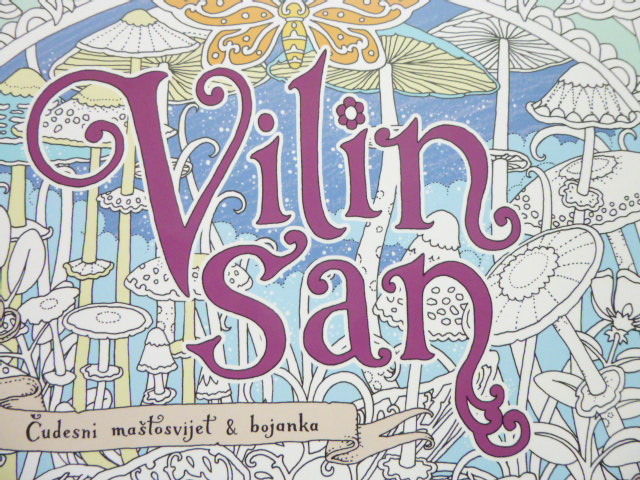
- Cover Image – The cover images are the same but Vilin San is printed smaller and has a little colour added to the top and bottom. Sprookjesbos has a larger, more zoomed in version of the image with a lot more colour added to it.

- Publishing Logo – The publishing logo is bottom centre on the cover of Sprookjesbos and at the top right on Vilin San.


- Cover Card – Both books are paperback and both have equally thick card covers.

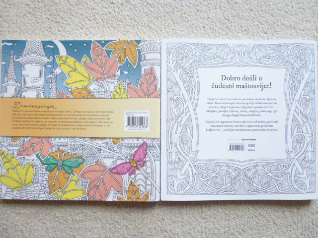
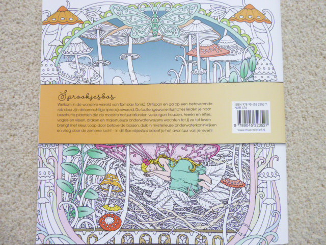
- Back Cover – The back cover of Sprookjesbos consists of the same image as the front cover, again, partially coloured and with the blurb in a ribbon across the centre. The back cover of Vilin San is completely black and white and the blurb is bordered by a frame from the introduction page inside the book.


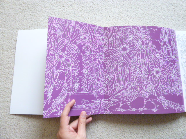
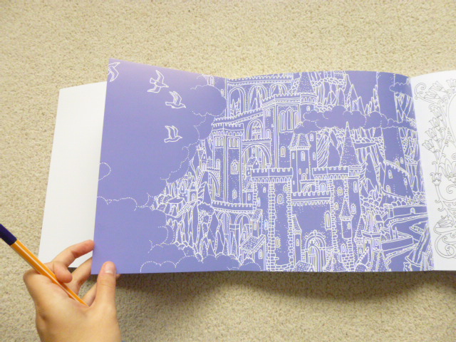
- Inside Covers – Sprookjesbos doesn’t have French Flaps, and the inside covers are blank white. Vilin San has French flaps with black and white artwork and these open out to reveal a bluey-purple and white line drawn illustration front and back.


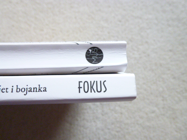
- Spine – The illustrator name and book title are differently ordered on the spines of the different editions, the subtitle is added on Vilin San. They both use completely different fonts. The Publisher logos at the bottom of the spine differ too.


- Book Size – Vilin San is slightly wider than Sprookjesbos because of its cover but the pages themselves are exactly the same size.

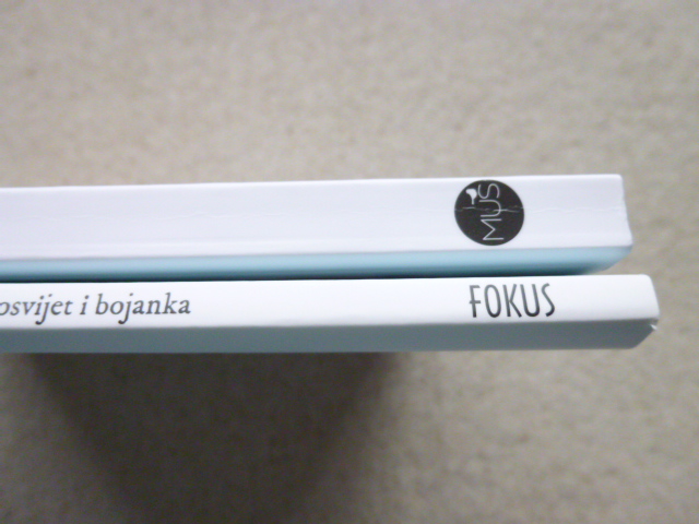
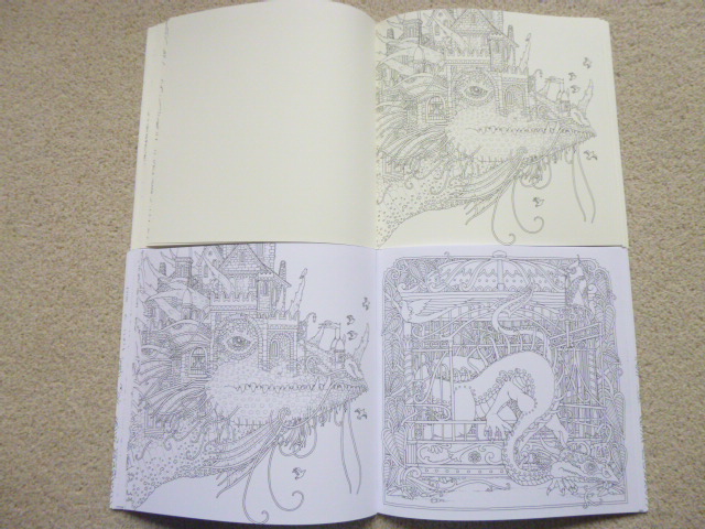
- Thickness – Sprookjesbos is significantly thicker than Vilin San, this is partially due to having thicker paper (more on this later) but also due to much of it being printed single-sided rather than double-sided. Sprookjesbos contains 68 pages whereas Vilin San contains 40 (plus poster).

- Binding – Both editions are glue and string-bound.

- Language – Vilin san is written in Croatian and Sprookjesbos in Dutch. I don’t read either of these languages so I’m therefore unable to comment on whether the text in each book translates the same, or whether it differs in meaning.


- Title – Obviously the titles differ due to language but they also slightly differ in meaning. Sprookjesbos translates as Fairytale Forest and Vilin San translates as Fairy’s Dream.


- Publisher – Both editions have been published by different publishing companies (hence all of these subtle differences), Vilin San is published by Fokus Na Hit and Sprookjesbos is published by BBNC Uitgevers.


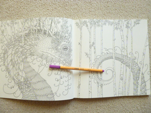
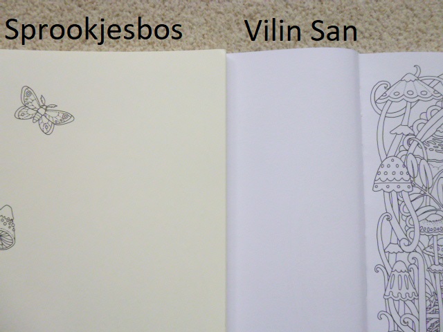
- Paper Colour – The paper in Vilin San is bright white, the paper in Sprookjesbos is cream.

- Paper Thickness – The paper in both is quite thick but it’s definitely thicker in Sprookjesbos. Water-based pens heavily shadow in Vilin San but don’t shadow at all in Sprookjesbos. The paper used in Sprookjesbos is, as far as I’m aware, the same paper that BBNC Uitgevers use in all of their colouring books, it’s a little temperamental with oil-based pencils (though others have had great results with these so it may well be my technique or lack of patience) and beautiful for pens and soft pencils like Prismacolor Premiers.

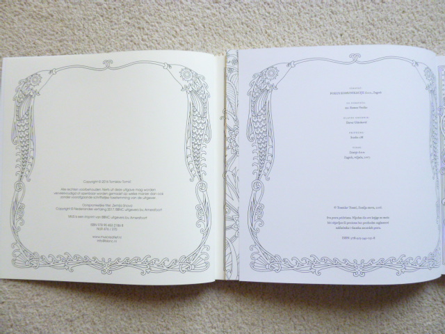
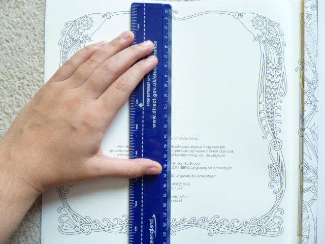
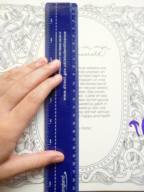
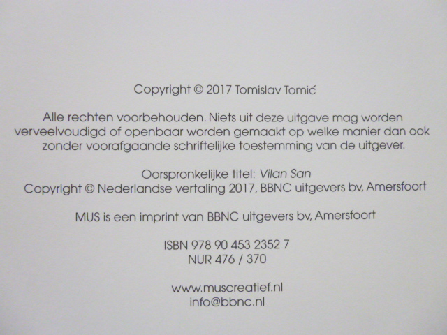
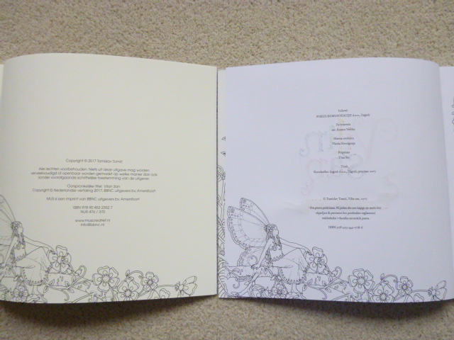
- Copyright Page – The information is much more spread out on the page in Vilin San and is contained to the bottom half of the page in Sprookjesbos. The page is at the front, as usual, in Vilin San, but it’s the last page at the back of the book in Sprookjesbos.

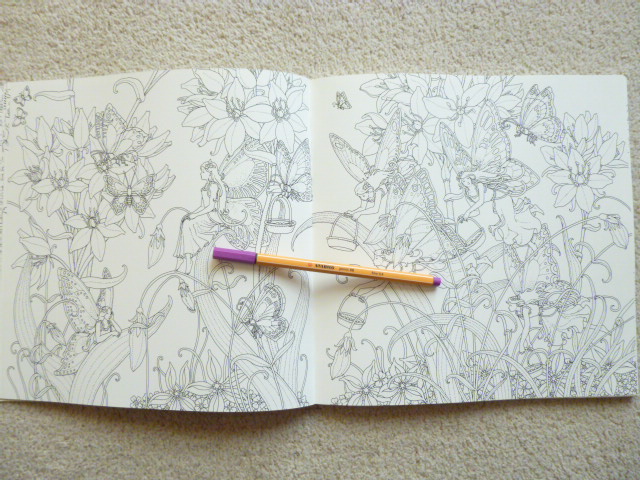
- Image Order – The images in Sprookjesbos are printed in exactly the same order as Vilin San apart from one double-page spread containing a flying bird which has been moved from very near the end to the centre of the book, all other pages are in the same order. This doesn’t remotely affect the enjoyment or cohesion of the book.

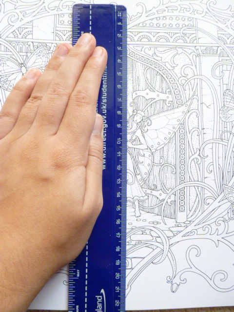
- Image Size – The images in both books are exactly the same size throughout.
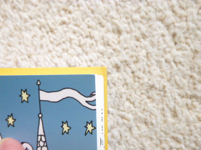
- Image Orientation – The images are spaced slightly differently between the books with a little more or less of the image shown at some edges on some pages when compared to each other, see photos for clarification.


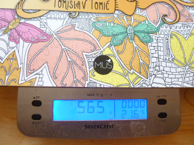
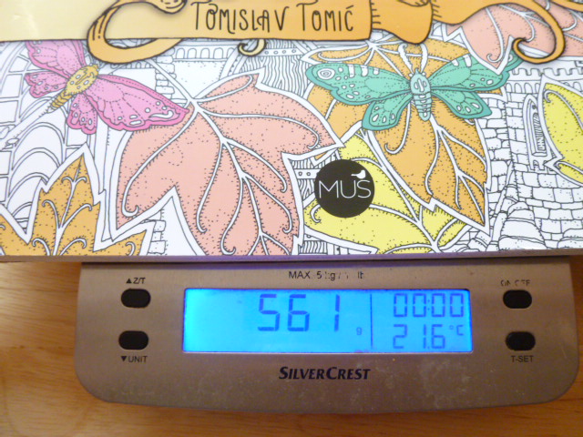
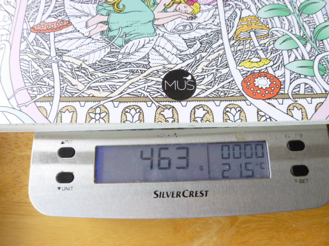
- Weight – Vilin San weighs less than Sprookjesbos, it weighs 317g compared to 463g.


- Availability – Vilin San is extremely difficult to get hold of outside Croatia and is one of the hardest colouring books on the market to obtain. We have run international group orders through the publisher’s site for the last 9 months but this isn’t easy and has all but dried up recently. Sprookjesbos is easier to get hold of with cheaper shipping from the sites below and hopefully it’ll become easier still if it makes its way to Amazon UK like Dromenvanger has. It’s likely to take weeks or even months to get there but hopefully, eventually, it’ll be easier to purchase.
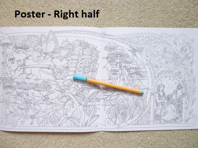
- Poster – Vilin San contains a beautiful 4-page poster that opens out into a huge scene. Sprookjesbos doesn’t include this or the imagery so sadly, you can only get that with Vilin San.


- Book Layout – Vilin San is entirely printed double-sided. Sprookjesbos is printed single-sided for the majority of the book.


- Covers – Sprookjesbos also has a soft-feel cover with glossy accents on the title, artist name and publishing logo. Vilin San has a soft-feel cover with glossy accents on the title, subtext, and artist name.


As you’ll have seen, there are a lot of subtle differences between the editions but hardly any of them affect use, in fact the only three that really do are the paper, the printing being single or double-sided and the lack of poster in Sprookjesbos. The single-sided printing really opens up your options for colouring because you can use so many different mediums that can’t be used when printing is double-sided. Although it’s a real shame that the poster artwork isn’t included in Sprookjesbos, and it’s a shame in some ways that the paper is cream, I know a lot of people love crisp, white paper, but this paper is thicker and ideal for water-based pens and pencils and with the (hopefully) increased accessibility, I will now forever be suggesting that people get a copy of Sprookjesbos. This new edition is beautiful and for those of you who already have Vilin San and are wondering about getting this new edition, or a second copy, I’d say definitely get a copy of Sprookjesbos, it’s beautifully produced, the illustrations look lovely on the new paper and it’s so much easier to get hold of and if you’re anything like me, you’ll want a copy of the new edition just because it’s a bit different, I truly am a colouring book hoarder!
If you’d like to purchase a copy of Sprookjesbos, it can be found at these sites:
Amazon UK – Sprookjesbos
https://www.bbnc.nl/sprookjesbos?search=sprookjesbos
https://www.bol.com/nl/p/sprookjesbos/9200000095550239/?suggestionType=browse&bltgh=imC0m1ReS55T4YWuif5OWg.1.2.ProductTitle
https://www.bookspot.nl/boeken/sprookjesbos-tomislav-tomic-9789045323527
https://www.boekhandelsmit.nl/9789045323527/tomic-tomislav/sprookjesbos/
https://www.libris.nl/boek/?authortitle=tomislav-tomic/sprookjesbos–9789045323527/
http://www.dinternet.nl/Boek/Tomislav–Tomic/Sprookjesbos/9789045323527.html
Video Comparison Post