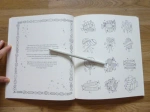
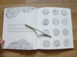
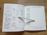
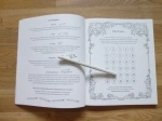
Adult Colouring

Johanna Basford 2022 Colouring Wall Calendar – A Review

Disclaimer – Please read this disclosure about my use of affiliate links which are contained within this post.

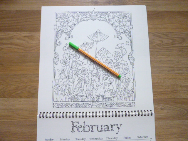
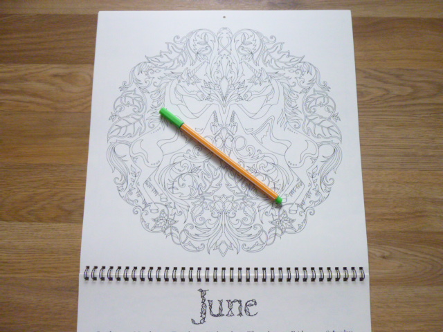
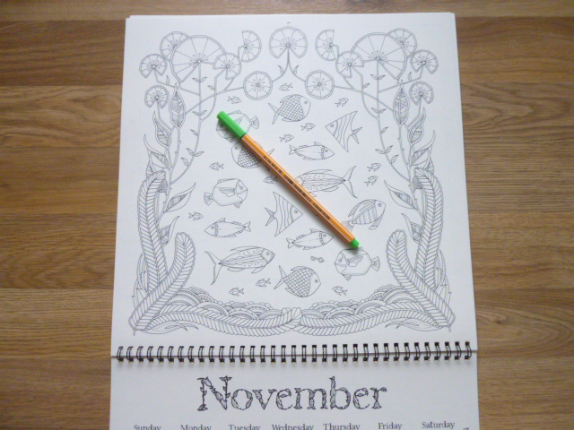
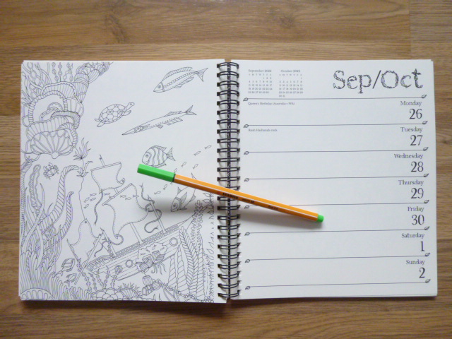
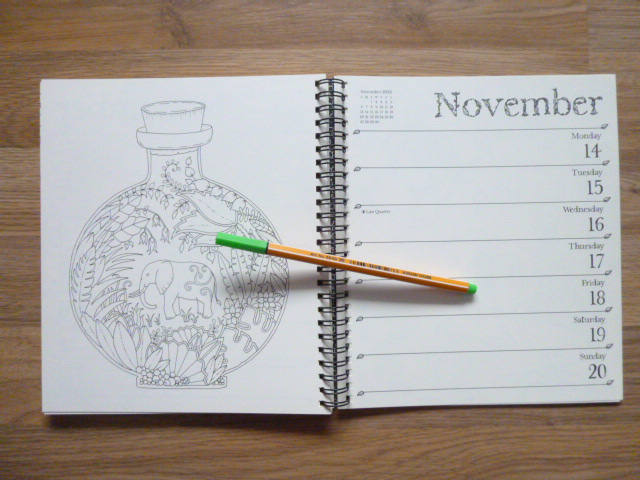
Johanna Basford 2022 Colouring Wall Calendar is published and was very kindly sent to me to review by Andrews McMeel Publishing. This calendar is beautiful and is the same format as the previous JB wall calendars. The calendar itself is the same size as most others at 12 inches square, making it significantly larger than Johanna’s books. Unlike the books, there are no other language or location editions, this US version is the only one. It includes 13 of Johanna’s drawings and this time, rather than being from one book, they’re from various titles she’s produced excluding How to Draw Inky Wonderlands, Worlds of Wonder and 30 Days of Creativity. As far as I’ve worked out, the images break down to: 2 Secret Garden, 2 Enchanted Forest, 2 Lost Ocean, 2 Magical Jungle, 1 Johanna’s Christmas, 2 Ivy and the Inky Butterfly, and 2 World of Flowers. This calendar doesn’t include any new images but as far as I’ve checked, none have been in any of her calendars before. There is one illustration for each month of the year and one at the beginning for a 4-month overview of September to December 2021. I have included pictures of all of the calendar pages below so that you can decide if this is for you.

The whole calendar, including the covers, is made of thick pale cream paper which is good quality (it is less yellow than the Secret Garden book paper and more cream than the ivory paper in Johanna’s newer books) – I thought it was going to bleed with water-based pens and watercolours but there was no bleed-through at all and only some shadowing when using my darker fineliners (in previous year’s calendar) and no bleed-through or shadowing with Derwent Inktense pencils activated with water. Do bear in mind, when writing on the calendar I’d strongly advise using pencil so that you don’t get bleed through onto the next month’s image, or indentation from using a biro. The images are printed much larger in the calendar than in the books so this is a great purchase for those of you who find Johanna’s books just a little too detailed and small. You definitely can’t use alcohol markers because the images are all printed double-sided with the dates for the previous month on the back of the page which will get ruined by bleed-through if you colour ahead but would be fine if you colour month by month. The paper is quite smooth but has a little tooth and I didn’t have any issues with getting a few layers built up with my Caran d’Ache Luminance pencils in a previous edition.

The calendar is spiral-bound so you can easily fold it back on itself for easier colouring as it’s a little unmanageable when it’s not folded in half. Each page has a small hole at the top, this is smaller than on normal calendars and doesn’t fit a nail through it so you’ll have to very carefully hang it up with string (be careful so you don’t rip the pages) or, use a Christmas tree hanger or unbent paperclip. The cover has signature gold foil accents and is fully colourable, as always, and each calendar page has lots of tiny leaf accents and each month has a leafy lettering title. My only issue with the whole calendar is the foiling from the front cover, it’s embossed which therefore leaves debossed sections on the first image which is printed on the inside cover above the 4-month 2021 overview, it’s fine to colour if you use wet media like pens or Derwent Inktense activated with water or other watercolour media but if you use regular pencils then you’re likely to struggle because the colour doesn’t apply evenly over these sections and looks like you’ve coloured over something, a similar effect to when you do brass or bark rubbing so just be mindful of this when colouring the first image.

In terms of mental health, this calendar is ideal because not only does it give you hours of colouring fun and distraction, you can also easily display it on your wall to brighten up even the darkest of days and you’ll get satisfaction every day looking at all of your beautiful hard work. The larger image size means it’s more suitable for those of you who don’t have perfect vision or fine motor control. It’s a great project that will help motivate you with a deadline of making sure each image is ready for the first day of the following month. The pages could also be removed at the end of the year once you’re done with the calendar and could be easily framed or gifted to others to bring enjoyment for years to come. The levels of intricacy are varying across the pages from larger open spaces in some of the pages from Magical Jungle and Ivy and the Inky Butterfly but much more intricate in those from Lost Ocean and World of Flowers so there’s a good mix and range for good and bad days. As ever, the images are heavily nature-focused which is ideal for calming you down and allows for so much creativity with colour palettes. Johanna’s images are really good for practising mindfulness techniques because many require a lot of focus and time to complete meaning this calendar is ideal for those of us who are mentally ill and needing to zone out. The line thickness is medium/thin throughout so there is some leeway when colouring.

I would highly recommend this for any colouring fan who needs a calendar in their life. Johanna fans won’t be disappointed with this calendar, it’s beautiful with a lovely selection of designs and great paper quality and it will brighten up the darkest of rooms and moods. It would make a fabulous gift either as it is, or fully coloured for someone and it’s not only useful for the coming year as a calendar, but for years to come when you can frame your pictures to continue the joy.

If you’d like to purchase a copy it can be found here:
Amazon UK – Johanna Basford 2022 Coloring Wall Calendar

Book Depository Worldwide – https://tidd.ly/3GtKdTg

Johanna Basford 2022 Weekly Colouring Planner – A Review

Disclaimer – Please read this disclosure about my use of affiliate links which are contained within this post.

Johanna Basford 2022 Weekly Colouring Planner is published and was very kindly sent to me to review by Andrews McMeel Publishing. This planner is the perfect combination of organisation and colouring with space to write plans, appointments and notes, whilst also having weeks and weeks of colouring for you to do too. This planner is paperback with flexible pale cream card covers which have a beautiful black line-drawn flower, leaf and butterfly design on the front and back with it printed in reverse, white on black, on the inside covers, the front cover has gold foiling accents and the front and back cover have removable lilac card strips with the information about the planner and the barcode etc printed on them. The planner is spiral-bound and measures 21.6 x 19.6cm, the covers aren’t especially sturdy so I’d be careful about travelling with it much and you’ll want to keep it safe somewhere rather than stuffing it in a bag or it’ll get damaged very quickly. This isn’t the best planner I’ve seen in terms of features and organisation, but for the combination of colouring and organising, it’s perfect and strikes a really good balance.

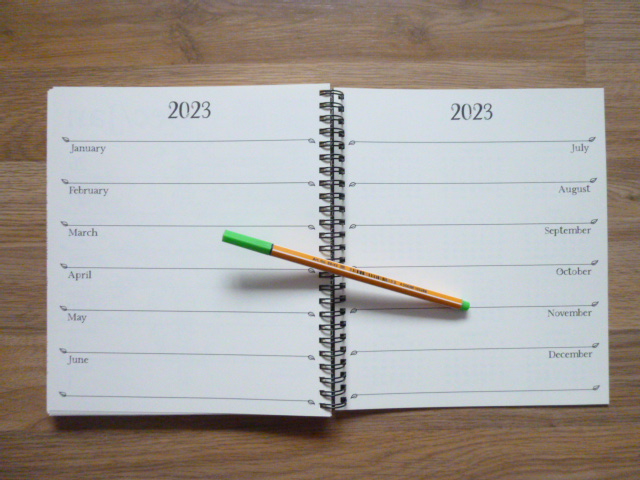
This planner runs for 12 months, from 27th of December 2021 to the 1st of January 2023. The planner is printed double-sided and starts with a one-page overview of the year 2022 and then the planner itself starts with an image on the left of each double-page spread from one of Johanna’s first eight books, images from all eight (Secret Garden, Enchanted Forest, Lost Ocean, Magical Jungle, Johanna’s Christmas, Ivy and the Inky Butterfly, World of Flowers, and How to Draw Inky Wonderlands) are included, and the week’s days and dates with writing space for each on the right (this is in the same style as normal planners with added leafy accents and leafy lettering for the month title at the top). Each week runs from Monday to Sunday with equal space to write for each day, the dates are on the right and important festivals and bank holidays etc are written in small text on the left of the page, as well as the country it’s celebrated in. After the planner pages, which make up the vast majority of the book, there is a double-page spread with sections for each month of 2023 for you to add your advance plans to. Following this is a full page of 2021 dates and a full page of 2023 dates, followed by 5 lined pages where you can write notes (all with added leaf accents) and the final page is a colouring test page where you can test out your mediums to check for bleed through.

The paper is pale cream rather than bright white (it is the same paper as the last 2 planners and it’s less yellow than the Secret Garden book paper and more cream than the ivory paper in World of Flowers), lightly textured and medium thickness, sadly it does shadow a fair bit with water-based pens but it doesn’t bleed through; I’d strongly advise writing in pencil throughout or you’ll ruin the image on the reverse either with shadowing or indentation from ballpoint pens. Pencils work well on this paper so I’d suggest mostly colouring with pencils and using water-based pens if you don’t mind the shadowing showing through on the planner pages. A great selection of images from Johanna’s books are included with some being sections of original images at the original size, some being sections zoomed in, printed larger, and others being the whole page shrunk down to fit on the planner page so some of the illustrations are quite tricky to colour neatly but almost none look impossible as long as you use a good set of fineliners or sharp pencils. I found that there was a good selection of images included, with a fair few pages from World of Flowers which are really lovely. We all have different preferences so do check out my video flip through of the whole planner below to check that you’re happy with the selection but I personally think it’s a really good range.

In terms of mental health, this colouring planner is ideal. It gives you a manageable goal of colouring one page per week which could either be next week’s page so that it’s coloured ready for that week or this week’s page so you can colour as you plan. You could even colour it ahead for the whole year. The pages are a great size to practice colour schemes for your copy of the actual books, or even to try out colouring mediums on a smaller page. The spiral-binding makes it easy to access the whole page and none of the images go into the spine, it’s also ideal because once you’ve finished using the planner at the end of 2022, the pages are easy to remove for framing or gifting if you want to get more use out of your works of art. There isn’t a treasure hunt element in this planner and there are no written hints for drawing though there are plenty of spaces on a number of images to be able to add your own details or backgrounds to really make the pages your own but this of course isn’t necessary and it’ll look finished without the need to draw at all. This planner is perfect for fans of Johanna’s work and it is a beautiful way of using her illustrations. The line thickness varies a little throughout from thin to spindly thin and the intricacy and detail levels are higher than in the books because some of the images are shrunk down to fit the pages so you will most definitely need very good vision and fine motor control to get the most out of this planner if you’re wanting to colour it; you could of course leave it blank and just admire the illustrations because they really are beautiful to just look at with no need to add colour if that’s too challenging. The images aren’t arranged into any order but a few have been cleverly chosen to fit celebrations like a heart for the week of Valentine’s Day and images from Johanna’s Christmas through December. There is no skull for Halloween this year. The page size is much more manageable and less daunting to colour and this is ideal for those of you with fluctuating conditions or concentration levels because these pages are quicker to finish and likely to cause less frustration.

I would highly recommend this colouring planner to fans of Johanna’s work and to those who love to be organised. It’s a great combination of planner and colouring pages and the size and format is ideal for those who find the full-size book pages too daunting. It’s great for practising colour schemes or using new colouring mediums and it’ll be a lovely keepsake to work through from beginning to end and see how you’ve progressed over the year it runs for; you can even remove the images afterwards and frame or gift them.

If you’d like to purchase a copy it’s available below:
Amazon UK – Johanna Basford 2022 Weekly Coloring Planner 
Book Depository Worldwide – https://tidd.ly/3FqdHjE

30 Days of Creativity – A Comparison between the UK and US Editions

Disclaimer – Please read this disclosure about my use of affiliate links which are contained within this post.

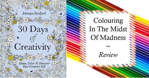
30 Days of Creativity is the latest book by Johanna Basford, it’s being published imminently and I have been lucky enough to be sent a copy of the UK and US edition by Johanna Basford in order to write this comparison post for you all. Every time Johanna releases a new book there are huge online debates about which edition is ‘best’ to buy, what the similarities will be and what will be different and so I’m here to tell you about each and every difference so that you can make an informed choice. I have reviewed the UK edition here and the US edition here.

This is a long post because there are so many pictures included to illustrate each point but please bear with me because a lot of time and effort has gone into being as thorough as possible. If you’d prefer to watch a video where I talk through and show all of the differences then scroll all the way to the bottom of the post where it’s embedded. Most of the things I’ve noticed don’t affect the enjoyment or use of the book, they’re just differences but there are a few items that are fundamentally different and do affect use so keep an eye out for those, they’re summarised at the bottom. Some of the very noticeable differences include the cover design, book size, binding and paper type, so here goes with the most comprehensive list of similarities and differences that you’re likely to find online!

If you want to just skip ahead to the most crucial differences then look at points 1, 7, 9, 10, 17, 27, and 29, and the summary section at the bottom.

  1. Book Size – Both books are rectangular and not square (the same size as How to Draw Inky Wonderlands and Ivy and the Inky Butterfly), they are each the same height as all of Johanna’s other titles published in the same country. The UK edition is almost half a centimetre smaller in both directions than the US edition.
    1. Book Size 30 Days of Creativity
  2. Cover Design – Both editions have the same floral pattern with art supplies interspersed centrally but the UK edition has much more empty space around the corners and edges whereas the US edition has more floral pattern filling these gaps. This also means that 2 of the butterflies are placed slightly differently on the covers.
    2. Cover Design 30 Days of Creativity
  3. Cover Colour – The books are both a beautiful pale blue colour but they’re not exactly the same, the UK edition is a slightly purer blue and the US edition is a slightly purpler blue.3. Cover Colour 30 Days of Creativity
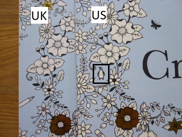
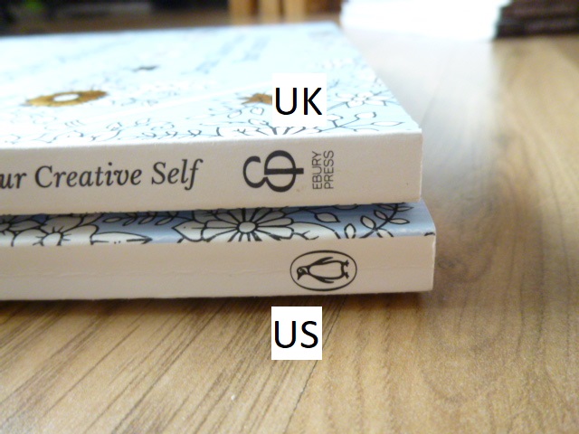
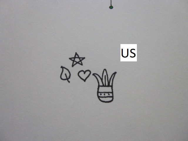
  4. Penguin Logo – The US edition has the Penguin Publishing logo subtly placed on the left in the middle. The US edition is published by Penguin, the UK edition is published by Ebury Press.
    4. Penguin Logo 30 Days of Creativity
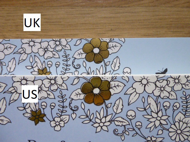
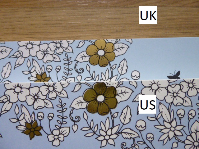
  5. Foiling Colour – The foil colour is gold on both but it’s ever so slightly yellower on the US copy.                                       5. Foiling Colour 30 Days of Creativity
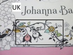
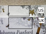
  6. Foiling Aspects/Amount – Both editions have the same aspects foiled apart from at the very bottom where on the US edition a flower on the left is foiled and on the UK edition a flower on the right is foiled. 6. Foiling Aspects 30 Days of Creativity (1)6. Foiling Aspects 30 Days of Creativity (2)
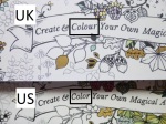
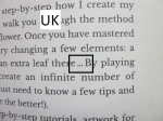
  7. Spelling – As ever, this is one of the most noticeable differences and it’s a really easy way to identify which edition you’re looking at because of the spelling of the word “colour” in the subtitle. Throughout the book there are various different spellings between the US and UK editions including favorite/favourite.
    7. Spelling 30 Days of Creativity
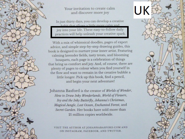
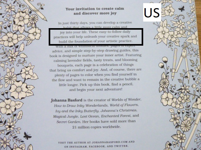
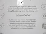
  8. Blurb – The UK and US editions have very slightly different blurbs with half a sentence extra on the US edition compared to the UK edition. The text is formatted into more paragraphs on the UK edition.
    8. Blurb 30 Days of Creativity (1)8. Blurb 30 Days of Creativity (2)8. Blurb 30 Days of Creativity (3)
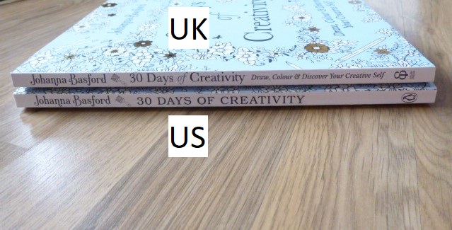
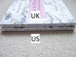
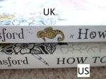
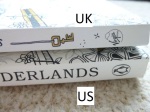
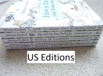
  9.  Spine – Usually the book spines are black in the UK and white in the US. This time (as with Ivy and the Inky Butterfly and How to Draw Inky Wonderlands), both are white with black text, it’s printed a little blacker on the US edition. The fonts for the text are different on each and the US title is written in capitals whereas the UK edition has capitalised words. The UK edition has the subtitle written on the spine too but the US edition doesn’t. The text is much larger on the US edition than the UK and the font remains consistent throughout the spine on the US edition whereas the subtitle is written in italics on the UK edition. Finally, the UK edition has the Ebury Press logo and the US edition has the Penguin Books logo.                       9. Spine 30 Days of Creativity (1)9. Spine 30 Days of Creativity (2)9. Spine 30 Days of Creativity (3)9. Spine 30 Days of Creativity (4)
  10. Binding – The UK edition is stitched and glue-bound whereas the US edition is only glue-bound. This makes the US edition less durable and can lead to pages falling out. The spine of both editions has to be worked in order to get the book to lie flat and if you work the spine too much, the US edition may fall apart whereas the UK edition will be much more durable.
    10. Binding 30 Days of Creativity
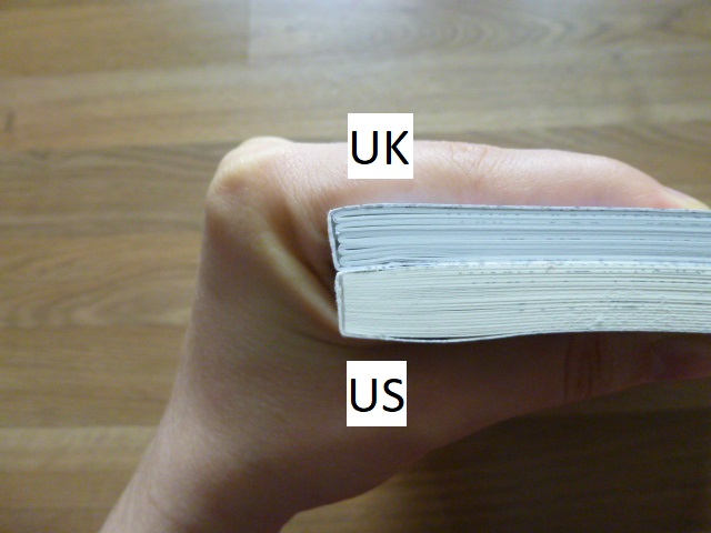
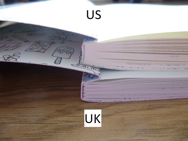
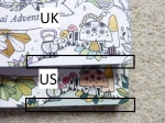
  11. Thickness – Due to the paper in the US edition being thicker (see point number 17), the book is thicker overall too.
    11. Thickness 30 Days of Creativity
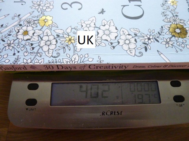
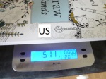
  12. Weight – The UK edition weighs less than the US edition at 402g vs 432g. A 30g difference.
    12. Weight 30 Days of Creativity (1)12. Weight 30 Days of Creativity (2)
  13. Dust Jacket – This is usually one of the biggest differences between the editions, with the UK edition usually having a removable dust jacket and the US edition having it attached. This time (as with Johanna’s Christmas, Ivy and the Inky Butterfly, How to Draw Inky Wonderlands, and Worlds of Wonder), neither of them have removable dust jackets. This is probably a very sensible choice as they’re prone to getting damaged and with this being an activity book that’s meant to be worked in, you need to be able to work in it unhindered, however, I’m personally a little sad because I do really love the removable dust jackets but at least it’s one fewer thing to have to choose between when deciding which edition you want to purchase. The covers are made of thick card folded into ½ French Flaps inside. The card used for the UK cover is a little thicker and less bendy than the card used for the US cover.
    13. Dust Jacket 30 Days of Creativity
  14. French Flaps – Both editions have ½ size French Flaps, they have the same illustrations at the front and both have pictures of Johanna’s previous titles on the back flap but these are printed fully black and white in the US edition and with colour where the gold foil accents are in the UK edition.
    14. French Flaps 30 Days of Creativity (1)14. French Flaps 30 Days of Creativity (2)
  15. Cover Attachment – The covers are attached to a little more of the first and last page on the UK edition compared to the US edition, this makes it a little harder to get the UK edition to lie flat at first but this eases up over time.
    15. Cover Attachment 30 Days of Creativity (1)15. Cover Attachment 30 Days of Creativity (2)
  16. Inside Cover Images – The illustration on the inside covers is printed the same size on both editions so there is a little extra shown on the US edition than the UK edition.
    16. Inside Cover Images 30 Days of Creativity
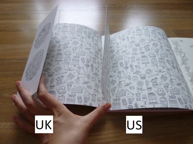
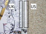
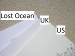
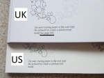
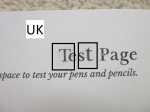
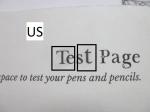
  17. Paper – This is one of the biggest differences between the two editions. The paper is not identical and is unique to each country. Johanna changed papers when Magical Jungle was published and her specially created ivory paper that was named after her is in all US copies of Magical Jungle, Johanna’s Christmas, Ivy and the Inky Butterfly, World of Flowers, How to Draw Inky Wonderlands, Worlds of Wonder, and now 30 Days of Creativity. In the UK we have a whiter ivory paper which Johanna and her team scoured the globe for and this is in all UK editions of the books previously listed. The UK paper is a similar thickness to the paper in Secret Garden and Enchanted Forest and significantly thicker than the paper in Lost Ocean, it has a little tooth but does burnish after a few layers of Polychromos and Prismacolor Premiers. The US paper is ivory but a more cream colour though it’s still paler than the cream colour of Secret Garden and Enchanted Forest. The paper is the thickest yet and has a more visible tooth, it takes far more layers for blending. In both editions water-based pens behave the same way and the paper in both is beautiful to colour on with pens as they glide really well with no feathering or spreading at all. For drawing, I tested out the Staedtler Pigment Liners that Johanna recommends and uses herself. They worked well on both papers however they seemed to spread a little on the US paper. My partner and I tried it in case it was user error on my part and we both experienced the same thing. Pencil erased well in both books but was significantly easier to erase in the US edition.                                                                  17. Paper 30 Days of Creativity (1)17. Paper 30 Days of Creativity (2)17. Paper 30 Days of Creativity (3)17. Paper 30 Days of Creativity (4)17. Paper 30 Days of Creativity (5)
  18. Title Page Image Size – The floral border in the US edition is 0.5cm larger than the UK edition.
    18. Title Page Image Size 30 Days of Creativity (1)18. Title Page Image Size 30 Days of Creativity (2)
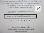
  19. Copyright Page Information – There is different information on the copyright pages in each of the editions and they have different ISBNs. This information is also laid out differently.
    19. Copyright Page Information 30 Days of Creativity (1)19. Copyright Page Information 30 Days of Creativity (2)
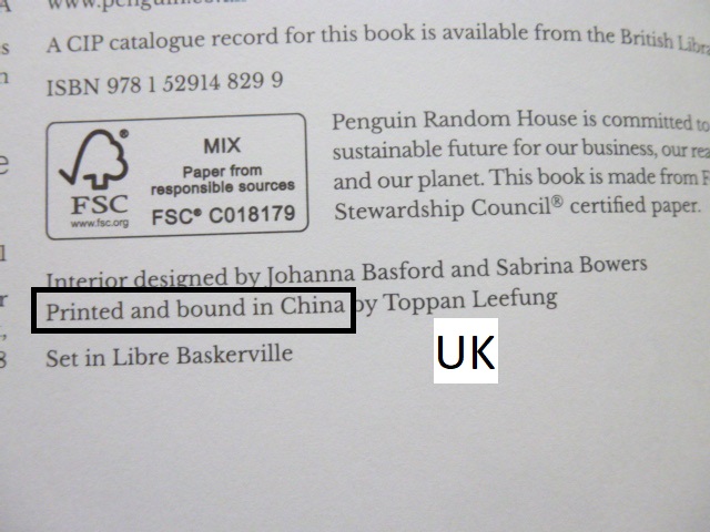
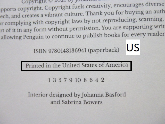
  20. Printing Location – The UK edition is printed in China, the US edition is printed in the USA.
    20. Printing Location 30 Days of Creativity (1)20. Printing Location 30 Days of Creativity (2)
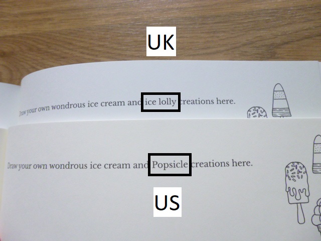
  21. Language Differences – A few words are written differently across the editions e.g. popsicles (US) vs ice lollies (UK), cup measurements (US) vs grams (UK), self-rising flour (US) vs self-raising flour (UK).
    21. Language Differences 30 Days of Creativity (1)21. Language Differences 30 Days of Creativity (2)
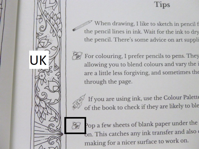
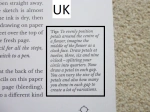
  22. Tips Bee/Butterfly – The bullet point illustrations are identical in each edition apart from point 4 where in the UK edition the bee picture is repeated whereas in the US edition there is a butterfly.22. Tips 30 Days of Creativity (1)22. Tips 30 Days of Creativity (2)
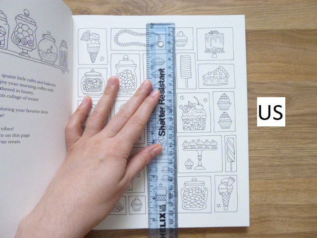
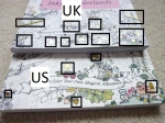
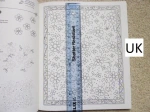
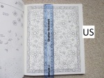
  23. Image Size – Some of the images are printed larger in the US edition than the UK edition but the amount of variance isn’t consistent throughout and only ranges up to a maximum of 1cm in each direction. Many are just a few millimetres if that.
    23. Image Size 30 Days of Creativity (1)23. Image Size 30 Days of Creativity (2)
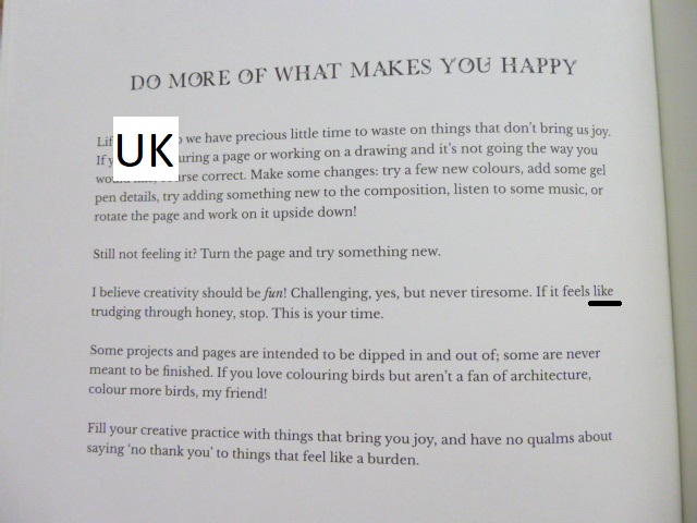
  24. Happy Quote Page – In the text in the US edition on this page the word ‘like’ is missing from the sentence “If it feels ‘like’ trudging through honey, stop.” It isn’t missing in the UK edition.
    24. Happy Quote Page 30 Days of Creativity (1)24. Happy Quote Page 30 Days of Creativity (2)
  25. Every Child is an Artist Quote Page – On the UK edition quote page, the quote is attributed to Picasso and his name is there and able to be coloured. It is not present on the quote page in the US edition.
    25. Every Child is and Artist Quote Page 30 Days of Creativity
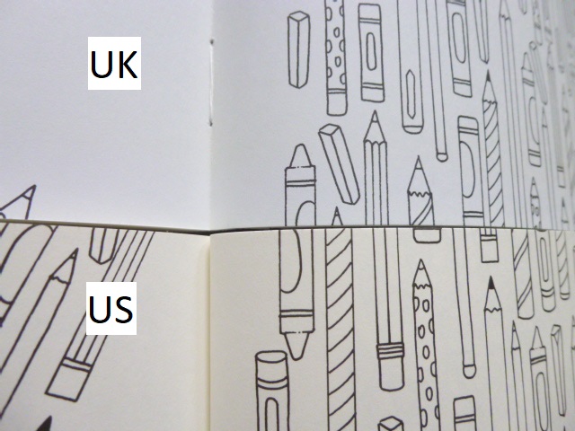
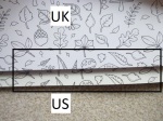
  26. Pencils page – In the UK edition this page has a much larger space for the gutter of the book, than the US edition which therefore shows a little more of the repeating pencil pattern.
    26. Pencils Page 30 Days of Creativity
  27. Page Ink Permanency – The ink is pretty permanent on both books. There was no movement of pigment in the UK edition with a Caran d’Ache Blender Pencil but there was a little movement using the same on the US edition so do be a little careful on the colouring pages.
    27. Page Ink Permanency 30 Days of Creativity
  28. Publication Date – The US edition publishes on Tuesday the 26th of October, the UK edition publishes on Thursday the 28th of October.
  29. Availability – Normally it’s very easy to get hold of whichever of these editions you wish to purchase and I’m hoping that will return to being the case. However, currently, at least in the UK it’s only possible to get the UK edition because the US edition isn’t listed on Amazon UK and it’s currently unavailable on Book Depository here. I’m hoping that this will change soon and if it does, I’ll be sure to update this post but currently the US edition is proving difficult to get hold of outside America and Canada.
  30. Treasure Hunt – This isn’t a difference between the books but it is different from Johanna’s earlier titles. There is no treasure hunt contained within this book. Though of course you could create your own with the drawing skills that you’ll have learnt!

Although there are a lot of differences, the ones that will affect your enjoyment and therefore impact your decision are the paper, the binding and having a matching set. This book matches the previous titles less than usual and so it will stick out a little on the shelf anyway as it’ll only directly match Ivy and the Inky Butterfly and How to Draw Inky Wonderlands. I think both papers are equally lovely but because of my issues with slight spreading of ink on the US edition, I would recommend the UK edition. I would also highly recommend the UK edition for the binding after numerous reports of US editions of previous titles falling apart. Mostly though, I’d advise getting whichever copy is easiest to get hold of because very few of these differences will hinder enjoyment or use enough that you wouldn’t want a copy.

Please do let me know in the comments section below which edition you’ll be purchasing and why!

UK Edition
Amazon UK – 30 Days of Creativity
Book Depository Worldwide – https://tidd.ly/2YV2lVE

US Edition
Amazon UK –
Book Depository Worldwide – https://tidd.ly/3vRrhJJ

Video Comparison

30 Days of Creativity (US Edition) – A Review

Disclaimer – Please read this disclosure about my use of affiliate links which are contained within this post.
30 Days of Creativity is by Johanna Basford who very kindly sent me a UK and US edition to review. This review is of the US edition, (my UK review can be found here) which is published by Penguin. I have also written a comparison post which can be found here, or the video comparison post can be found here.

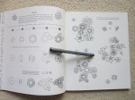
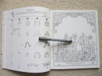
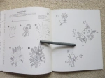
This book is most similar to How to Draw Inky Wonderlands but it’s also largely different from anything previously produced by Johanna and in fact, anything else I’ve seen on the market. This book was born during the Covid-19 pandemic and Johanna created it to help instil creative habits in us all. I’ll be completely honest, when she first announced the theme of the book, I was disappointed because I’m not such a huge fan of books where I need to add anything myself other than colour because drawing isn’t my forte (despite the fantastic lessons Johanna gave us) and my imagination isn’t so up to scratch with working out what to add. However, I have learnt that Johanna is always to be trusted and as ever, she’s created a truly beautiful book, way beyond my expectations based on the title and it’s honestly really lovely! While there are a lot of activity pages, they mostly don’t feel overwhelming or unachievable, at least not to me and there are plenty of colouring pages for those traditional creative days that are what so many of us were drawn into this hobby by. The pages consist of 30 double page spreads of activities and 5 double pages of colourable quotes interspersed within these. The activities include 18 colouring tasks (this is mostly based on explicit instruction to colour as really the whole book can be coloured), 11 drawing tasks, 7 doodling, 1 recipe and as previously mentioned, 5 colourable quotes.

The book itself is paperback and unlike the majority of Johanna’s colouring books, it’s rectangular, not square and measures 21.5 by 25.5cm, making it the same size as Ivy and the Inky Butterfly and How to Draw Inky Wonderlands and the same height as all of the US editions of Johanna’s colouring books. As with all US editions, there is no removable dust cover (nor is there on the UK edition this time), instead having flexible card covers with ½ French flaps which open out front and back to reveal a beautiful design of all sorts of objects including cakes, flowers, fish and utensils that is fully colourable; it isn’t waxy and is very smooth meaning most mediums will be suitable for colouring it, just be careful with alcohol markers in case they bleed through to the external covers. The covers are a beautiful pale blue and the front cover has gold foiling accents. The spine is white with black text and is glue bound which has caused issues in the past for colourists and without very careful handling can lead to pages falling out. Little to none of the content enters the spine and therefore you don’t lose much in the gutter. The pages are printed double-sided. The paper is the same as that used in previous US editions of Johanna’s titles from Magical Jungle onwards, this paper was created and named after Johanna and it’s beautiful. It’s not the same paper as used in the UK editions. The paper is a pale ivory colour, it’s a medium thickness and lightly textured and it’s perfect for pens and pencils. It has a good level of tooth so it can cope with pencil lines being drawn and erased and the Staedtler Pigment Liners that Johanna uses herself and recommends drawing with work beautifully on the paper with a light touch but can lead to feathering and spreading due to the tooth of the paper. Using the Staedtler Pigment Liners means that your drawings will match Johanna’s and blend in really well with the printed artwork so your drawings won’t stand out as “different” from the content that’s already on the page. The paper is ideal for pencils and water-based pens and you only need to avoid alcohol makers or particularly wet media. As ever, there’s a test page at the back of the book where you can check out how each of your tools and mediums behaves.

This is very much an activity book but with a real grown-up feel to it and it’s a great way to start a creative habit. It begins with an introduction and tips page and follows on to a habit tracker so that you can mark off each day when you’ve done your allotted 10 minutes of creativity. There are no page numbers and each double-page spread stands alone so you can work through the book in order, work through the same page on consecutive days until it’s finished or work through at random, picking and choosing what you fancy as you go, it’s entirely up to you. There are no rules and no rights or wrongs. If you’re getting stuck about where to start then Johanna is running a 30 day free course of videos and you can follow along with her in your book to get the habit embedded and also to experience being part of a huge group of people all over the world who’ll all be doing the same thing. If you’re interested in joining the course or participating later then all of the information about it can be found on her website and social media pages and it begins on the 1st of November.

The colouring pages and sections in this book are, as ever, really lovely and encompass a wide range of subjects including baking ingredients and equipment, robots, art supplies, all sorts of food, flowers, underwater creatures and more. Many of the drawing tasks can be avoided if you wish but it’s always worth pushing yourself a little out of your comfort zone and having a go if you can; Johanna is such a good teacher and you might just surprise yourself! These tasks include doodling as well as actual drawing but they’re mostly pretty small projects so not too challenging.

In terms of mental health, it’s really good. Personally it’s not my favourite book because I am and always will be a die hard colouring fan and drawing and activities, as well as having text on the page just isn’t so up my street. However, I can absolutely appreciate the benefits of this book for many of the more adventurous among you who want to create and keep a new creative habit and need a little nudge to get there. This book eases you in gently and feels like a friend guiding you through the tasks and offering words of encouragement and tips and tricks where needed. It isn’t overwhelming and the tasks are all a manageable level and there are very few nearly empty pages to contend with. There is a good range of difficulty within the activities and they’ll all take totally different lengths of time to complete too which is ideal for adapting to your schedule. There are pages where you can colour or draw a full spread as well as small drawings where you can complete a single one really quickly and get a lovely sense of achievement from doing so.

Overall, I would highly recommend this book, while it’s not my favourite, it’s a really lovely addition to anyone’s collection and it’s a great book to dip in and out of as well as to help you begin a creative habit, something that is known to reduce anxiety and stress levels and promote calmness. The activities are well-described and easy to follow and the colouring pages are beautiful and this will be the perfect accompaniment to the video series Johanna has created to get your habit kick-started.

If you’d like to purchase a copy it’s available here:
Amazon UK –
Book Depository Worldwide – https://tidd.ly/3vRrhJJ

Video Review

30 Days of Creativity (UK Edition) – A Review

Disclaimer – Please read this disclosure about my use of affiliate links which are contained within this post.
30 Days of Creativity is by Johanna Basford who very kindly sent me a UK and US edition to review. This review is of the UK edition, (my US review can be found here) which is published by Ebury press. I have also written a comparison post which can be found here, or the video comparison post can be found here.

This book is most similar to How to Draw Inky Wonderlands but it’s also largely different from anything previously produced by Johanna and in fact, anything else I’ve seen on the market. This book was born during the Covid-19 pandemic and Johanna created it to help instil creative habits in us all. I’ll be completely honest, when she first announced the theme of the book, I was disappointed because I’m not such a huge fan of books where I need to add anything myself other than colour because drawing isn’t my forte (despite the fantastic lessons Johanna gave us) and my imagination isn’t so up to scratch with working out what to add. However, I have learnt that Johanna is always to be trusted and as ever, she’s created a truly beautiful book, way beyond my expectations based on the title and it’s honestly really lovely! While there are a lot of activity pages, they mostly don’t feel overwhelming or unachievable, at least not to me and there are plenty of colouring pages for those traditional creative days that are what so many of us were drawn into this hobby by. The pages consist of 30 double page spreads of activities and 5 double pages of colourable quotes interspersed within these. The activities include 18 colouring tasks (this is mostly based on explicit instruction to colour as really the whole book can be coloured), 11 drawing tasks, 7 doodling, 1 recipe and as previously mentioned, 5 colourable quotes.

The book itself is paperback and unlike the majority of Johanna’s colouring books, it’s rectangular, not square and measures 21 by 25cm, making it the same size as Ivy and the Inky Butterfly and How to Draw Inky Wonderlands and the same height as all of the UK editions of Johanna’s colouring books. There is no removable dust cover this time, instead having flexible card covers with ½ French flaps which open out front and back to reveal a beautiful design of all sorts of objects including cakes, flowers, fish and utensils that is fully colourable; it isn’t waxy and is very smooth meaning most mediums will be suitable for colouring it, just be careful with alcohol markers in case they bleed through to the external covers. The covers are a beautiful pale blue and the front cover has gold foiling accents. The spine is white with black text and is glue and string-bound which makes it very durable but a little tricky to get it to lie flat for drawing in, however, little to none of the content enters the spine and therefore you don’t lose much in the gutter. The pages are printed double-sided. The paper is the same as that used in previous UK editions of Johanna’s titles from Magical Jungle onwards, this paper was found through a global hunt and it’s beautiful, it’s not the same paper as used in the US editions. The paper is a very pale ivory colour, it’s a medium thickness and lightly textured and it’s perfect for pens and pencils. It has a good level of tooth so it can cope with pencil lines being drawn and erased and the Staedtler Pigment Liners that Johanna uses herself and recommends drawing with work beautifully and seamlessly on the paper with no feathering, spreading, shadowing or bleeding and they blend in beautifully with the printed artwork so your drawings won’t stand out as “different” from the content that’s already on the page. The paper is ideal for pencils and water-based pens and you only need to avoid alcohol makers or particularly wet media. As ever, there’s a test page at the back of the book where you can check out how each of your tools and mediums behaves.

This is very much an activity book but with a real grown-up feel to it and it’s a great way to start a creative habit. It begins with an introduction and tips page and follows on to a habit tracker so that you can mark off each day when you’ve done your allotted 10 minutes of creativity. There are no page numbers and each double-page spread stands alone so you can work through the book in order, work through the same page on consecutive days until it’s finished or work through at random, picking and choosing what you fancy as you go, it’s entirely up to you. There are no rules and no rights or wrongs. If you’re getting stuck about where to start then Johanna is running a 30 day free course of videos and you can follow along with her in your book to get the habit embedded and also to experience being part of a huge group of people all over the world who’ll all be doing the same thing. If you’re interested in joining the course or participating later then all of the information about it can be found on her website and social media pages and it begins on the 1st of November.

The colouring pages and sections in this book are, as ever, really lovely and encompass a wide range of subjects including baking ingredients and equipment, robots, art supplies, all sorts of food, flowers, underwater creatures and more. Many of the drawing tasks can be avoided if you wish but it’s always worth pushing yourself a little out of your comfort zone and having a go if you can; Johanna is such a good teacher and you might just surprise yourself! These tasks include doodling as well as actual drawing but they’re mostly pretty small projects so not too challenging.

In terms of mental health, it’s really good. Personally it’s not my favourite book because I am and always will be a die hard colouring fan and drawing and activities, as well as having text on the page just isn’t so up my street. However, I can absolutely appreciate the benefits of this book for many of the more adventurous among you who want to create and keep a new creative habit and need a little nudge to get there. This book eases you in gently and feels like a friend guiding you through the tasks and offering words of encouragement and tips and tricks where needed. It isn’t overwhelming and the tasks are all a manageable level and there are very few nearly empty pages to contend with. There is a good range of difficulty within the activities and they’ll all take totally different lengths of time to complete too which is ideal for adapting to your schedule. There are pages where you can colour or draw a full spread as well as small drawings where you can complete a single one really quickly and get a lovely sense of achievement from doing so.

Overall, I would highly recommend this book, while it’s not my favourite, it’s a really lovely addition to anyone’s collection and it’s a great book to dip in and out of as well as to help you begin a creative habit, something that is known to reduce anxiety and stress levels and promote calmness. The activities are well-described and easy to follow and the colouring pages are beautiful and this will be the perfect accompaniment to the video series Johanna has created to get your habit kick-started.

If you’d like to purchase a copy it’s available here:

Amazon UK – 30 Days of Creativity

Book Depository Worldwide – https://tidd.ly/2YV2lVE

Video Review

Worlds Within Worlds – A Review

Disclaimer – Please read this disclosure about my use of affiliate links which are contained within this post.
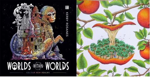
Worlds Within Worlds is illustrated by Kerby Rosanes and published and kindly sent to me to review by Michael O’Mara. This book is the seventh title by Kerby and is not part of the Morphia series albeit it’s drawn in a very similar style but without the signature alien creatures and swirls of the earliest Morphia titles.

The book is 25cm square, the same size as Kerby’s previous titles and most other bestsellers. It’s paperback with black covers and white lettering. The images on the front and back covers are partially coloured and are both contained within the book. The spine is glue and string-bound and quite tight on arrival, it takes a bit of work to get it lying flat however you shouldn’t need to crack the spine to colour the entirety of each image. The majority of images don’t enter the gutter so it’s not a big issue and it will ease up with use. The paper is bright white and medium thickness, it has a light tooth and allows for blending and shading. I used Prismacolor Premier Pencils which blended very well. When using heavy pressure, some of the image on the reverse page did transfer to the opposite page so you may want to put a sheet of scrap paper under your work in order to prevent this, however it’s easily erased if it does happen. The book begins with a name plate spread and information about the new search and find element of the book, a key hidden on a tiny image of a main feature of the proceeding image hidden within each colouring design. The book then contains 83 pages of illustrations printed double-sided which are a mixture of single pages, paired designs and double-page spreads. The image content is extremely wide ranging and because there is no specific theme, it really does contain a bit of everything including themes that he’s previously drawn in his earlier titles. None of the images are repeats, a few of them are just the same subject, drawn differently including fish, nautilus, dragon, bees, skull, and stags. The vast majority of the images are of completely different subjects and all of them are drawn in a very different way from previously. The premise of the book is exactly as the title suggests of worlds within worlds including cities within Russian dolls, rabbit warrens in rabbits, terrariums containing fields and windmills, underwater asteroids and so much more. The imagery is so inventive and as with all of Kerby’s work, it constantly surprises you and each time you look at it you notice something new that you hadn’t spotted before. Kerby’s artwork is full of the weird and wonderful and although it can often be very tricky to know where to start, no matter what colour palette you choose, you’re sure to create a masterpiece, it’s almost impossible not to with line drawings like this!

In terms of mental health, this book is fantastic. It offers so much choice in image theme and the content can’t help but inspire you! I often feel very overwhelmed when looking at Kerby’s work and trying to choose an image to colour because they’re quite an undertaking because of the amount of stuff crammed into each drawing but I didn’t feel that way about this book and the page I coloured was the page I chose as my favourite on my first flick-through of the book which is pretty much unheard of for me! The images contain a wide range of intricacy and detail levels and although none could ever be described as simple, there is a good variety ranging from pages absolutely packed with content and hundreds of individual component parts all overlapping each other which can be quite difficult to visually distinguish, to much larger, less complicated images where a centralised object takes centre-stage and there are a few internal or surrounding details. On flicking through the book, these differences are apparent and it means that you can use this book during lots of different symptom levels and pick simpler images to colour on days where your concentration isn’t up to scratch and attack a much more complicated design on days where you’re really able to focus and not inadvertently identify things as background that shouldn’t be. This book is hugely distracting, even just to look through and it’s certainly helped me over the last week when I’ve struggled to focus on much at all and really needed a distraction, colouring my page took far longer than I expected but I’ve really enjoyed it and it’s certainly kept me busy and kept my mind occupied which I’ve been very grateful for. It’s a great book to get you out of your comfort zone because nothing is as it seems and you absolutely don’t need to stick to conventional or realistic colour schemes if you don’t want to.

I would highly recommend this book. It’s a great title to begin with to delve into the world of Kerby’s artwork and for those of us who’ve been fans for years, it’s a wonderful new title and theme to add to his previous works. The images are just incredible and feel very exciting and fresh, you’d never guess this was the 6th book of new images, it feels like a show-stopping debut! I can’t recommend it highly enough and although I often find that new books are my favourite of an illustrator’s, this isn’t just my favourite Kerby book because it’s new, it’s by far my favourite imagery of his and an absolute must-have for followers and fans of his work!

If you’d like to purchase a copy, it’s available here:
Amazon UK – Worlds Within Worlds
Book Depository Worldwide – https://www.bookdepository.com/Worlds-Within-Worlds-Kerby-Rosanes/9781912785124/?a_aid=colouringitmom

The image below was coloured using Prismacolor Premier Pencils.

My video review and flick through can be found here.

How to Draw Inky Wonderlands – A Comparison between the UK and US Editions

Disclaimer – Please read this disclosure about my use of affiliate links which are contained within this post.
How to Draw Inky Wonderlands is now released worldwide and I have been lucky enough to be sent a copy of the UK and US edition by Johanna Basford in order to write this comparison post for you all. Every time Johanna releases a new book there are huge online debates about which edition is ‘best’ to buy, what the similarities will be and what will be different and so I’m here to tell you about each and every difference so that you can make an informed choice. I have reviewed the UK edition here and the US edition here.

This is a long post because there are so many pictures included to illustrate each point but please bear with me because a lot of time and effort has gone into being as thorough as possible. If you’d prefer to watch a video where I talk through and show all of the differences then scroll all the way to the bottom of the post where it’s embedded. Most of the things I’ve noticed don’t affect the enjoyment or use of the book, they’re just differences but there are a few items that are fundamentally different and do affect use so keep an eye out for those, they’re summarised at the bottom. Some of the very noticeable differences include the cover colour, book size and paper type, so here goes with the most comprehensive list of similarities and differences that you’re likely to find online!

If you want to just skip ahead to the most crucial differences then look at points 1, 9, 14, 17, 20, 31, and 38, and the summary section at the bottom.

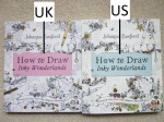
  1. Book Size – Each edition is the same height as the previous titles from the same country but they are not the same size as each other. This time they’re rectangular (like Ivy and the Inky Butterfly) and the US edition is 25.5cm by 21.5cm and the UK edition is half a centimetre smaller in each direction.
    1. Book Size How to Draw Inky Wonderlands (1) 1. Book Size How to Draw Inky Wonderlands (2)
  2. Cover Design – The cover design is very slightly zoomed in on the UK edition so the US edition has a little extra detail on 3 out of the 4 sides, at the bottom it appears to have been shifted slightly up on the UK edition and so it has a little extra image there.
    2. Cover Design How to Draw Inky Wonderlands (1) 2. Cover Design How to Draw Inky Wonderlands (2)
  3. Penguin Logo – The US edition has the Penguin Publishing logo subtly placed in the top right corner inside the seahorse image. The UK edition has a swirl design in its place. The US edition is published by Penguin, the UK edition is published by Virgin Books an imprint of Ebury.
    3. Penguin Logo How to Draw Inky Wonderlands
  4. Foiling Colour – The foil colour is gold on both but it’s ever so slightly yellower on the US copy and it’s shinier and smoother on the US copy too, it feels a little rougher on the UK edition.
    4. Foiling Colour How to Draw Inky Wonderlands (1) 4. Foiling Colour How to Draw Inky Wonderlands (2)
  5. Foiling Aspects/Amount – Both editions have completely different aspects of the cover foiled, with the UK edition having significantly more foiling than the US edition.
    5. Foiling Aspects Amount How to Draw Inky Wonderlands (1) 5. Foiling Aspects Amount How to Draw Inky Wonderlands (2)
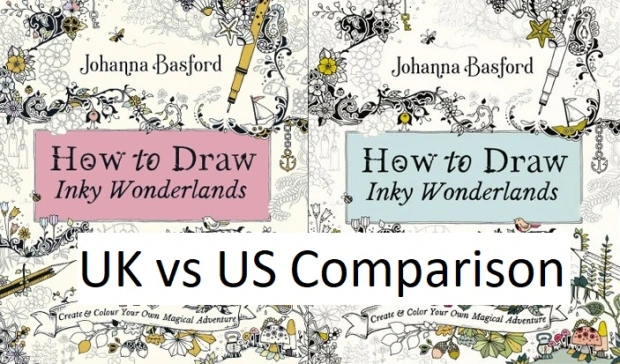
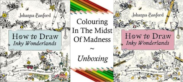
  6. Coloured Background – The UK edition has a beautiful pink background behind the title, the US edition has a lovely duck egg blue background behind the title.
    6. Coloured Background How to Draw Inky Wonderlands
  7. Coloured Accents – Both editions have different aspects coloured and both have different colours, the UK edition only has pastel shades ranging from green to pink and the US edition has a much wider range of colours including pastels and more vibrant shades. There is much more colour added to the US edition though this is limited to the bottom right corner of the cover whereas the UK edition has small coloured accents scattered all over.
    7. Coloured Accents How to Draw Inky Wonderlands (1) 7. Coloured Accents How to Draw Inky Wonderlands (2) 7. Coloured Accents How to Draw Inky Wonderlands (3)
  8. Pencil on Cover – The pencil lines on the UK edition are printed much darker than on the US edition.
    8. Pencil on Cover How to Draw Inky Wonderlands
  9. Spelling – As ever, this is one of the most noticeable differences and it’s a really easy way to identify which edition you’re looking at because of the spelling of the word “colour” in the subtitle. Throughout the book there are various different spellings and sometimes completely different words are used due to the language differences between UK and US English. Examples of this include: Autumn/Fall, Sweets/Candy, Greaseproof Paper/Baking Parchment.
    9. Spelling How to Draw Inky Wonderlands
  10. Blurb – The UK and US editions have completely different blurbs. There is far more text and information on the US edition than the UK edition.
    10. Blurb How to Draw Inky Wonderlands (1) 10. Blurb How to Draw Inky Wonderlands (2) 10. Blurb How to Draw Inky Wonderlands (3)
  11. Cover Colour – The UK cover is whiter than the US cover, neither is cream but the UK edition is very white.
    11. Cover Colour How to Draw Inky Wonderlands
  12. Back Cover Images – The illustrations and tutorials on the back cover are printed much larger on the UK edition than the US edition, probably because there’s more space due to less text. There is also an illustrated tutorial at the bottom of the US back cover that isn’t shown on the UK edition however it is included in both books, just not on both covers.
    12. Back Cover Images How to Draw Inky Wonderlands
  13. Spine – Usually the book spines are black in the UK and white in the US. This time (as with Ivy and the Inky Butterfly), both are white with black text, it’s printed a little blacker on the US edition. The UK spine has two foiled drawings on it, the US spine has no foiling. The motifs differ too with the UK edition having a seahorse and a key and the US edition having a pen. The text is much larger on the US edition than the UK and the font remains consistent throughout the spine on the US edition whereas half of the title is written in italics on the UK edition spine. Neither edition has the subtitle printed on the spine this time. Finally, the UK edition has the Virgin Books logo and the US edition has the Penguin Books logo.
    13. Spine How to Draw Inky Wonderlands (1) 13. Spine How to Draw Inky Wonderlands (2) 13. Spine How to Draw Inky Wonderlands (3) 13. Spine How to Draw Inky Wonderlands (4) 13. Spine How to Draw Inky Wonderlands (5) 13. Spine How to Draw Inky Wonderlands (6)
  14. Binding – The UK edition is stitched and glue-bound whereas the US edition is only glue-bound. This makes the US edition less durable and can lead to pages falling out. The spine of both editions has to be worked in order to get the book to lie flat and if you work the spine too much, the US edition may fall apart whereas the UK edition will be much more durable.
    14. Binding How to Draw Inky Wonderlands
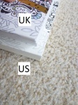
  15. Thickness – Due to the paper in the US edition being thicker (see point number 20), the book is thicker overall too.
    15. Thickness
  16. Weight – The UK edition weighs less than the US edition at 474g vs 511g. A 37g difference.
    16. Weight How to Draw Inky Wonderlands (1) 16. Weight How to Draw Inky Wonderlands (2)
  17. Dust Jacket – This is usually one of the biggest differences between the editions, with the UK edition usually having a removable dust jacket and the US edition having it attached. This time (as with Johanna’s Christmas and Ivy and the Inky Butterfly), neither of them have removable dust jackets. This is probably a very sensible choice as they’re prone to getting damaged and with this being a drawing book that’s meant to be worked in, you need to be able to work in it unhindered, however, I’m personally a little sad because I do really love the removable dust jackets but at least it’s one fewer thing to have to choose between when deciding which edition you want to purchase. The covers are made of thick card folded into ½ French Flaps inside. The card used for the UK cover is significantly thicker and less bendy than the card used for the US cover.
    17. Dust Jacket How to Draw Inky Wonderlands
  18. French Flaps (Images and Layout) – Both editions have ½ size French Flaps, they have the same illustrations but a very different layout with the UK edition having an image on each flap and the information from the US blurb about Johanna’s social media accounts on the back flap, and the US edition having both illustrations on the front flap and images of most of Johanna’s previously published titles on the back flap.
    18. French Flaps How to Draw Inky Wonderlands (1) 18. French Flaps How to Draw Inky Wonderlands (2)
  19. Inside Cover Design – The illustration on the inside covers is differently orientated with more of the image being printed in the US edition than the UK edition.
    19. Inside Cover Images How to Draw Inky Wonderlands
  20. Paper – This is one of the biggest differences between the two editions. The paper is not identical and is unique to each country. Johanna changed papers when Magical Jungle was published and her specially created ivory paper that was named after her is in all US copies of Magical Jungle, Johanna’s Christmas, Ivy and the Inky Butterfly, World of Flowers and now How to Draw Inky Wonderlands. In the UK we have a whiter ivory paper which Johanna and her team scoured the globe for and this is in all UK editions of Magical Jungle, Johanna’s Christmas, Ivy and the Inky Butterfly, World of Flowers, and How to Draw Inky Wonderlands. The UK paper is equal in thickness to Secret Garden and Enchanted Forest and significantly thicker than Lost Ocean, it has a little tooth but does burnish after a few layers of Polychromos and Prismacolor Premiers. The US paper is ivory but a more cream colour though it’s still paler than the cream colour of Secret Garden and Enchanted Forest. The paper is the thickest yet and has a more visible tooth, it takes far more layers for blending. In both editions water-based pens behave the same way and the paper in both is beautiful to colour on with pens as they glide really well with no feathering or spreading at all. The UK paper seems like it will shadow faster and more easily than the US edition and while I didn’t experience any shadowing in either, the UK paper did seem like it might with very dark colours if not using a light touch. I personally prefer the colour of the UK paper but the US paper is much easier to use pencils on and is less likely to bleed with water-based pens so I have to recommend that one.
    For drawing, I tested out the Staedtler Pigment Liners that Johanna recommends and uses herself. They worked well on both papers however the 0.2 size pen seemed to spread a little on the US paper. My partner and I tried it in case it was user error on my part and we both experienced the same thing however it was mostly just with that pen and not the other two sizes I tried so it’s possible it was just a dodgy pen but I don’t have a spare to test. Pencil erased well in both books but was significantly easier to erase in the US edition.
    20. Paper How to Draw Inky Wonderlands (1) 20. Paper How to Draw Inky Wonderlands (2) 20. Paper How to Draw Inky Wonderlands (3) 20. Paper How to Draw Inky Wonderlands (4) 20. Paper How to Draw Inky Wonderlands (5)
  21. Title Page Image Size – The title page image is printed 1.5cm larger in the US edition than the UK edition.
    21. Title Page Image Size How to Draw Inky Wonderlands (1) 21. Title Page Image Size How to Draw Inky Wonderlands (2)
  22. Copyright Page Information – There is much more information on the copyright page in the UK edition than the US edition.
    22. Copyright Page Information (1) 22. Copyright Page Information (2)
  23. Copyright Page Design – The design on the copyright page is printed much larger in the US edition and therefore a little less of the design is shown, despite the larger page size.
    23. Copyright Page Design Size and Orientation How to Draw Inky Wonderlands (1) 23. Copyright Page Design Size and Orientation How to Draw Inky Wonderlands (2)
  24. Printing Location – The UK edition is printed in China, the US edition is printed in the USA.
    24. Printing Location How to Draw Inky Wonderlands (1) 24. Printing Location How to Draw Inky Wonderlands (2)
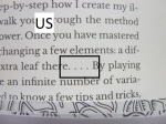
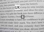
  25. Grammar – There are several grammatical differences between the two editions. Different punctuation for quotes, the UK edition has apostrophes, the US edition uses standard speech marks (quotation marks). Due to different text justification, the US edition has a number of hyphenated words that cross two lines, there are none in the UK edition. In various places dots have been used and between the editions these are spaced very differently and a different number of dots are used. Oxford commas are used in both editions but fewer are found in the UK edition. A few words are written differently across the editions with some being two separate words, some one word and some hyphenated e.g. Facedown (US) vs Face Down (UK), Claw Like (US) vs Claw-like (UK), Mega Doodle (US) vs Mega-doodle (UK), straightaway (US) vs straight away (UK).
    25. Grammar How to Draw Inky Wonderlands (1) 25. Grammar How to Draw Inky Wonderlands (2) 25. Grammar How to Draw Inky Wonderlands (3) 25. Grammar How to Draw Inky Wonderlands (4) 25. Grammar How to Draw Inky Wonderlands (5) 25. Grammar How to Draw Inky Wonderlands (6) 25. Grammar How to Draw Inky Wonderlands (7) 25. Grammar How to Draw Inky Wonderlands (8) 25. Grammar How to Draw Inky Wonderlands (9)
  26. Tip Layout – In the UK edition, the tip is spaced much closer to the main body of text and the title is written in the same size font. In the US edition there is a larger space between the tip and the main body of text and the title is written in a larger font and the text justified differently. This is the same throughout the editions.
    26. The Tip is Laid Out Differently How to Draw Inky Wonderlands (1) 26. The Tip is Laid Out Differently How to Draw Inky Wonderlands (2)
  27. Web Address – This is printed in normal text in the UK edition and in bold in the US edition.
    27. Web Address How to Draw Inky Wonderlands (1) 27. Web Address How to Draw Inky Wonderlands (2)
  28. Missing Intro Text – On the Blooms and Ship Ahoy! pages, the introduction text is missing and there is just an empty space. This information isn’t important and therefore it’s not a big deal that it’s missing, it’s just something I noticed as a difference and it’s not clear why this is the case on just these 2 pages.
    28. Missing Intro Text How to Draw Inky Wonderlands (1) 28. Missing Intro Text How to Draw Inky Wonderlands (2)
  29. Grey Numbered Circles – In the US edition there is much more contrast in the colour of the grey compared to the black whereas the contrast varies in the UK edition and changes from lighter grey to darker grey and back again.
    29. Grey Numbered Circles How to Draw Inky Wonderlands
  30. Posies – There is an extra sentence in the last UK instruction, it’s not hugely important but a little strange.
    30. Posies How to Draw Inky Wonderlands
  31. Image Size – Some of the images are printed larger in the US edition than the UK edition but the amount of variance isn’t consistent throughout and only ranges up to a maximum of 1.5cm in each direction. Many are just a few millimetres.
    31. Image Size How to Draw Inky Wonderlands (1) 31. Image Size How to Draw Inky Wonderlands (2)
  32. Image Layout/Orientation – On all pages where the design reaches the edge of the page, the layout and orientation of the design differs between the editions.
    32. Image Layout and Orientation How to Draw Inky Wonderlands
  33. Seaweed Tangle Fish Image – In the US edition the fish image next to the instructions is placed much higher on the page than in the UK edition.
    33. Seaweed Tangle Fish Image How to Draw Inky Wonderlands
  34. Mention of Page numbers – On the Seashells and Woodland Garland pages in the UK edition, it mentions using the technique on page 26, there are no printed page numbers in either edition and no mention of this in the US edition.
    34. Mention of Page Numbers How to Draw Inky Wonderlands (1) 34. Mention of Page Numbers How to Draw Inky Wonderlands (2)
  35. Layout of Text on Last Page –The text on the last page is laid out differently with the UK edition having more paragraphs than the US and the information being identical but differently ordered.
    35. Layout of Text on Last Page How to Draw Inky Wonderlands
  36. Page Ink Permanency  – The ink is pretty permanent on both books. I tested both with a Derwent Blender pencil and a Derwent Burnisher pencil, there was no movement of pigment on the UK edition and very little movement on the US edition. Due to this not being a colouring book this is likely to have little to no effect on your enjoyment of the book, it’s just something I always test.
    36. Page Ink Permanency How to Draw Inky Wonderlands (1) 36. Page Ink Permanency How to Draw Inky Wonderlands (2)
  37. Publication Dates – The US edition published on Tuesday the 15th of October, the UK edition published on Thursday the 17th of October.
  38. Availability – Normally it’s very easy to get hold of whichever of these editions you wish to purchase and I’m hoping that will return to being the case. However, currently, at least in the UK and on Book Depository, it’s only possible to get the UK edition because the US edition isn’t listed on Amazon UK and is out of stock on Book Depository. I’m hoping that this will change soon and if it does, I’ll be sure to update this post but currently the US edition is proving difficult to get hold of outside America and Canada.
  39. Treasure Hunt – This isn’t a difference between the books but it is different from Johanna’s other titles. There is no treasure hunt contained within this book. Though of course you could create your own with the drawing skills that you’ll have learnt!

Although there are a lot of differences, the ones that will affect your enjoyment and therefore impact your decision are the paper, the binding and having a matching set. This book matches the previous titles less than usual and so it will stick out a little on the shelf anyway as it’ll only directly match Ivy and the Inky Butterfly. I think both papers are equally lovely but because of my issues with slight spreading of ink on the US edition, I would recommend the UK edition. I would also highly recommend the UK edition for the binding after numerous reports of US editions of previous titles falling apart. Mostly though, I’d advise getting whichever copy is easiest to get hold of because very few of these differences will hinder enjoyment or use enough that you wouldn’t want a copy.

Please do let me know in the comments section below which edition you’ll be purchasing and why!

UK Edition
Amazon UK – How to Draw Inky Wonderlands
Book Depository Worldwide – https://www.bookdepository.com/How-Draw-Inky-Wonderlands-Johanna-Basford/9780753553190/?a_aid=colouringitmom

US Edition
Amazon UK –
Book Depository Worldwide – https://www.bookdepository.com/How-Draw-Inky-Wonderlands-Johanna-Basford/9780143133940/?a_aid=colouringitmom

Video Comparison

How to Draw Inky Wonderlands (UK Edition) – A Review

Disclaimer – Please read this disclosure about my use of affiliate links which are contained within this post.
How to Draw Inky Wonderlands is by Johanna Basford who very kindly sent me a UK and US edition to review. This review is of the UK edition, (my US review can be found here) which is published by Virgin Books. I have also written a comparison post which can be found here, or the video comparison post can be found here.

This book is completely different from anything previously produced by Johanna and in fact, anything else I’ve seen on the market. Rather than being a colouring book, Johanna has welcomed us into her world to teach us her secrets in order to allow us all to be more creative and draw our own colouring pages and additions. As soon as I heard about the premise of the book I was very excited but also really nervous; I’ve always wanted to learn to draw but struggle to be patient or practice enough to actually improve. However, if anyone can teach me to draw, it’s colouring book queen, Johanna Basford, and spoiler alert, it’s actually working! Loads of people state that they can’t draw and are lying through their teeth, they normally mean that they can’t create a hyper-realistic portrait of someone that looks identical to a photograph. I, however, am serious about my lack of talent for drawing, I genuinely struggle to draw straight lines, circles or evenly-spaced stars and my sheep, age 28, are still drawn as clouds with stick legs and smiley faces. They’re adorable but no one believes anyone over the age of 8 drew them.

The book itself is paperback and unlike the majority of Johanna’s colouring books, it’s rectangular, not square and measures 21 by 25cm, making it the same size as Ivy and the Inky Butterfly and the same height as all of the UK editions of Johanna’s colouring books. There is no removable dust cover this time, instead having flexible card covers with ½ French flaps which open out front and back to reveal a beautiful flower, leaf and butterfly design that is fully colourable, it isn’t waxy and is very smooth meaning most mediums will be suitable for colouring it, just be careful with alcohol markers in case they bleed through to the external covers. The spine and covers are white with black text, the cover has gold foiling accents and the title is backed with a beautiful pink background. The spine is glue and string-bound which makes it very durable but a little tricky to get it to lie flat for drawing in however little to none of the content enters the spine and therefore you don’t lose much in the gutter. The paper is the same as that used in previous UK editions of Johanna’s titles from Magical Jungle onwards, this paper was found through a global hunt and it’s beautiful, it’s not the same paper as used in the US editions. The paper is a very pale ivory colour, it’s a medium thickness and lightly textured and it’s perfect for pens and pencils. It has a good level of tooth so it can cope with pencil lines being drawn and erased and the Staedtler Pigment Liners that Johanna uses herself and recommends drawing with work beautifully and seamlessly on the paper with no feathering, spreading, shadowing or bleeding and they blend in beautifully with the printed artwork so your drawings won’t stand out as “different” from the content that’s already on the page. The paper is ideal for pencils and water-based pens and you only need to avoid alcohol makers or particularly wet media. As ever, there’s a test page at the back of the book where you can check out how each of your tools and mediums behaves.

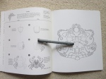
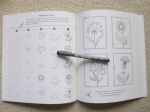
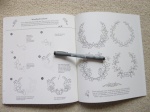
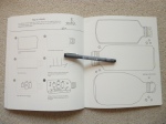
This is very much a drawing book, it’s not a colouring book with a few drawing tips included. Upon opening the book, you find a beautiful title page, name page and introduction including tips and a materials list. The book is then split into 3 themed sections: Garden, Ocean, and Forest. There are no page numbers in the book and no contents page. The book is printed double-sided with each double page depicting at least one drawing technique, often many more. The drawings are all split up into really clear sections most of which are visually displayed in steps along with accompanying written instructions. There is a real range of different size projects included from small and simple requiring just a few very easy steps, to much more time-consuming and complicated and requiring more focus and ability to replicate well.

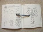
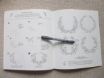
For the vast majority of the tutorials, each step is numbered and the step you’re currently drawing is printed in black, with the previously drawn sections in paler grey so that you can easily identify what elements you’re adding each time. Once you’ve drawn the whole image you then go over it all with pen and once dry, erase the pencil lines and voila, you’ve got your own illustration which is highly likely to surprise you, mine certainly did! There is a huge range of content for the tutorials including loads of different types of flowers and leaves, fish and other sea creatures including crabs and lobsters, ships, objects, borders, and different types of motifs including crests, symmetrical, repeating and circular. The possibilities are endless once you’ve learnt the basics and Johanna has a real knack for making it all seem very simple and easy rather than difficult and daunting so before you know it, you’re drawing things you never expected to be able to. It can be really anxiety-inducing starting something new, especially when it’s something you’ve struggled with before and find frustrating but this book is so different from any others I’ve seen and doesn’t make things just sound simpler, it actually breaks each drawing down into simpler steps so that you’re drawing very basic shapes and creating amazing things with them. There is real talent in being able to teach a skill in that way and make it so inclusive and accessible.

The tutorials are ideal for starting to learn to draw but they’re also fantastic to help you continue because once you’ve started you’ll start noticing how other images are created and what shapes they’re made up of. I often find inspiration very lacking when I try to draw and if you’re like me then I highly recommend going through Johanna’s colouring books and you’ll be absolutely inundated with ideas to the point where the only difficulty you’ll have will be choosing what to draw first! Learning to draw is apparently like exercising, it won’t come naturally or easily at first and it may feel like it’s not worth it but the more you practice, the more you’ll improve and the easier it will become and eventually you’ll be creating your own things rather than copying the original tutorials.

In terms of mental health, I’ll be completely honest and say that before receiving the book, I was dreading writing this section because I thought I was going to have to say it was bad because I’ve always found drawing stressful. However, I’m pleased to say that this isn’t the case and actually, I think this book is great for mental health as long as you have a little patience because it makes it surprisingly simple and learning to draw the few things I have with this book has been by far the least frustrating drawing experience I’ve ever had! I’m not just saying that because I’m a huge fan of Johanna, I honestly was so nervous about reviewing this book because I didn’t want to have to write a negative review or say that although it was lovely, I was still unteachable. How wrong I was! Just as Johanna has been telling us, anyone can learn to draw. I’m certainly not an artist, I’m not ever going to get paid for anything my pen puts on paper (apart from my signature on a job contract) but I can safely say that with practice, my drawings will no longer look like a child’s and people won’t laugh when I tell them I drew it rather than a small kid. For me, that’s more progress than I ever thought I’d make and it’s a huge confidence boost too. That’s one reason why this book is ideal for those of us with mental health problems because it gives you the tools you need to actually succeed at learning a new skill and that’s sure to improve your self-esteem and confidence.

I would highly recommend the Johanna Basford journals for practising your drawing in, it’s what I’m currently using and I’ve had no issues at all so far. The features I’m particularly liking about using them are the ribbon bookmark which I can use to mark my place, the paper which is lovely and thick and a great surface to draw on and takes erasing well, and the motifs already printed on each double-page spread which offer great inspiration and make the whole process much less daunting, at least for me, because I’m not starting on a completely blank page, each one has already been started for me! I intend to work through in order, dating my drawings as I go so that I can hopefully see my progress over time.

Overall, I would highly recommend this book, even to those of you who absolutely cannot draw because Johanna really will teach you! I already miss getting my yearly fix of colouring pages from her but the fact that she’s teaching us how to draw our own comes a very close second for me and seeing everyone’s versions cropping up online is definitely spurring me on to practice and learn and be more creative. This book is spreading joy, even more so than Johanna’s colouring books do, and it’s boosting confidence and self-esteem all over the world. If you weren’t sure about getting a copy then I really would suggest getting one and seeing what you think and if you need further persuading then have a go at following Johanna’s video tutorials on her Facebook page and see what you can create!

If you’d like to purchase a copy it’s available here:
Amazon UK – How to Draw Inky Wonderlands
Book Depository Worldwide – https://www.bookdepository.com/How-Draw-Inky-Wonderlands-Johanna-Basford/9780753553190/?a_aid=colouringitmom

Video Review


How to Draw Inky Wonderlands (US Edition) – A Review

Disclaimer – Please read this disclosure about my use of affiliate links which are contained within this post.
How to Draw Inky Wonderlands is by Johanna Basford who very kindly sent me a UK and US edition to review. This review is of the US edition, (my UK review can be found here) which is published by Penguin. I have also written a comparison post which can be found here, or the video comparison post can be found here.

This book is completely different from anything previously produced by Johanna and in fact, anything else I’ve seen on the market. Rather than being a colouring book, Johanna has welcomed us into her world to teach us her secrets in order to allow us all to be more creative and draw our own colouring pages and additions. As soon as I heard about the premise of the book I was very excited but also really nervous; I’ve always wanted to learn to draw but struggle to be patient or practice enough to actually improve. However, if anyone can teach me to draw, it’s colouring book queen, Johanna Basford, and spoiler alert, it’s actually working! Loads of people state that they can’t draw and are lying through their teeth, they normally mean that they can’t create a hyper-realistic portrait of someone that looks identical to a photograph. I, however, am serious about my lack of talent for drawing, I genuinely struggle to draw straight lines, circles or evenly-spaced stars and my sheep, age 28, are still drawn as clouds with stick legs and smiley faces. They’re adorable but no one believes anyone over the age of 8 drew them.

The book itself is paperback and unlike the majority of Johanna’s colouring books, it’s rectangular, not square and measures 21.5 by 25.5cm, making it the same size as Ivy and the Inky Butterfly and the same height as all of the US editions of Johanna’s colouring books. There is no removable dust cover this time, instead having flexible card covers with ½ French flaps which open out front and back to reveal a beautiful flower, leaf and butterfly design that is fully colourable, it isn’t waxy and is very smooth meaning most mediums will be suitable for colouring it, just be careful with alcohol markers in case they bleed through to the external covers. The spine and covers are white with black text, the cover has gold foiling accents and the title is backed with a beautiful duck egg blue background. The spine is glue-bound which you’ll need to be careful with, a number of people have reported previous titles published in the US falling apart so you will need to be gentle with this edition when trying to open it flat for drawing in. The paper is the same as that used in previous US editions of Johanna’s titles from Magical Jungle onwards, this paper was created and named after Johanna it’s beautiful, it’s not the same paper as used in the UK editions. The paper is a pale ivory colour, it’s a medium thickness and lightly textured and it’s perfect for pens and pencils. It has a good level of tooth so it can cope with pencil lines being drawn and erased and the Staedtler Pigment Liners that Johanna uses herself and recommends drawing with work beautifully on the paper. The only issue I had was that my 0.2 nib pen slightly feathered and spread on the page, however, none of my other pens really did this so it may just be a dodgy pen but just bear it in mind and do check out the photos below to see what I mean. Using the Staedtler Pigment Liners means that your drawings will match Johanna’s and blend in really well with the printed artwork so your drawings won’t stand out as “different” from the content that’s already on the page. The paper is ideal for pencils and water-based pens and you only need to avoid alcohol makers or particularly wet media. As ever, there’s a test page at the back of the book where you can check out how each of your tools and mediums behaves.

This is very much a drawing book, it’s not a colouring book with a few drawing tips included. Upon opening the book, you find a beautiful title page, name page and introduction including tips and a materials list. The book is then split into 3 themed sections: Garden, Ocean, and Forest. There are no page numbers in the book and no contents page. The book is printed double-sided with each double page depicting at least one drawing technique, often many more. The drawings are all split up into really clear sections most of which are visually displayed in steps along with accompanying written instructions. There is a real range of different size projects included from small and simple requiring just a few very easy steps, to much more time-consuming and complicated and requiring more focus and ability to replicate well.

For the vast majority of the tutorials, each step is numbered and the step you’re currently drawing is printed in black, with the previously drawn sections in paler grey so that you can easily identify what elements you’re adding each time. Once you’ve drawn the whole image you then go over it all with pen and once dry, erase the pencil lines and voila, you’ve got your own illustration which is highly likely to surprise you, mine certainly did! There is a huge range of content for the tutorials including loads of different types of flowers and leaves, fish and other sea creatures including crabs and lobsters, ships, objects, borders, and different types of motifs including crests, symmetrical, repeating and circular. The possibilities are endless once you’ve learnt the basics and Johanna has a real knack for making it all seem very simple and easy rather than difficult and daunting so before you know it, you’re drawing things you never expected to be able to. It can be really anxiety-inducing starting something new, especially when it’s something you’ve struggled with before and find frustrating but this book is so different from any others I’ve seen and doesn’t make things just sound simpler, it actually breaks each drawing down into simpler steps so that you’re drawing very basic shapes and creating amazing things with them. There is real talent in being able to teach a skill in that way and make it so inclusive and accessible.

The tutorials are ideal for starting to learn to draw but they’re also fantastic to help you continue because once you’ve started you’ll start noticing how other images are created and what shapes they’re made up of. I often find inspiration very lacking when I try to draw and if you’re like me then I highly recommend going through Johanna’s colouring books and you’ll be absolutely inundated with ideas to the point where the only difficulty you’ll have will be choosing what to draw first! Learning to draw is apparently like exercising, it won’t come naturally or easily at first and it’ll often feel like it’s not worth it but the more you practice, the more you’ll improve and the easier it will become and eventually you’ll be creating your own things rather than copying the original tutorials.

In terms of mental health, I’ll be completely honest and say that before receiving the book, I was dreading writing this section because I thought I was going to have to say it was bad because I’ve always found drawing stressful. However, I’m pleased to say that this isn’t the case and actually, I think this book is great for mental health as long as you have a little patience because it makes it surprisingly simple and learning to draw the few things I have with this book has been by far the least frustrating drawing experience I’ve ever had! I’m not just saying that because I’m a huge fan of Johanna, I honestly was so nervous about reviewing this book because I didn’t want to have to write a negative review or say that although it was lovely, I was still unteachable. How wrong I was! Just as Johanna has been telling us, anyone can learn to draw. I’m certainly not an artist, I’m not ever going to get paid for anything my pen puts on paper (apart from my signature on a job contract) but I can safely say that with practice, my drawings will no longer look like a child’s and people won’t laugh when I tell them I drew it rather than a small kid. For me, that’s more progress than I ever thought I’d make and it’s a huge confidence boost too. That’s one reason why this book is ideal for those of us with mental health problems because it gives you the tools you need to actually succeed at learning a new skill and that’s sure to improve your self-esteem and confidence.

I would highly recommend the Johanna Basford journals for practising your drawing in, it’s what I’m currently using and I’ve had no issues at all with it so far. The features I’m particularly liking about using them are the ribbon bookmark which I can use to mark my place, the paper which is lovely and thick and a great surface to draw on and takes erasing well, and the motifs already printed on each double-page spread which offer great inspiration and make the whole process much less daunting, at least for me, because I’m not starting on a completely blank page, each one has already been started for me! I intend to work through in order, dating my drawings as I go so that I can hopefully see my progress over time.

Overall, I would highly recommend this book, even to those of you who absolutely cannot draw because Johanna really will teach you! I already miss getting my yearly fix of colouring pages from her but the fact that she’s teaching us how to draw our own comes a very close second for me and seeing everyone’s versions cropping up online is definitely spurring me on to practice and learn and be more creative. This book is spreading joy, even more so than Johanna’s colouring books do, and it’s boosting confidence and self-esteem all over the world. If you weren’t sure about getting a copy then I really would suggest getting one and seeing what you think and if you need further persuading then have a go at following Johanna’s video tutorials on her Facebook page and see what you can create!

If you’d like to purchase a copy it’s available here:
Book Depository Worldwide – https://www.bookdepository.com/How-Draw-Inky-Wonderlands-Johanna-Basford/9780143133940/?a_aid=colouringitmom

Video Review

Video Post – Unboxing How to Draw Inky Wonderlands (UK and US Editions) by Johanna Basford

Disclaimer – Please read this disclosure about my use of affiliate links which are contained within this post. 
Today I received the most exciting parcel of goodies from Johanna Basford. Check out my video to see what was inside, see the UK and US edition of her new book, How to Draw Inky Wonderlands, due out in October, and to hear me get so excited that I stop being able to make sense. Reviews, flip throughs and comparison videos and written posts will be coming soon!

If you’d like to pre-order a copy it’s available here:
Amazon UK – How to Draw Inky Wonderlands
Book Depository Worldwide – https://www.bookdepository.com/How-Draw-Inky-Wonderlands-Johanna-Basford/9780753553190/?a_aid=colouringitmom