One-sided images

Johanna Basford 2022 Weekly Colouring Planner – A Review

Disclaimer – Please read this disclosure about my use of affiliate links which are contained within this post.

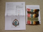
Johanna Basford 2022 Weekly Colouring Planner is published and was very kindly sent to me to review by Andrews McMeel Publishing. This planner is the perfect combination of organisation and colouring with space to write plans, appointments and notes, whilst also having weeks and weeks of colouring for you to do too. This planner is paperback with flexible pale cream card covers which have a beautiful black line-drawn flower, leaf and butterfly design on the front and back with it printed in reverse, white on black, on the inside covers, the front cover has gold foiling accents and the front and back cover have removable lilac card strips with the information about the planner and the barcode etc printed on them. The planner is spiral-bound and measures 21.6 x 19.6cm, the covers aren’t especially sturdy so I’d be careful about travelling with it much and you’ll want to keep it safe somewhere rather than stuffing it in a bag or it’ll get damaged very quickly. This isn’t the best planner I’ve seen in terms of features and organisation, but for the combination of colouring and organising, it’s perfect and strikes a really good balance.

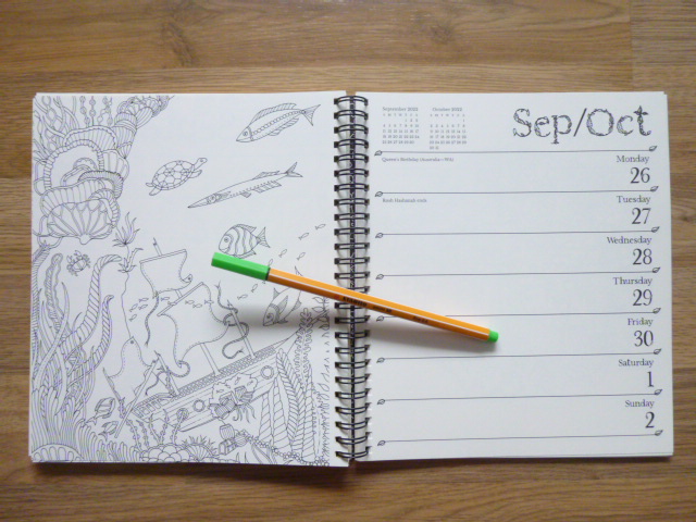
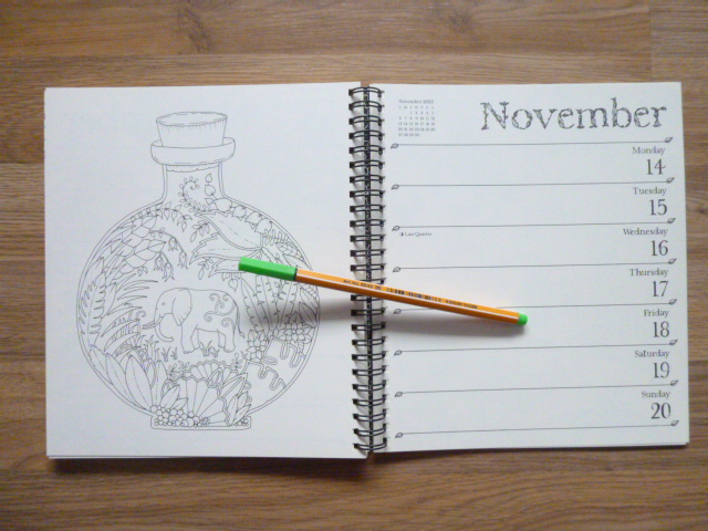
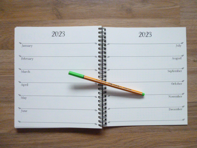
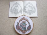
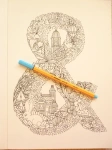
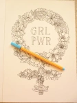
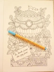
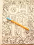
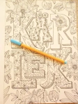
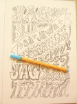
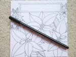
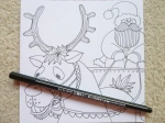
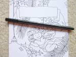
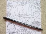
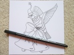
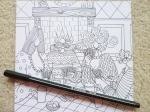
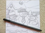
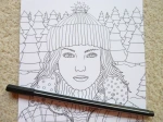
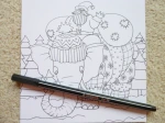
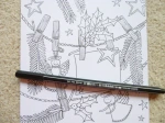
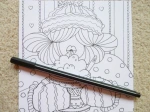
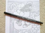
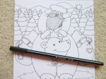
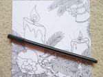
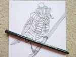
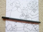
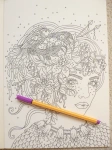
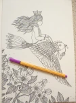
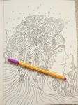
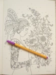
This planner runs for 12 months, from 27th of December 2021 to the 1st of January 2023. The planner is printed double-sided and starts with a one-page overview of the year 2022 and then the planner itself starts with an image on the left of each double-page spread from one of Johanna’s first eight books, images from all eight (Secret Garden, Enchanted Forest, Lost Ocean, Magical Jungle, Johanna’s Christmas, Ivy and the Inky Butterfly, World of Flowers, and How to Draw Inky Wonderlands) are included, and the week’s days and dates with writing space for each on the right (this is in the same style as normal planners with added leafy accents and leafy lettering for the month title at the top). Each week runs from Monday to Sunday with equal space to write for each day, the dates are on the right and important festivals and bank holidays etc are written in small text on the left of the page, as well as the country it’s celebrated in. After the planner pages, which make up the vast majority of the book, there is a double-page spread with sections for each month of 2023 for you to add your advance plans to. Following this is a full page of 2021 dates and a full page of 2023 dates, followed by 5 lined pages where you can write notes (all with added leaf accents) and the final page is a colouring test page where you can test out your mediums to check for bleed through.

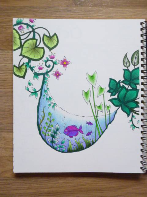
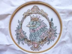
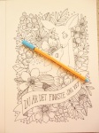
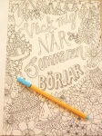
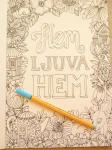
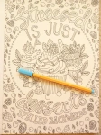
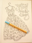
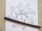
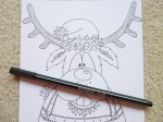
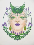
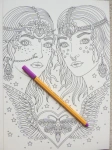
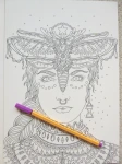
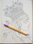
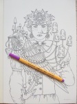
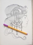
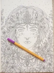
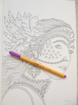
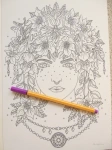
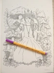
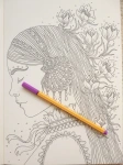
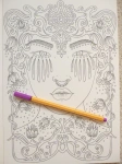
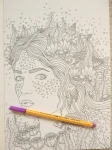
The paper is pale cream rather than bright white (it is the same paper as the last 2 planners and it’s less yellow than the Secret Garden book paper and more cream than the ivory paper in World of Flowers), lightly textured and medium thickness, sadly it does shadow a fair bit with water-based pens but it doesn’t bleed through; I’d strongly advise writing in pencil throughout or you’ll ruin the image on the reverse either with shadowing or indentation from ballpoint pens. Pencils work well on this paper so I’d suggest mostly colouring with pencils and using water-based pens if you don’t mind the shadowing showing through on the planner pages. A great selection of images from Johanna’s books are included with some being sections of original images at the original size, some being sections zoomed in, printed larger, and others being the whole page shrunk down to fit on the planner page so some of the illustrations are quite tricky to colour neatly but almost none look impossible as long as you use a good set of fineliners or sharp pencils. I found that there was a good selection of images included, with a fair few pages from World of Flowers which are really lovely. We all have different preferences so do check out my video flip through of the whole planner below to check that you’re happy with the selection but I personally think it’s a really good range.

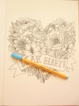
In terms of mental health, this colouring planner is ideal. It gives you a manageable goal of colouring one page per week which could either be next week’s page so that it’s coloured ready for that week or this week’s page so you can colour as you plan. You could even colour it ahead for the whole year. The pages are a great size to practice colour schemes for your copy of the actual books, or even to try out colouring mediums on a smaller page. The spiral-binding makes it easy to access the whole page and none of the images go into the spine, it’s also ideal because once you’ve finished using the planner at the end of 2022, the pages are easy to remove for framing or gifting if you want to get more use out of your works of art. There isn’t a treasure hunt element in this planner and there are no written hints for drawing though there are plenty of spaces on a number of images to be able to add your own details or backgrounds to really make the pages your own but this of course isn’t necessary and it’ll look finished without the need to draw at all. This planner is perfect for fans of Johanna’s work and it is a beautiful way of using her illustrations. The line thickness varies a little throughout from thin to spindly thin and the intricacy and detail levels are higher than in the books because some of the images are shrunk down to fit the pages so you will most definitely need very good vision and fine motor control to get the most out of this planner if you’re wanting to colour it; you could of course leave it blank and just admire the illustrations because they really are beautiful to just look at with no need to add colour if that’s too challenging. The images aren’t arranged into any order but a few have been cleverly chosen to fit celebrations like a heart for the week of Valentine’s Day and images from Johanna’s Christmas through December. There is no skull for Halloween this year. The page size is much more manageable and less daunting to colour and this is ideal for those of you with fluctuating conditions or concentration levels because these pages are quicker to finish and likely to cause less frustration.

I would highly recommend this colouring planner to fans of Johanna’s work and to those who love to be organised. It’s a great combination of planner and colouring pages and the size and format is ideal for those who find the full-size book pages too daunting. It’s great for practising colour schemes or using new colouring mediums and it’ll be a lovely keepsake to work through from beginning to end and see how you’ve progressed over the year it runs for; you can even remove the images afterwards and frame or gift them.

If you’d like to purchase a copy it’s available below:
Amazon UK – Johanna Basford 2022 Weekly Coloring Planner 
Book Depository Worldwide – https://tidd.ly/3FqdHjE

Queen of the Skies Cross Stitch Kit by Hanna Karlzon and The Folklore Company - Click through to read the review and see photos

Queen of the Skies Cross Stitch Kit – A Review

This kit was created and very kindly sent to me to review by The Folklore Company, who create fabulous embroidery and cross stitch kits. I’ve loved cross stitch since I was a child but haven’t done any in nearly 10 years but when I found out that The Folklore Company had teamed up with one of my favourite colouring book artists, Hanna Karlzon, I just knew I’d have to start up again! This design is available in two formats, the normal cross stitch format which is what I’m reviewing here or a tote bag with a special dissolvable plastic that allows you to sew on it as if it were aida fabric and then dissolve the plastic in water afterwards just leaving the stitches in place on the bag. I wish I’d asked to review that kit now because this design is beautiful and would look stunning on a bag!

The kit arrives well packed in a clear plastic packet and contains everything you need to get started apart from a small pair of scissors and an embroidery hoop, I’d personally recommend one that’s around 26cm in diameter, mine is this size and I haven’t had to move it once as the design fits within this space preventing lots of creasing and possible damage to stitching by having to move the hoop around whilst working. The kit contains Aida fabric, more than large enough to fit the design on and with plenty of space to fit whatever size hoop you have to hand, a needle (in a small plastic packet), 3 sheets of paper including the pattern and instructions, printed in colour and double-sided, and 10 different colour embroidery flosses. The instructions give clear guidelines for newbies as well as seasoned stitchers about where to begin, how to sew without using knots and handy tips about not getting show-through from dark threads and trailing colours when needed. The pattern is clear and printed just about large enough for those with most levels of visual acuity. I don’t know what everyone else’s technique whilst cross-stitching is but I always like to colour over the pattern when stitching to be sure that I know what I have and haven’t sewn which helps me avoid mistakes. I didn’t want to do this on the pattern itself so I photocopied it and have scribbled my way through that instead. The pattern is divided into 4 quarters each printed on a single piece of A4 though these are printed double-sided so unless you photocopy it, you can’t lay out the whole pattern at once and match it up. The pattern also doesn’t reach the edges of the paper which can make lining things up a little tricky, you certainly won’t want to swap quarters whilst tired or you’re likely to make mistakes. Each thread is allocated a symbol in the key and these are then shown on the pattern, all of these are well chosen and differ strongly from each other so you won’t get confused or accidentally misread the symbols and start sewing in the wrong colour. My only niggle with the symbols is the black square used for the dark grey thread as this is very difficult to colour over/around to indicate that I’ve sewn those areas and I do keep having to really study the pattern to check exactly what I have and haven’t done rather than being able to check with a glance like I’m able to with all of the other symbols and thread colours. This is a very minor criticism and will likely only affect people who cross-stitch in the same way as me. The only other difficulty is that the crossover sections on each page of the pattern aren’t totally clear, the lines for the edge of the diagram cross halfway through the symbols and these can be a little challenging to see and decipher but again, this is a minor issue and only affects the central crossing vertical and horizontal line so it is pretty minor in the grand scheme of the diagram and pattern.

All of the stitches in this pattern are full crosses, there are no quarter, half, or three-quarter cross stiches and no running/back stitch outlines either so the whole design is neatly made from full crosses which I personally prefer as I can never neatly sew partial cross stitches. The instructions suggest that you start in the very centre which is the middle of the bird and this is indeed where I started. It then suggests that you work through each quarter but I don’t work so well like that so I did the majority of the bird, then the outline of the top of the frame, then the bottom, then filled those in and then did the flowers outlining them first and then filling them in and finally finished off with the flower centres. There’s no right or wrong way of sewing, just make sure that you’ve centred the design correctly and that you double check your counting if you do separate sections to ensure that they will join up in the right places later. Having now finished the whole piece, I have a lot of thread left over so you’re given plenty of each one and don’t need to worry about running out. The darkest two colours were used by far the most and I don’t have a huge amount left but as long as you’re not very wasteful with them or trailing them across the design a lot, you definitely won’t run low on them and the others I’ve got loads left of.

In terms of mental health, cross stich generally is really good because you have to focus fully on the pattern to ensure you sew it correctly and the motion of sewing is very calming and therapeutic. This pattern is great for mental health because it’s a really good level of difficulty, it’s not so small that you can complete it in a day or two but it’s also not so big that you’ll get bored or feel like you’re not making progress. There are quite a lot of colour changes and not so many large blocks of the same colour but while this means you have to swap threads a fair bit, it also means that it keeps you interested and there isn’t lots of repetition. The colour choices are lovely and quite muted but not dull, they’re a great choice for aiding calm feelings and they’ll go nicely with lots of different décor if you want to frame and display it after you’ve finished. The design does require a pretty good level of concentration, especially the frame sections so you will need to sew on good days and those where your functioning is high. Alternatively, you could just sew for short periods of time to avoid making mistakes but still get your stitching fix. My anxiety disorders mean that I often struggle to concentrate for long periods of time and my vision is often affected which makes reading and following cross stitch patterns a real challenge, to combat this I tried to make sure not to sew when I was tired and to always sew in good light, either daylight or with a bright light near me and I double-checked all counting and regularly checked that what I’d sewn was correct with the pattern, as well as colouring over the pattern in pencil for every few stitches I’d done. This meant that I only made one mistake in the whole thing and that was just one stitch that no one would ever notice so I’m really pleased, this is the first time I’ve ever managed to do a whole project and not make a noticeable mistake!

If you photocopy the pattern before scribbling all over it like I did then it would be possible to reuse it in future and you could even change the colour scheme to create personalised projects that would match your own décor or favourite colours. Each colour only needs one skein of thread so it would be very easy to reuse the pattern and make heaps of beautiful birds if you wished. For those of you who are from the colouring community, you might be interested to know that this design isn’t an exact replica of one of Hanna’s drawings but rather a combination of two, both from a double-page spread in Magisk Gryning (Magical Dawn), her third colouring book and a photo of these can be found below. Before you ask, yes, I did spend ages trawling through all of her books to find it because I was almost certain I’d seen the image before!

Overall, I would highly recommend this cross stitch kit, it’s a beautiful design, lovely colours, and a great level of difficulty that’s not too simple or too challenging. I like it so much that I’m hoping to recreate it in future with a totally different colour scheme but for now, I’m hoping to frame this one and have it in pride of place in my flat, it’s a great reminder of what you can accomplish, even whilst very poorly. This kit would suit seasoned stitchers, as well as complete beginners who are up for a challenge!

If you’d like to purchase a kit, they’re available here: Queen of the Skies Cross Stitch Kit

Hem Ljuva Hem (Home Sweet Home) by Emelie Lidehall Oberg, click through to read my review, see a flick through and photos

Hem Ljuva Hem (Home Sweet Home) – A Review

Disclaimer – Please read this disclosure about my use of affiliate links which are contained within this post.
Hem Ljuva Hem (Home Sweet Home) is illustrated by Emelie Lidehäll Öberg and published and kindly sent to me to review by Pagina Förlag. This book is only available in this format and is similar to the Swedish Artist’s Editions (Tavelboks), it measures 29.5x21cm (A4), it’s paperback with thick but flexible card covers which are white with green imagery from inside the book. The book has a green tape binding meaning the pages lie completely flat when the book is open and they can be removed for framing. The pages are made of thick cream card which is lightly textured and absolutely fabulous for using pencils on as they layer really well and blend seamlessly. Water-based pens also work really well on this card and don’t bleed through or sideways and there isn’t even a hint of shadowing either. The illustrations are all single-page designs and are printed single-sided so you can use whatever medium you fancy without worrying about bleed-through and mine didn’t even shadow when colouring the black sections of the image. The 20 illustrations are all posters, 19 contain text, 7 are written in Swedish, 12 are written in English, two of them include swearing (one English and one Swedish). The posters contain varying amounts of imagery and text with some just being beautifully drawn text and others just having a subtle message placed within a large colourable image. The phrases range from romantic to funny, exclamations to sayings, you can see them all in the images below. The illustrations also vary a lot from animals to flowers, objects to houses, scenes to collections and more, they are all drawn beautifully and are each packed with content so there’s loads to colour in each one. The posters would be ideal to remove and frame either for your own home or to give as gifts.

In terms of mental health, this book is great, I’m always a huge fan of books that offer a project that can be gifted or displayed because these are fantastic for showing us what we can achieve and for giving us a goal to work towards and afterwards, a reminder of what we can do. You could easily colour them to match the theme of a room or to stand out a look fabulous and I can’t wait to frame my finished page and brighten up my walls with it! The line thickness is consistent throughout and remains thin but not spindly. The intricacy and detail levels vary a little within each image with most being fairly intricate but having a few places with larger open spaces, therefore this book would be ideal for most levels of vision and fine motor control. The content is pretty uplifting and positive and sure to make you smile or laugh, even on your worst days and it looks even more fabulous once you’ve filled it with colour! The images are all a manageable size and will take varying amounts of time to colour depending on what mediums you use and how much blending and shading you want to do but none are overwhelming or likely to require weeks of dedication! Most of them consist of lots of component parts so you can colour them in sections if you wish, particularly useful if you’re having a bad day.

Overall, this is a fab book, it’s filled with beautiful artwork just begging to be coloured and displayed and it’s sure to perk up even the most symptom-filled days. The card is ideal for all mediums and the posters lend themselves to all types of colouring styles.

If you’d like to purchase a copy, it’s available here: https://www.printworksmarket.com/p/shop/books/all-books/hem-ljuva-hem-20-posters-to-color-and-frame.html

I run a fan group for the artwork of Emelie, please do join us and share your work.

The image below was coloured with Holbein Artist’s Colored Pencils, Faber-Castell Polychromos Pencils and a black Sharpie.

WORLDWIDE GIVEAWAY and Review – Winterkleurkaarten: 20 Ansichtkaarten & Enveloppen (Winter Colour Cards: 20 Postcards and Envelopes) by Julia Woning

Disclaimer – Please read this disclosure about my use of affiliate links which are contained within this post.
Winterkleurkaarten: 20 Ansichtkaarten & Enveloppen (Winter Colour Cards: 20 Postcards and Envelopes) are published and very kindly sent to me to review by BBNC Utigevers. They have also very kindly provided me with an extra set which I’m currently running a Worldwide Giveaway for on my FB page until 23.59 GMT on the 29th of November, and you can also win a copy of the Tiffany Glass Coloring Book, to enter please click here. This set of cards is illustrated by Julia Woning, a talented Dutch illustrator who’s previously published a number of books in the Netherlands. These cards arrive in a red card box with an image adapted from one of the cards on the front, this box is a little bit flimsy but does prevent the cards from getting damaged or lost. The box contains 20 cards, these are not greetings cards, they are square postcards that are single-sided with a design illustrated on the front, and text at the top on the back saying Merry Christmas and a Happy New Year in Dutch, along with the copyright information at the bottom. The 20 plain white envelopes fit the cards perfectly and will be ideal for giving or sending the cards to others. The cards are made of bright white, lightly textured, medium thickness card, it doesn’t bleed or shadow with water-based pens but will with alcohol markers so do be aware of this, pencils, especially oil-based ones or those with harder leads, are very difficult to colour with on this card and require a lot of patience as the lack of tooth makes it difficult to layer or blend, my Prismacolor Premiers worked pretty well but I really struggled with Holbeins which seemed to clump and not colour evenly. The images themselves are all drawn in Julia’s signature style which is often out of proportion with people having very large rounded bodies and very small faces with exaggerated features. The content is really varied but all is heavily winter and Christmas themed and include all sorts from snowflakes to Santa, robins to reindeer, candles to baubles, cocoa, to polar bears, stocking, angels and so much more, there is even a jumper-wearing elephant! Each picture is packed with imagery and many of them have spaces to write your own messages if you wish. Most of the cards contain scenes or snapshots of Christmas celebrations and each is different from the next from a woman drinking cocoa to Santa riding his sleigh, snowmen in a garden to a decorated Christmas tree and more. The cards are really beautiful and will be ideal for challenging yourself to try out new techniques including colouring skin, snow, shiny objects, glowing backgrounds and even glass. They’re all really beautiful and sure to spread some Christmas cheer whether you keep them yourself or gift them to others.

In terms of mental health, these cards offer a great, manageable project, they’re small enough not to be overwhelming, but large enough that they’re not coloured in seconds and you can take your time colouring each section without needing days to do so. The line thickness is consistent throughout and is thin. The intricacy and detail levels do vary across and within each card but mainly remain low to moderate so anyone with moderate vision or fine motor control will be able to enjoy these cards. You won’t need especially good concentration levels and will be able to colour these cards on good and bad days which is great! Colouring cards are a great project because not only do you get to enjoy colouring them, you can then send them to others and share the joy or even send them uncoloured to a friend who might need a little push to start colouring, they’re great for spreading some happiness and colouring love! The shape of them would make them ideal to frame if you wish, they could be a lovely added extra to your Christmas decorations or a really personal touch for your loved ones. They’re also the perfect project to start trying out some new colouring techniques without having to worry about ruining a whole page and you can use any medium you fancy because they’re single-sided.

Overall, I would highly recommend these colouring cards, they’re beautifully drawn and really varied in content and they’re a lot of fun to colour, you can try out new techniques or just enjoy getting in the festive spirit. These will appeal to colourist’s of all ages and be sure to get you feeling Christmassy!

If you’d like to purchase a set, they’re currently unavailable on the usual sites though they are listed there so do sign up for email alerts and they’ll tell you when they have them in stock, hopefully it’ll be soon!
Amazon UK – Winterkleurkaarten: 20 Ansichtkaarten & Enveloppen
Book Depository Worldwide – https://www.bookdepository.com/Winterkleurkaarten-Julia-Woning/9789045321851/?a_aid=colouringitmom
BBNC (Publisher site with very reasonable International Shipping) – http://www.bbnc.nl/kleurboeken/julia-woning-winterkleurkaarten

I’m currently running a Worldwide Giveaway for a set of these cards on my FB page until 23.59 GMT on the 29th of November, and you can also win a copy of the Tiffany Glass Coloring Book, to enter please click here.

The card below was coloured with Stabilo 68 Fibre-Tip Pens.

Tillsammans Målarbok (Together Colouring Book) – A Review

Disclaimer – Please read this disclosure about my use of affiliate links which are contained within this post.
Tillsammans Målarbok (Together Colouring Book) is illustrated by Hanna Karlzon and published and kindly sent to me to review by Pagina Förlag. This book is in an artist’s edition format but this is the only format it’s available in, it’s not a full-size colouring book or postcard book. It is identical in format to the artist’s editions (tavelboks) of Hanna’s other books, Daydreams (Dagdrommar), Summer Nights (Sommarnatt) and Magical Dawn (Magisk Gryning) and therefore my review is mostly identical apart from the content section and the photos, skip to paragraph 2 for information about the content. The book measures 29.5x21cm (A4), it’s paperback with thick but flexible card covers which are a pale lemon colour with a black and white line drawing of one of the portraits (found inside) with gold foiling accents on the front and back. The book has a black tape binding meaning the pages lie completely flat when the book is open and they can be removed for framing. The pages are made of thick cream card which is lightly textured and absolutely fabulous for using pencils on as they layer really well and blend seamlessly. Water-based pens also work really well on this card and don’t bleed through or sideways and there isn’t even a hint of shadowing either. The illustrations are all single-page designs and are printed single-sided so you can use whatever medium you fancy without worrying about bleed-through.

The 20 illustrations are all portraits of women and 15 of these have been chosen from Hanna’s 4 previous colouring books and 5 have been newly created for this book specifically. The images Hanna has chosen are a really good cross-section and seem to be some of the favourites of the colouring community, none of the previously published images have been printed in artist’s edition format so while it’s not all new content, it is all newly published in the single-sided format printed on card. There are a range of different portraits from two women together to single women face on, some in side profile and others showing a whole person. Each image contains various different objects and accessories including gems, metal, jewellery, mushrooms, flowers, birds, shells, moths, crowns, and candles, there is a really good variety despite them all being portraits of women. Those images taken from previous colouring books are all printed the same size as the originals so if you’re able to colour those, you’ll also be able to colour these with no difficulty. The pictures would all look amazing framed for yourself or gifted to others and because the faces are mostly quite large they’re great to practice skin tone colouring on and really push yourself out of your comfort zone. All of the images are pictured below so you can check that you’re happy with the choices and see if your favourites are included.

In terms of mental health, this book is great, it’s very absorbing and ideal for those who want to colour realistically and learn how to colour people. The line thickness is consistent throughout and remains medium/thin so it’s definitely manageable to colour. The intricacy and detail vary a little throughout from medium to high and this is part of what makes Hanna’s work so special and beautiful, if you’re wanting to colour within each teeny tiny section then you’ll need to have very good vision and fine motor control but if you’re happy to colour over some of it and use it as texture underneath then moderate vision and fine motor control would be absolutely fine! I found this book and the illustrations within it great for my mood, just looking through it and noticing all of the different details, patterns and objects makes me feel calmer and the images are just charming so they’re sure to lift your mood and keep you distracted from any difficult thoughts or persistent symptoms. The images do vary a little in size and difficulty but unlike many of Hanna’s images that consist of lots of component parts, these are all portraits and scenes and therefore they don’t have such natural stopping points for those wanting to just colour in short bursts, you can still colour just one flower or just the eyes but it’s not so easy to come to an obvious point to stop, however, if you don’t mind stopping part-way through an image then this book would be ideal for using on good and bad days. The fact that the pages are printed single-sided and are removable is fantastic because it means you can remove your works of art and frame them or gift them which is a great way of reminding yourself of what you can achieve and brighten up the darkest of days.

I would highly recommend this book to those of you who are already fans of Hanna’s work and have her previous books and really want to colour more people, while 75% of the artwork can be found in Hanna’s previous books, this gives you the opportunity to colour those pages again and use different colour schemes or wetter media without ruining a reverse image and you can also frame them for wonderful gifts or beautiful decoration for your own home. This book is ideal for those who use wet media and alcohol markers and the illustrations are a great cross-section of Hanna’s portraits.

If you’d like to purchase a copy, it’s available from Printworks. A Dutch edition will be published in March 2018 by BBNC Uitgevers and it will be called Karakter.

The image below was coloured using Faber-Castell Polychromos Pencils and a White Sakuara Gelly Roll Gel Pen.I used the skin tone tutorial from Colorist’s Special Effects by Helen Elliston.
Buy on Amazon UK – Colorist’s Special Effects
Buy on Book Depository – goo.gl/CrS7DU

Ivy and the Inky Butterfly – Unboxing and Flick-Through

Disclaimer – Please read this disclosure about my use of affiliate links which are contained within this post.

If you’d like to purchase a copy it’s available to pre-order here:
UK Edition
Amazon UK – Ivy and the Inky Butterfly
Book Depository Worldwide – https://www.bookdepository.com/Ivy-and-the-Inky-Butterfly-Johann-Basford/9780753545652/?a_aid=colouringitmom
US Edition
Amazon UK – Ivy and the Inky Butterfly
Book Depository Worldwide – https://www.bookdepository.com/Ivy-and-the-Inky-Butterfly-Johann-Basford/9780143130925/?a_aid=colouringitmom

WORLDWIDE GIVEAWAY and Review – Winterkleurkaarten: 20 Ansichtkaarten & Enveloppen (Winter Colour Cards: 20 Postcards and Envelopes)

Disclaimer – Please read this disclosure about my use of affiliate links which are contained within this post.
Winterkleurkaarten: 20 Ansichtkaarten & Enveloppen (Winter Colour Cards: 20 Postcards and Envelopes) are published and very kindly sent to me to review by BBNC Utigevers. They have also very kindly provided me with an extra set and an extra copy of Schemertijd Kleurboek by Maria Trolle which I’m currently running a Worldwide giveaway for on my blog until 23.59 GMT on the 10th of October, to enter please click hereThis set of cards is illustrated by Jessica Palmer, the hugely talented illustrator of Tangle Wood, Tangle Bay, and Tangle Magic. These cards arrive in a gold card box with an image of one of the cards on the front, this box is a little bit flimsy and did get a bit squished on its travels to me, however, none of the cards or envelopes were damaged. The box contains 20 cards, these are not greetings cards, they are square postcards that are single-sided with a design illustrated on the front, and text at the top on the back saying Merry Christmas and a Happy New Year in Dutch, along with the copyright information at the bottom. The 20 plain white envelopes fit the cards perfectly and will be ideal for giving or sending the cards to others. The cards are made of bright white, lightly textured, medium thickness card, it doesn’t bleed or shadow with water-based pens but will with alcohol markers so do be aware of this, pencils, especially oil-based ones or those with harder leads, are very difficult to colour with on this card and require a lot of patience as the lack of tooth makes it difficult to layer or blend, my Prismacolor Premiers worked pretty well but I really struggled with Holbeins which seemed to clump and not colour evenly. The images themselves are all drawn in Jessica’s beautiful signature style and are really varied in content, some are winter-themed and the majority are Christmas themed. As always, none of them include people but rather beautifully anthropomorphised animals in humanesque scenes from ice-skating foxes to a mummy rabbit bearing cake and presents, badgers sharing a candlelit dessert to dancing herons, dogs decorating a Christmas tree to daddy bear reading a bedtime story to mummy and baby bear, each card is different from the last, they all feel similar because of Jessica’s drawing style but the content really does vary between each one. These cards are different from any imagery you’ll see on normal Christmas cards, or any colouring Christmas cards and they really are something special!

In terms of mental health, these cards offer a great, manageable project, they’re small enough not to be overwhelming, but large enough that they’re not coloured in seconds and you can take your time colouring each section without needing days to do so. The line thickness is consistent throughout and is thin and spindly thin. The intricacy and detail levels do vary a little across the images as well as within them but mostly they’re very intricate with lots of small details so you will need very good vision and fine motor control to enjoy these cards. You will need pretty good concentration to get the most out of them, some of the cards consist of lots of fine details that can be a little tricky to decipher if your focus is elsewhere so I’d suggest leaving those cards to colour on your better days. Colouring cards are a great project because not only do you get to enjoy colouring them, you can then send them to others and share the joy or even send them uncoloured to a friend who might need a little push to start colouring, they’re great for spreading some happiness and colouring love! The shape of them would make them ideal to frame if you wish, they could be a lovely added extra to your Christmas decorations or a really personal touch for your loved ones.

Overall, I would highly recommend these colouring cards, they’re beautifully drawn and really varied in content and they’re a lot of fun to colour, you will need good vision and hand control but these are really worth taking time over to make them perfect and they’re ideal for pen colourists! If you liked Jessica’s Tangle series of colouring books then you’re sure to love these cards!

If you’d like to purchase a set, they’re currently unavailable on the usual sites though they are listed there so do sign up for email alerts and they’ll tell you when they have them in stock, hopefully it’ll be soon! If you just can’t wait then you can order from Bol.com, below.
Amazon UK – Winterkleurkaarten: 20 Ansichtkaarten & Enveloppen
Book Depository Worldwide – https://www.bookdepository.com/Winterkleurkaarten/9789045322070/?a_aid=colouringitmom
Bol.com – Winterkleurkaarten

Don’t forget, I’m running a Worldwide giveaway to win a set of these cards and a copy of Schemertijd by Maria Trolle, to enter click here by 23.59 GMT on October the 10th.

The image below was coloured using Prismacolor Premier Colored Pencils  and Holbein Artist’s Colored Pencils.

WORLDWIDE GIVEAWAY and Review of Schemertijd Kleurboek (Skymningstimman Målarbok)

Disclaimer – Please read this disclosure about my use of affiliate links which are contained within this post.
Schemertijd Kleurboek is published and kindly sent to me to review by BBNC Utigevers. They have also very kindly provided me with an extra copy of this book and an extra set of Winterkleurkaarten by Jessica Palmer which I’m currently running a Worldwide giveaway for on my blog until 23.59 GMT on the 10th of October, to enter please click here. This book is illustrated by Maria Trolle and was originally published in Sweden by Printworks with the title Skymningstimman which roughly translates as Twilight/Dusk Hour, the book reviewed here, Schemertijd, is the Dutch edition. This book is most similar to Maria’s first title, Blomstermandala (Published in English as Twilight Garden) and has the same format as that, therefore much of my review is the same, skip to paragraph two for information about the content of this title. I don’t have the Swedish edition of this book and am therefore unable to comment on any differences between the two though I would assume these are minimal based on what I’ve seen of the Swedish edition online from others.

The book itself is just a little smaller than A4, measuring 21.8 x 25.7cm, it’s hardback with very sturdy thick covers with a black background and partially coloured image from inside the book with gold foil accents on the front and back and the blurb also written in gold foiling. The spine is covered in black tape with beautiful debossed gold writing, it is glue and string-bound and attached to tape within the hardback binding so it’s very durable but a little tricky to get the book to lie flat and reach the very edge of the image in the gutter. The images are printed double-sided throughout and are mostly single page designs with some double-page spreads, a whopping 32 pages have black backgrounds, this is roughly every third double-page spread so those who like colouring ‘midnight’ pages will adore this book! The paper is cream, thick and very lightly textured, water-based pens don’t bleed or shadow but do always test in an inconspicuous area because we all colour differently. Pencils go on smoothly but oil-based pencils can be a little tricky to blend and layer due to lack of tooth, experienced colourists will manage to get stunning results though I’m sure and my Prismacolor Premiers worked very well.

This illustrations are all based in nature and consist of various different styles from wreaths to scenes, centralised images and portrait style pictures, the imagery is absolutely stunning and this book feels just a little more polished than Blomstermandala, it really is lovely! There is so much pictured within the pages that it’s hard to even begin to make a list but some of the things illustrated include: tree houses, nests, squirrels, butterflies, peonies, deer, fairies, frogs, rabbits, birds, mushrooms, owls, bees, ferns, foxes, pussy willow, snowdrops, waterlilies, spider webs, and even dragons. There are countless flowers and plants included and at the back of the book is a double-page spread with all of the pages numbered and a list of all of the flowers pictured in each so that you can easily identify them and colour them accurately if you wish which is a major plus point of this already fabulous book! The images are drawn in a mostly realistic style but some are slightly surreal in context with women pictured with nests in their hair, a girl sat in the centre of a sunflower, owls nestling in a peony’s leaves and lots more; these quirky scenes are lovely to look through and give a really whimsical feel to the book, some of the images have a beautiful childlike charm and this is aided by some of the cute and quirky characters included which we first saw in Maria’s book about Vivi finding a friend (Vivi Soker en Van and Dutch edition, Droomreis), but all are adult level colouring rather than basic or boring. Much of the imagery consists of anthropomorphised animals in humanesque scenes and situations. The sheer amount of different content means that you’re offered a huge variety of things to colour from practising skin tones and fur to feathers and water, if you want a book to challenge you out of your comfort zone then this is ideal. Equally though, this would look gorgeous block coloured or with minimal blending and shading, or with a touch of added sparkle from some glitter gel pens so don’t be put off if you’ve not mastered fur, I haven’t yet but I’ll be giving it a go in this book. A few of the images have dots on to indicate shading and these are very useful, especially for beginner colourists to learn where light and shade can be placed in an image.

In terms of mental health, this book is just fantastic because it’s so centred around nature and is inherently very calming and relaxing. Even just looking through the book soothes my mind and noticeably slows it down and it really helps distract you from any negative thoughts or difficult symptoms. The line thickness is consistent throughout and is thin but not spindly thin so there is a little leeway for slight issues with vision and fine motor control though you will need a fairly high level of both of these but not perfect! The intricacy and detail levels vary throughout from large open spaces all the way down to small spaces but nothing is teeny tiny and none of the sections would be impossible to colour separately if you wish. The imagery is just beautiful and I absolutely love it, there’s a lot of variety but all centred around the same floral garden theme which makes it feel really cohesive and it’ll look incredible coloured cover to cover! The images are often made up of lots of component parts which is ideal for those of you with poor concentration or symptoms that make completing a whole page too daunting or difficult and you can easily colour one mouse, hedgehog or daffodil and still get a sense of achievement. On better days you can tackle a whole page or even a double-page spread so this book is filled with lots of different size projects. A number of the images are centralised images with space around them where you could add your own backgrounds, there are no written hints so this is by no means obligatory but the option is there if you wish, the images do of course look finished without any additions though.

Overall, I would highly recommend this book to people who love Maria’s colouring books and who love nature. The illustrations are beautiful and they’re drawn in a mostly realistic style which makes them ideal for realistic or surreal colour schemes. If you like pretty images of flowers, animals and plants then you’re sure to love this book, it’s gorgeous and utterly charming from beginning to end!

If you’d like to purchase a copy of the book, it’s listed below, it seems to be taking a while for Amazon and Book Depository to be getting stock (this also happened with Droomreis which is now available on Amazon UK) but it is available currently at bol.com (direct link below).
Amazon UK – Schemertijd Kleurboek
Book Depository Worldwide – https://www.bookdepository.com/Schemertijd-Mari-Trolle/9789045322674/?a_aid=colouringitmom
Bol.com – Schemertijd

Don’t forget, I’m running a Worldwide giveaway to win a copy of this book and a set of Winterkleurkaarten by Jessica Palmer, to enter click here by 23.59 GMT on October the 10th.

The image below was coloured using Prismacolor Premier Colored Pencils  and Pan Pastels for the background.

Carovne Lahodnosti (Magical Delights), practically perfect in every way, click through to see more photos and read my review of it.

Čarovné Lahodnosti (Magical Delights) – A Review

Disclaimer – Please read this disclosure about my use of affiliate links which are contained within this post.
Čarovné Lahodnosti is illustrated, self-published and kindly sent to me to review by Klara Markova. It is Czech and the title translates into English as Magical Delights and the book truly contains all manner of magical and wonderful imagery. The book itself is hardback with beautiful dusky pink covers and a darker pink cloth binding down the spine with gold foiling text, it measures 25.4 x 21.6cm so it’s the same size as most Swedish books and their translations. The spine is glue and string-bound so it’s very durable but a little tricky to get the book to lie flat and reach the central part of the images that enters the book gutter. The illustrations are all printed single-sided and all but one are single-page spreads with one double-page spread near the back of the book. The paper is cream, medium thickness and very lightly textured, it’s most similar to the paper used in Swedish colouring books, oil-based pencils struggle a bit with layering and blending due to the smoothness of the paper; water-based pens don’t bleed but do shadow, alcohol markers will bleed through so make sure you put protective pages behind your work to avoid any accidents! The images are all beautifully drawn and contain all manner of things from mice to cats, mushrooms to berries, fairies to potion bottles and lots and lots of fairy houses which are just gorgeous! Some of the illustrations contain quite heavy shading in the form of dots but don’t be put off, these are really useful for beginner colourists and very helpful for those who are more advanced as it really shows where the shading should be placed in the image. The drawings are all quite fantastical and fantasy-based and many contain what look like enchanted objects and beings, these can all be coloured in whatever palette you choose and they look amazing whether you choose monochrome, realistic or as bright as can be so you really can go to town with your colour choices. At the back of the book is a page that can be cut out and included are 3 colourable doors that you can colour, cut out and then stick onto the corresponding colouring pages to make a lift-the-flap style page, a completely new idea which is fantastic and truly beautiful, the instructions are written in Czech but it’s fairly self-explanatory so don’t worry if you don’t understand the text. On the back of each colouring page is a pair of small designs, identical on each page, and 3 dotted lines where you can write your name, date and possibly even what colouring mediums you used.

In terms of mental health, this book offers wonderful escapism and distraction, there’s loads of content in each image so there’s lots to look at and decipher as well as lots of natural stopping points for days when your concentration is poor. The line thickness is consistently variable throughout and ranges from thin to medium, mostly staying in the thin range. The intricacy and detail levels also vary within each page with most containing a range of large open spaces and much smaller details so you’ve got lots of areas to practice blending and shading if you wish. You’ll need a moderate level of vision and fine motor control to enjoy this book, none of it’s too small to contend with. Because the content is fantasy-based it means there’s no set colour scheme and you can colour everything however you wish which is ideal for those of us who feel quite restricted when colouring realistic things and feel we have to use the “correct” colours, these images might help push you out of your comfort zone and spice things up with glowing blue berries, pink butterflies and more! The illustrations are drawn beautifully and are very absorbing, they create a wonderful sense of place and truly draw you into Klara’s magical world, you may never want to leave as the houses look so cosy and inviting!

Overall, I’d highly recommend this book, it’s gorgeous, beautifully produced and filled with wonderful creatures and magical scenes. If you like Swedish books, fantasy-based imagery or all things pretty then you’ll love this book and the fact that it’s single-sided means that you can use whatever mediums you wish.

If you’d like to purchase a copy it’s available via Klara herself on her Etsy shop and her website. Occasionally it crops up on various Amazon sites for a stupidly cheap price (usually around £7 and under) please be aware that this is always a scam and not from legitimate sellers, you won’t get the book and will have to try to get your money back through Amazon. The only registered distributor is Klara herself so if it seems too good to be true, it definitely is!
Amazon UK – Čarovné Lahodnosti

Klara has recently announced that she’s nearly finished creating a second book, Tenderful Enchantments, this time it will be published in Czech and English and more information can be found here. https://www.facebook.com/klara.markova.12/posts/10209569730744522

The image below was coloured using Prismacolor Premier Colored Pencils and Sudee Stile Pencils for the blue berry.

Droomreis (Dream Trip) Kleurboek by Maria Trolle - Click through to read my review of this Dutch edition and my comparison to the original Swedish edition, there are LOTS of differences and some new content!

Droomreis (Dream Trip) Kleurboek: Dutch edition of Vivi Söker en Vän (Vivi’s looking for a friend) – A Review and Comparison

Disclaimer – Please read this disclosure about my use of affiliate links which are contained within this post.
Droomreis Kleurboek is published and kindly sent to me to review by BBNC Utigevers. This book is illustrated by Maria Trolle and was originally published in Sweden by Printworks with the title Vivi Söker en Vän (Vivi’s looking for a friend), as many of you will already know this book was originally published as a full colour children’s book with an accompanying story (read the quote below from Maria herself describing the story and purpose of the book) and Maria created a colouring book of the uncoloured illustrations, this new Dutch version has the same beautiful images but quite a different publication format so read on to find out about the book itself and the similarities and differences between it and the Swedish edition.

“The story of the book in short is this: “When Vivi woke at dawn the walls were darker than usual and the house felt cramped. I want a friend, someone who is just mine, she thought. Vivi lives in a tree house in the woods. One day she goes on an adventure to find herself a friend.
Vivi takes a ride with a bird and fly up into the sky where she meets the Cloudbear. She goes deep into the ocean where she meets ta mermaid. In the oak, she becomes friends with the tree spirit. Vivi looks into hollows in the ground where the voles live. But who can be her very own friend who is hers always…
The Miniwolf are also looking for a friend. He is curious about Vivi and wonders if she’ll ever see him …
Vivi meets a friend is about finding your place in the world and to find yourself and meet the right person. A best friend.”

The book itself is 21.7 x 25.6cm, it’s hardback with a partially coloured image from inside on the cover and a black and white illustration on the back cover, also from inside the book with gold foil on Vivi’s dress. The spine is glue and string bound and attached to tape within the hardback binding so it’s very durable but a little tricky to get the book to lie flat and reach the very edge of the image in the gutter. The majority of the pages are printed single-sided and aren’t perforated, five of the pages span onto the left page either creating complete double-page spreads or partial ones where a third of the page is filled with illustration. The paper is cream, thick and very lightly textured, it doesn’t bleed with water-based pens but will bleed with alcohol markers so make sure you pop a protective sheet behind your work. Pencils go on smoothly but oil-based pencils can be a little tricky to blend and layer due to lack of tooth, experienced colourists will manage to get stunning results though I’m sure and my Prismacolor Premiers worked very well. The images themselves are a great mix of adult level colouring but with childlike charm. The illustrations tell the story of Vivi as she goes in search of a friend and she travels to different environments and meets different creatures which means you’re offered a huge variety of things to colour from practising skin tones and fur to feathers and clouds, if you want a book to challenge you out of your comfort zone then this is ideal. Equally though, this would look gorgeous block coloured or with minimal blending and shading, or with a touch of added sparkle from some glitter gel pens so don’t be put off if you’ve not mastered fur, I haven’t yet but I’ve given it a go in this book. A few of the images have dots on to indicate shading and these are very useful, especially for beginner colourists to learn where light and shade can be placed in an image. As with Maria’s other books, a total of 8 images have a black background which is a lovely touch and will make the colours really pop on those pages. There are almost 50 images which are really varied in content and there is a beautiful map at the back showing all of the different places Vivi travels to within the story.

In terms of mental health, this book is wonderful, the storytelling aspect is lovely because it offers escapism and Maria’s images are so evocative and charming that you can’t help but become immersed in Vivi’s world and your worries and symptoms soon melt away. The childlike quality of the images is very nostalgic and really transports you back to simpler times and happy days as a child. The line thickness is consistent throughout and is thin. The intricacy and detail levels vary from large open spaces of a fox or whale to much smaller details of leaves, flower centres and butterflies, and everything in between. You will need fairly good vision and fine motor control to keep within the lines but they don’t need to be perfect so don’t be put off, just check the images below to decide if they’re suitable or not. This book offers a huge amount of scope for the imagination, while the pictures do tell the story very well, you could easily add your own written story on the blank left-hand pages throughout the book and once coloured you could gift it to a child or read it to your own children. You could even colour Vivi to look like a little girl you know and get her to wear their favourite colour so that it’s like that child is in the story, this would make the most wonderful personalised gift! The variance in image content means that this book is ideal for those with fluctuating conditions and concentration levels, on bad days you can colour just one cloud or acorn and on better days you could colour a whole image, there are loads of natural stopping points so you can get the satisfaction of finishing something without it having to be the entire page which can often be quite daunting and off-putting!  This book really is another beautiful creation which is exactly what we’ve come to expect from Maria, it’s a really different premise from most adult colouring books but I personally love it and even though I don’t have children myself, or really anyone to gift it to, I’m still loving colouring in it and imagining myself on Vivi’s journey as she meets cloud bears, mermaids and woodland creatures.

Overall, I would highly recommend this book, it offers so much escapism and the artwork is just charming. It would make a wonderful gift fully coloured, with a written story added, or even a framed page and Vivi is sure to become a family favourite!


Comparison of Droomreis and Vivi Söker en Vän

  • Droomreis is hardback, Vivi Söker en Vän is paperback
  • Droomreis has glue and string-bound pages which are non-perforated, Vivi Söker en Vän has glue and string-bound pages which are perforated and therefore removable.
  • The paper is the same colour in both books and is a creamy off-white colour, it is thicker and almost card-like in Vivi Söker en Vän and the paper in the Dutch edition seems identical to the paper used in the majority of Swedish books.
  • The language throughout the book, including all text in images has been changed from Swedish to Dutch.
  • A few of the images in Droomreis are double-page spreads or partial double-page spreads where the image reaches across some of the left page, these images are all single pages in Vivi Söker en Vän so you do get a few unseen pages to colour in Droomreis and some of the single page spreads in Vivi have been slightly re-jigged to include a bit more content (see photos below for comparisons).
  • The front and back cover and the text on the spine of Droomreis has gold foiling accents, Vivi Söker en Vän has no gold foiling.
  • The covers are completely different and both depict different internal images that are partially coloured.
  • Droomreis is slightly larger than Vivi but the pages inside the covers are a little smaller overall.

If you’d like to purchase a copy of the book it’s available below though it is often out of stock on Book Depository so you may want to sign up for email alerts with them so you know as soon as it’s available again!
Amazon UK – Droomreis Kleurboek
Book Depository Worldwide – https://www.bookdepository.com/Droomreis-kleurboek-Mari-Trolle/9789045321875/?a_aid=colouringitmom

The image below was coloured using Prismacolor Premier Colored Pencils.