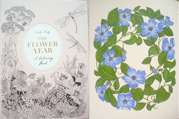
Disclaimer – Please read this disclosure about my use of affiliate links which are contained within this post.
Tillsammans Målarbok (Together Colouring Book) is illustrated by Hanna Karlzon and published and kindly sent to me to review by Pagina Förlag. This book is in an artist’s edition format but this is the only format it’s available in, it’s not a full-size colouring book or postcard book. It is identical in format to the artist’s editions (tavelboks) of Hanna’s other books, Daydreams (Dagdrommar), Summer Nights (Sommarnatt) and Magical Dawn (Magisk Gryning) and therefore my review is mostly identical apart from the content section and the photos, skip to paragraph 2 for information about the content. The book measures 29.5x21cm (A4), it’s paperback with thick but flexible card covers which are a pale lemon colour with a black and white line drawing of one of the portraits (found inside) with gold foiling accents on the front and back. The book has a black tape binding meaning the pages lie completely flat when the book is open and they can be removed for framing. The pages are made of thick cream card which is lightly textured and absolutely fabulous for using pencils on as they layer really well and blend seamlessly. Water-based pens also work really well on this card and don’t bleed through or sideways and there isn’t even a hint of shadowing either. The illustrations are all single-page designs and are printed single-sided so you can use whatever medium you fancy without worrying about bleed-through.
The 20 illustrations are all portraits of women and 15 of these have been chosen from Hanna’s 4 previous colouring books and 5 have been newly created for this book specifically. The images Hanna has chosen are a really good cross-section and seem to be some of the favourites of the colouring community, none of the previously published images have been printed in artist’s edition format so while it’s not all new content, it is all newly published in the single-sided format printed on card. There are a range of different portraits from two women together to single women face on, some in side profile and others showing a whole person. Each image contains various different objects and accessories including gems, metal, jewellery, mushrooms, flowers, birds, shells, moths, crowns, and candles, there is a really good variety despite them all being portraits of women. Those images taken from previous colouring books are all printed the same size as the originals so if you’re able to colour those, you’ll also be able to colour these with no difficulty. The pictures would all look amazing framed for yourself or gifted to others and because the faces are mostly quite large they’re great to practice skin tone colouring on and really push yourself out of your comfort zone. All of the images are pictured below so you can check that you’re happy with the choices and see if your favourites are included.
In terms of mental health, this book is great, it’s very absorbing and ideal for those who want to colour realistically and learn how to colour people. The line thickness is consistent throughout and remains medium/thin so it’s definitely manageable to colour. The intricacy and detail vary a little throughout from medium to high and this is part of what makes Hanna’s work so special and beautiful, if you’re wanting to colour within each teeny tiny section then you’ll need to have very good vision and fine motor control but if you’re happy to colour over some of it and use it as texture underneath then moderate vision and fine motor control would be absolutely fine! I found this book and the illustrations within it great for my mood, just looking through it and noticing all of the different details, patterns and objects makes me feel calmer and the images are just charming so they’re sure to lift your mood and keep you distracted from any difficult thoughts or persistent symptoms. The images do vary a little in size and difficulty but unlike many of Hanna’s images that consist of lots of component parts, these are all portraits and scenes and therefore they don’t have such natural stopping points for those wanting to just colour in short bursts, you can still colour just one flower or just the eyes but it’s not so easy to come to an obvious point to stop, however, if you don’t mind stopping part-way through an image then this book would be ideal for using on good and bad days. The fact that the pages are printed single-sided and are removable is fantastic because it means you can remove your works of art and frame them or gift them which is a great way of reminding yourself of what you can achieve and brighten up the darkest of days.
I would highly recommend this book to those of you who are already fans of Hanna’s work and have her previous books and really want to colour more people, while 75% of the artwork can be found in Hanna’s previous books, this gives you the opportunity to colour those pages again and use different colour schemes or wetter media without ruining a reverse image and you can also frame them for wonderful gifts or beautiful decoration for your own home. This book is ideal for those who use wet media and alcohol markers and the illustrations are a great cross-section of Hanna’s portraits.
If you’d like to purchase a copy, it’s available from Printworks. A Dutch edition will be published in March 2018 by BBNC Uitgevers and it will be called Karakter.
The image below was coloured using Faber-Castell Polychromos Pencils and a White Sakuara Gelly Roll Gel Pen.I used the skin tone tutorial from Colorist’s Special Effects by Helen Elliston.
Buy on Amazon UK – Colorist’s Special Effects
Buy on Book Depository – goo.gl/CrS7DU