Derwent

Die Welt Unter Der Lupe zu Lande click through to read my review, see a video flick through and photos of inside

Die Welt unter der Lupe – Zu Lande (The World Under the Magnifying Glass – Land) – A Review

Disclaimer – Please read this disclosure about my use of affiliate links which are contained within this post.
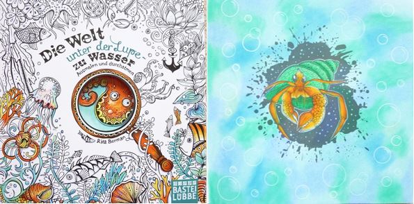
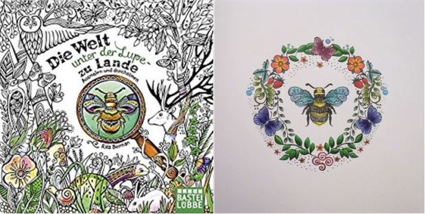
Die Welt unter der Lupe – Zu Lande (The World Under the Magnifying Glass – Land) is published and kindly sent to me to review by Bastei Lübbe. This book is the sixth illustrated by Rita Berman, a highly talented German illustrator, she previously brought us the hugely successful and utterly beautiful series of season colouring books, reviewed by me here, and the first in this new series, Die Welt unter der Lupe – Zu Wasser. I had high hopes for this new book after the previous one was so utterly beautiful and I didn’t think that one could be beaten but I think I’ve fallen in love with this one just a little more because the content is so wonderfully wide-ranging and just a little more free because of the topic being land rather than water, it’s just exquisite. As with all of her books, I was absolutely blown away by its beauty, I can’t enthuse enough about it, it’s beautiful! It is identical in format to her previous books and therefore my review of each is the same, as are the mental health benefits, skip straight to the second paragraph about content and photos at the end to see what’s inside this title.

The book itself is slightly smaller than most at 20cm square, it’s paperback with a partially coloured image from inside the book on the front cover and a hole in the centre of the magnifying glass which gives a very clever 3D effect of looking at a bee printed on the inside of the full size French flaps. Both covers have fully illustrated French flaps with colour added to the external covers and the internal front flap but none add to the back one so it’s fully colourable with alcohol markers if you wish. The spine is glue and string-bound so it’s durable and strong and will ease up with use; many of the images are full page designs and therefore a number of them do reach or span the gutter however as the spine becomes more supple, you’ll be able to reach almost all areas of the page. The images are printed double-sided and are a mixture of single and double-page spreads, the book contains 72 pages of images, at the back of the book are three pages showing the book covers of the previous titles. The paper is bright white, medium/thick and lightly textured, water-based pens didn’t bleed or shadow when I tested them but dark colours or colouring the same spot may cause shadowing so do ensure that you test them yourself in an inconspicuous area; coloured pencils blend and shade well. The images themselves are where these books really come into their own, there are similar style images in each of Rita’s books but they’re beautifully tailored to the specific theme of the title, previously seasons or underwater and this time land, and it’s very clear from looking through each book what it’s dedicated to.

The drawings are incredible, as with all of Rita’s books, each time I look through the book I see new things that I didn’t notice before. The content this time is even more varied and ranges from double-page spreads of forest scenes and cities within birds’ wings, to branches of acorn houses and desert cactus landscapes. There are small centralised images of cornflowers and poppies, larger single-page images of beetles, flamingos, birds’ nests and mouse houses and a few pages showing a scene on one page and a corresponding pattern on the other. There are so many different things pictured including foxes, hedgehogs, bees, flowers, deer, snails, rabbits, birds, butterflies, insects, beehives, leaves, fruit, elephants, lizards, monkeys, parrots, and so much more. The illustrations are all drawn quite realistically but each is filled with patterns and small sections to colour which really opens up the possibilities of how to colour them. The pages are filled with cute, whimsical and friendly-feeling images, none are intimidating, they just welcome you in to fill them with colour.

In terms of mental health, each of Rita’s books is just wonderful, the images are really natural and the content is very cute and packed with details so each time you flick through the book you notice more in the images. Because of how the illustrations are drawn, with mostly realistic outlines of obviously recognisable things but filled in with patterns and whimsical doodles, you can either colour the pages realistically, or in outlandish colour schemes and either will look totally fabulous as you’ll see from completed pages on social media. The line thickness is consistently variable throughout, each image is outlined in a medium/thin line with thin-lined details. The intricacy and detail level varies across the images from low-ish to very high, however, don’t despair if your vision or fine motor control aren’t perfect, they don’t need to be, none of the parts are impossibly tiny to colour and many of the images can be simplified by colouring over the internal patterns rather than within them which instantly reduces the intricacy to a much lower level for almost all of the images. The size of the book is ideal because it’s smaller than most and therefore doesn’t require quite so much time to complete each page, the content varies from full double-page spreads depicting scenes to much smaller images so it’s ideal for those with fluctuating conditions or poor concentration as you can colour one object or group of objects on a bad day, or colour a full double-page spread when you’re feeling focused and well. There are also a number of pages that have large open spaces where you could add your own backgrounds or imagery if you wish, this is by no means a necessity but the option is there if you want it. The illustrations create a wonderful sense of place and offer great escapism, they really transport you into Rita’s super cute world filled with charming animals and beautiful plants and away from any difficulties or symptoms you might be experiencing.

Overall, I would highly recommend this book and all of the other titles by Rita, they complement each other beautifully and really transport you into a whimsical world. The pages offer a manageable project for any level of functioning and they are just gorgeous when finished.

If you’d like to purchase a copy it’s available here:
Amazon UK – Die Welt unter der Lupe – Zu Lande
Amazon US – Die Welt unter der Lupe – Zu Lande
Book Depository Worldwide – https://www.bookdepository.com/Die-Welt-unter-der-Lupe—zu-Lande-Rita-Berman/9783404609482/?a_aid=colouringitmom

You can read my reviews of Rita’s other books here.

The image below was coloured using Faber-Castell Polychromos Pencils.

The Tiffany Glass Coloring Book – A Review

Disclaimer – Please read this disclosure about my use of affiliate links which are contained within this post.
The Tiffany Glass Coloring Book is published by Rizzoli and illustrated and very kindly sent to me to review by Jessica Palmer. Jessica has also sent me a second copy in order to run a giveaway, this is currently running on my FB page and you can win a copy of this book and a set of 20 Winterkleurkaarten by Julia Woning; you have until midnight on the 29th of November 2017 to enter here. This book is a new format, design and style from what we’ve come to know for Jessica’s art in the Tangle book series but it is no less beautiful, it’s just different. The book itself is 23.1 x 25.4cm, paperback with flexible card covers and a partially coloured black and white design from inside the book. The spine is glue and string-bound and can be a little tricky to get completely flat but with perseverance this will become easier. The pages are a mixture of single-sided (25 images) and double-sided printing (42 images) and it seems quite random as to where these are placed, the images are also a mixture of single (63) and double-page spreads (4 comprising of 2 spreads) and many have black backgrounds (23 ish). The paper is bright white, lightly texture and medium thickness, it worked well with my Derwent Inktense Pencils and didn’t overly warp when activated with water and this didn’t shadow or bleed. Water-based pens don’t seem to bleed or shadow and pencils work well for blending and layering, alcohol markers can be used on the single-sided images as long as you place a protective sheet behind to catch any bleed-through. The images themselves are all inspired by Tiffany lamps and therefore have a real stained glass feel as they’re designed to have light displayed through them to show each section, therefore the images are mostly quite heavily lined with lots of sections making up each design. Each of the designs contains at least one dragonfly for you to find, sometimes these are the centre of the image and other times they’re hidden, they give a really cohesive feel to the book because even though each page is filled with different content, it’s still tied together with the Tiffany lamp and dragonfly theme. The designs vary a lot in size and content and Jessica explains in the introduction that she has deliberately created illustrations with much simpler designs for children or beginners and all different levels in between up to very complex detailed designs. There is a really good mixture of designs and pretty much all of them are heavily nature-inspired, just like the real Tiffany lamps. The images don’t contain actual lamps with fixtures and stands, they’re all designs inspired by lamps and therefore the artwork has been altered and adapted to fit a flat page rather than all of them being circular or curved which is nice.

In terms of mental health, this book is lovely, the natural images are great for calming you down and helping you zone out. The different levels of difficulty are ideal for those of us with fluctuating conditions because you can do simpler images on your worse days and more complex images on your better days when you can focus. The line thickness varies throughout and ranges from spindly thin to thick and mostly stays around the thin range. The intricacy and detail levels also vary hugely from large open spaces to much smaller, finer details and again, it remains mostly around the quite detailed level and therefore you’ll need fairly good vision and fine motor control to enjoy the majority of the images. The printing is ideal for those who like to use wet media or mixed media as you can colour the double-sided pages with pencil or carefully with water-based pens and the single-sided pages with watercolours, alcohol markers and paints if you wish. You can really challenge yourself to work on making the images look like sections of lamps with light shining through them if you wish or you can just colour them as normal colouring images, either option will look equally beautiful. The single-sided images could even be carefully removed from the book once coloured and framed or gifted if you wanted.

Overall, this is a lovely book, it’s not as niche as you might expect and the illustrations are all drawn in Jessica’s beautiful signature style and will look incredible once splashed with colour, whatever medium you fancy using!

If you’d like to purchase a copy it’s available here:
Amazon UK – The Tiffany Glass Coloring Book
Book Depository Worldwide – https://www.bookdepository.com/Tiffany-Glass-Coloring-Book/9780847860708/?a_aid=colouringitmom

Jessica has also sent me a second copy in order to run a giveaway, this is currently running on my FB page and you can win a copy of this book and a set of 20 Winterkleurkaarten by Julia Woning; you have until midnight on the 29th of November 2017 to enter here.

The image below was coloured with Derwent Inktense Pencils and activated with water.

Die Welt unter der Lupe zu Wasser, a beautiful close-up look into an underwater world that you can colour, click through to read my review!

Die Welt unter der Lupe – Zu Wasser (The World Under the Magnifying Glass – Water) – A Review

Disclaimer – Please read this disclosure about my use of affiliate links which are contained within this post.

Die Welt unter der Lupe – Zu Wasser (The World Under the Magnifying Glass – Water) is published and kindly sent to me to review by Bastei Lübbe. This book is the fifth illustrated by Rita Berman, a highly talented German illustrator, she previously brought us the hugely successful and utterly beautiful series of season colouring books, reviewed by me here. I had high hopes for this new book which will be joined in November by a land themed title and I wasn’t disappointed, I didn’t think that her season books could be topped but I think this new book might just have done that, it’s exquisite and absolutely packed full with content. As with all of her books, I was absolutely blown away by its beauty, I can’t enthuse enough about it, it’s stunning! It is identical in format to her previous four books and therefore my review of each is the same, as are the mental health benefits, skip straight to the second paragraph about content and photos at the end to see what’s inside this title.

The book itself is slightly smaller than most at 20cm square, it’s paperback with a partially coloured image from inside the book on the front cover and a hole in the centre of the magnifying glass which gives a very clever 3D effect of looking at an octopus printed on the inside of the full size French flaps. Both covers have fully illustrated French flaps with colour added to the external covers and the internal front flap but none add to the back one so it’s fully colourable with alcohol markers if you wish. The spine is glue and string-bound so it’s durable and strong and will ease up with use; many of the images are full page designs and therefore a number of them do reach or span the gutter however as the spine becomes more supple, you’ll be able to reach almost all areas of the page. The images are printed double-sided and are a mixture of single and double-page spreads, the book contains 72 pages of images, at the back of the book are three pages showing the book covers of the previous and upcoming titles. The paper is bright white, medium/thick and lightly textured, water-based pens didn’t bleed or shadow when I tested them but dark colours or colouring the same spot may cause shadowing so do ensure that you test them yourself in an inconspicuous area; coloured pencils blend and shade well. The images themselves are where these books really come into their own, there are similar style images in each of Rita’s books but they’re beautifully tailored to the specific theme of the title, previously seasons, and this time under water and it’s very clear from looking through each book what it’s dedicated to.

The drawings are incredible, each time I look through the book I see new things that I didn’t notice before. The content ranges from double-page spreads of whales or jellyfish to small central images of hermit crabs, shoals of pufferfish and a close up on the opposite spread to patterns including shells and waves, large centralised images to underwater scenes of deep sea diving, shipwrecks and a shell city and so much more! There are tropical fish, buried treasure, sea plants, shells and even an Arctic scene of seals and penguins. You can colour pearls, octopi, bubbles, seahorses, crabs, jellyfish, dolphins, starfish, seaweed, coral, anemones, clownfish, lobsters, turtles, squid and even a nautilus, it really is packed with watery, sea-dwelling creatures! The illustrations are all drawn quite realistically but each is filled with patterns and small sections to colour which really opens up the possibilities of how to colour them. The pages are filled with cute, whimsical and friendly-feeling images, none are intimidating, they just welcome you in to fill them with colour.

In terms of mental health, each of Rita’s books is just wonderful, the images are really natural and the content is very cute and packed with details so each time you flick through the book you notice more in the images. Because of how the illustrations are drawn, with mostly realistic outlines of obviously recognisable things but filled in with patterns and whimsical doodles, you can either colour the pages realistically, or in outlandish colour schemes and either will look totally fabulous as you’ll see from completed pages on social media. The line thickness is consistently variable throughout, each image is outlined in a medium/thin line with thin-lined details. The intricacy and detail level varies across the images from low-ish to very high, however, don’t despair if your vision or fine motor control aren’t perfect, they don’t need to be, none of the parts are impossibly tiny to colour and many of the images can be simplified by colouring over the internal patterns rather than within them which instantly reduces the intricacy to a much lower level for almost all of the images. The size of the book is ideal because it’s smaller than most and therefore doesn’t require quite so much time to complete each page, the content varies from full double-page spreads depicting scenes to much smaller images so it’s ideal for those with fluctuating conditions or poor concentration as you can colour one object or group of objects on a bad day, or colour a full double-page spread when you’re feeling focused and well. There are also a number of pages that have large open spaces where you could add your own backgrounds or imagery if you wish, this is by no means a necessity but the option is there if you want it. The illustrations create a wonderful sense of place and offer great escapism, they really transport you into Rita’s super cute world filled with charming animals and beautiful plants and away from any difficulties or symptoms you might be experiencing.

Overall, I would highly recommend this book and those in the seasons series, they complement each other beautifully and really transport you into a whimsical world. The pages offer a manageable project for any level of functioning and they are just gorgeous when finished.

If you’d like to purchase a copy it’s available here:
Amazon UK – Die Welt unter der Lupe – Zu Wasser (The World Under the Magnifying Glass – Water)
Book Depository Worldwide (currently reduced in price!) – goo.gl/8CQa2s

You can read my reviews of the other books in the series here.

You can view my silent video flick-through here.

The image below was coloured using Prismacolor Premier Colored Pencils, the bubbles were created using a circle template, a Derwent burnishing pencil and the background with various colours of PanPastels.

Birdtopia 2018 Colouring Calendar – A Review

Disclaimer – Please read this disclosure about my use of affiliate links which are contained within this post.
Birdtopia 2018 Colouring Calendar is published and was very kindly sent to me to review by Laurence King Publishing. This calendar contains images from Daisy Fletcher’s gorgeous colouring book, Birdtopia. This calendar is huge, it’s 30.5cm wide by 35.5cm long, when closed, making it a whopping 71cms long when it’s opened and hung on the wall so it really will be pride of place no matter where you hang it. It is significantly larger than the book (see photos below) and contains 12 of the images, each enlarged to fit the larger pages, one for each month of the year. I have included pictures of all of the calendar pages below so that you can decide if this is for you, as well as comparison photos of the book and calendar image sizes. The images are printed a fair bit larger in the calendar than in the book so this is a great purchase for those of you who found Daisy’s illustrations just a little too detailed and small, under each illustration is a small note stating what birds are drawn so that you can easily identify them and colour them realistically if you wish. The cover of the calendar is yellowy-cream card with the same images and design as the book cover, the title is printed in gold foil lettering and on the back are thumbnail pictures of all of the images inside; the calendar arrives wrapped in protective plastic wrap so you can’t look inside. The paper is cream and medium weight with a little bit of tooth and it’s perfectly possible to get a number of layers and to blend well, I tested Holbein and Polychromos pencils and these worked really well; water-based pens don’t bleed and will only shadow if you press too hard but do be sure to test in an inconspicuous area. I completed my page using Derwent Inktense Pencils activated with minimal water and the paper held up very well to this with minimal warping or buckling. You definitely can’t use alcohol markers because the images are all printed double-sided with the dates for the previous month on the back of the page which will get ruined by bleed-through if you colour ahead but would be fine if you colour month by month. As with the Birdtopia book, this calendar has the quirky feature of having white colouring spaces but cream background printed throughout (except for the peacock page which is entirely white due to being a full page design), this isn’t a bad thing and many people think that this feature was one of the things that made Birdtopia so special but it’s worth mentioning and taking note of my photos below as it doesn’t suit everyone and is a bit of a surprise when you first look through the calendar.

The calendar pages themselves are beautifully arranged with a large month title at the top and the dates all neatly spaced in a grid. There is plenty of space to write plans into each box and a notes section at the bottom consisting of five lines. The calendar lists all major holidays and dates as well as the country that celebrates them in brackets and the moon phases are also shown. At the bottom of each calendar page is a small coloured bird illustration, sometimes accompanied by a flower or plant. When writing on the calendar I’d strongly advise using pencil so that you don’t get bleed through onto the next month’s image, or indentation from using a biro. The calendar is stitch-bound so you can easily fold it back on itself for easier colouring as it’s a little unmanageable when it’s not folded in half. Each page has a hole at the top that you can either hang directly on a nail or thread string through to hang on a hook.

In terms of mental health, this calendar is ideal because not only does it give you hours of colouring fun and distraction, you can also easily display it on your wall to brighten up even the darkest of days and you’ll get satisfaction every day looking at all of your beautiful hard work. The larger image size means it’s more suitable for those of you who don’t have perfect vision or fine motor control, there are still some small and intricate sections but these are much more manageable. It’s a great project that will help motivate you with a deadline of making sure each image is ready for the first day of the following month. The pages could also be removed at the end of the year once you’re done with the calendar and could be easily framed or gifted to others to bring enjoyment for years to come. The majority of Daisy’s images are intricate and detailed and do require a fair amount of concentration which is great for keeping you occupied when you’re feeling anxious or low, they’re also nature-themed, realistically drawn (though not realistically composed in terms of accurate plants or comparative sizes of things) and truly beautiful and just looking through the calendar is sure to lift your mood. These images are really good for practising mindfulness techniques because they require a lot of focus and time to complete meaning this calendar is ideal for those of us who are mentally ill and needing to zone out. The line thickness is thin and spindly thin throughout so you’ll need to colour slowly in order to keep within the lines but this is perfectly doable if you’re patient.

I would highly recommend this for any colouring fan who needs a calendar in their life. If you like Daisy’s previous work, or if it’s new to you and you love birds and nature then this calendar will be perfect for you, it’s an absolute joy to colour and it looks amazing when you finish a page. With its beautiful selection of designs and great paper quality, it will brighten up the darkest of rooms and moods. It would also make a fabulous gift either as it is, or fully coloured for someone and it’s not only useful for the coming year as a calendar, but for years to come when you can frame your pictures to continue the joy.

If you’d like to purchase a copy it can be found here:
Amazon UK – Birdtopia 2018 Colouring Calendar
Book Depository Worldwide – https://www.bookdepository.com/Birdtopi-2018-Colouring-Calendar-Daisy-Fletcher/9781786270498/?a_aid=colouringitmom

The image below was coloured using Derwent Inktense Pencils activated with minimal water.

Fairies: The Colouring Book of Secrets – A Review

Disclaimer – Please read this disclosure about my use of affiliate links which are contained within this post.
Fairies: The Colouring Book of Secrets is illustrated, published, and kindly sent to me to review by Russell Ince. Russell is best known for his beautiful story books, Fairies: The Book of Secrets and Santa Claus: The Book of Secrets, he received heaps of requests to turn his beautiful illustrations into a colouring book so that people could make the illustrations their own and Russell very kindly responded with these two beautiful colouring books. I’ve not actually seen the story books themselves so I’m unable to comment on whether these illustrations are the originals with the colour removed, or new ones in a similar style to those found in the story books.

The book itself is 21.4 x 14.9cm, landscape, paperback with a medium thickness flexible card cover with a black and white line drawing of an illustration from inside the book with gold foiling on the text set on a black background. The spine is lightly glue-bound and is pretty easy to break so that the pages lie-flat, this does mean that you’ll need to be careful to ensure that your pages don’t accidentally become loose and fall out though this would make removing them to frame very easy if you wish. The images are printed full page and double-sided and are a mixture of single and double-page spreads. The paper is thick, white, and lightly textured, pencils blend and shade smoothly, it feels thick enough that pens shouldn’t bleed but sadly my water-based pens did shadow a bit onto the reverse so do check yours in an inconspicuous area before diving straight in; alcohol markers will bleed through. Due to not having the original books, I didn’t know what to expect from the illustrations but I was hoping for lots of fairy scenes and images of them, their houses etc, sadly I was a little disappointed, there are surprisingly few fairies pictured and a large number of the images are actually wallpaper style images rather than scenes. These wallpaper designs are very nice and I really can’t fault them, they just weren’t the imagery I was expecting so do be aware of this and check out the photos below before ordering a copy. That being said, the fairies that are pictured are very lovely. The content ranges from wallpaper-style patterns to mirror image spreads, centralised fairy images and a lot of repeating patterns. The fairies are a mix of male and female and all have pointy ears with all but one having wings, they’re very pretty and nicely drawn and have quite a variety of outfits and wing styles so they don’t feel samey.

In terms of mental health, this book is a bit of a mixture, the illustrations are beautiful and if you like patterns and wallpaper style images then this will be ideal for your symptoms, however, if you’re wanting escapism and to be transported to another world then this may not be the book for you. The fairies are sadly lacking, 32 of the pages don’t contain fairies at all and only 13 do which seems like a low number in a fairy-specific book. However, this is a great mixture of images for pattern-lovers and the pages really offer a great variety of pattern styles to really go to town on and make your own and they’ll be ideal for anxious days as they can be coloured in any scheme you like and they’ll look fabulous. The line thickness is consistent throughout and is spindly thin so you don’t have much wiggle room at all. The intricacy and detail levels vary from large open spaces of fairy faces to much smaller sections of tiny berries and other details, you’ll therefore need very good vision and fine motor control as the majority of the images contain a lot of intricate parts. The images will mostly require a good level of concentration and focus so it’s best to save it for your good days. Patterns can be great for helping you zone out and re-focus your mind so those who suffer from anxiety may well like this book as the patterns are also very organic and nature-based which is ideal for all mental health problems.

Overall, this is a nice book and I’d recommend it as long as you look at the internal images first, I was left disappointed by the lack of scene pages and lack of actual fairies or magical objects but the content that is here is very nice it’s just very pattern-focused.

If you’d like to purchase a copy, it’s available here:
Amazon UK – Fairies: The Colouring Book of Secrets
Book Depository Worldwide – https://www.bookdepository.com/Fairies-The-Colouring-Book-of-Secrets-Russell-Ince/9780957577060/?a_aid=colouringitmom

The image below was coloured using Derwent Inktense Pencils activated with minimal water.

Romantic Country: The Third Tale – A Review

Disclaimer – Please read this disclosure about my use of affiliate links which are contained within this post.
Romantic Country: The Third Tale is published and kindly sent to me to review by St Martin’s Griffin. I’ve been looking forward to this book being published for such a long time and I was delighted when it arrived just a few days ago and I was able to complete my Romantic Country collection. I think that the second book is my personal favourite, it seems the most cohesive and most exciting in terms of content, however, this third instalment is beautiful too though the story does jump around from us being shown Elena meeting Joset the duck in Chapter 4 to seeing new scenes of shops and places we’ve seen in previous books as well as visiting new islands and areas. The book is illustrated by Eriy, a Japanese artist who creates her work using a toothpick dipped in ink. This whole book took approximately 900 toothpicks and because of the way the lines are created they’re not a uniform thickness and aren’t a stark black colour (more on this later). This series was the series I’ve been hoping would be made, with its childlike charm but with adult levels of intricacy, it’s what I always felt was missing for me in JB’s books, don’t get me wrong, hers are stunningly beautiful, I really love them, but they’re a little too perfect for my imagined perfect series. Eriy’s books are utterly charming, not quite perfect, and truly heart-warming and that’s what makes them so wonderful.

This book is square, the same size as the bestsellers, paperback, with a removable paper dust jacket with partially coloured images from the book on the front and back. The book itself has brown card covers with two line drawings from inside the book and blank covers on the inside. The paper is a lovely rich creamy colour (it’s hard to describe but it’s a little warmer in colour than the paper in Johanna’s first two books but not yellowy and it’s the same as in the previous Romantic Country titles), and it’s thick and doesn’t bleed or shadow with water-based pens when used carefully, it also holds up well to water and doesn’t bleed through with Derwent Inktense pencils. The paper is lightly textured and while you can’t get loads of layers, pencils do lay down well on it and it’s perfectly possible to get some lovely blending and layering. The spine is glue and stitch-bound so it’s durable but a little difficult to get to the centre of each spread, however, spines of this type do ease up with use so do persevere. The images are printed double-sided and borderless and are a mixture of single and double-page spreads so a little of each image is lost into the spine to begin with.

The images themselves are beautiful, charming, and begging to be coloured and are split into the following 5 chapters: 1. Peaceful Days in the North; 2. Peaceful Days in the South; 3. Beautiful Island Scenes; 4. Good Times for Elena and Joset; 5. The Passage of Time in the Secret Forest. The book starts with a single page spread showing a map of the islands of Cocot (the name of the land in which the first two books are set, which was dreamt up in the imagination of Eriy when she was a child), depicting the landmarks introduced in this book. Following this, are two double-page spreads showing mapped scenes of Sarryska Island and Cocot North, and Uisce and Melati Islands and their landmarks which are pictured in more detail later in the book so you can clearly see where they’re situated in relation to each other. Following the maps, the images show beautiful scenes of children posting letters to Santa Claus, vegetable carts, snow-capped castles, farmyard scenes, cutlery and crockery, a library, Island traditional dress, a lamp shop, inside a boat, a picnic, fairies, mermaids, a dragon receiving healthcare, a witch’s hat shop, and so much more. Each image is shown as a thumbnail at the back of the book too with a short description telling you more about each place and life there. At the back of the book are two fully colourable pages with single-sided scenes to cut out and assemble into a 3D shop that Elena and her duck friend Joset, are visiting.

In terms of mental health, I doubt there’s a book (or series) that’s better for it in all honesty! Certainly for mine anyway! The illustrations are so charming and because they have a beautiful childlike quality to them they really have a nostalgic aspect which will remind you of colouring books you used as a child but with so much more detail and intricacy that it’s still very entertaining as an adult. The content is wonderful because it whisks you off to a simpler, happier, gentler place where there is a slower pace of life and mythical creatures live alongside people and even witches are good. The line thickness varies throughout because Eriy draws with a toothpick and so it naturally varies however the majority of the lines are thin but not spindly so they’re perfectly colourable with moderate vision and fine motor control. The lines themselves are not a stark black, they’re an uneven brown because they’re drawn in dipping ink and while this may not sound great and does take a little getting used to, it truly adds so much charm to the drawings and these illustrations just wouldn’t look right drawn in harsh, black, perfect lines. The images range in intricacy and detail from large open spaces in some of the landscape pages, to small intricate details of vegetables, books and leaves, and everything in between, it’s very wide-ranging but the intricacy level in this book is significantly higher in most images than in Romantic Country though most of the images would still be suitable for those with moderate, or higher, vision or fine motor control so this is a great book for nearly anybody! The images are detailed and contain lots of things to look at and colour but most are not so overwhelming that you don’t know where or how to start and because they’re all depicting real things like buildings, plants, and food, they’re easy to work out colour schemes for whether that be subtle pastels, realistic browns and greys, or bright fantastical colours, this book isn’t so perfect that you don’t want to touch it which is part of its huge appeal. The images are less cohesive in this book and don’t tell a chronological story, however, they do create a wonderful sense of place and they offer great escapism as you walk through the streets, castles, countryside and shops, by the end of the book you really feel like you’ve visited the fantastical lands and you’ll be planning your next visit as soon as you can!

I would highly recommend this book to anyone who likes to colour scenes, landscapes, shops, food and flowers. This is one of the most beautiful books I’ve ever seen, it’s cute, pretty, whimsical, magical and charming and it truly is the book of my dreams, and hopefully of yours. If you don’t already have the first two Romantic Country titles then get them too, this series is truly perfect!

If you’d like to purchase a copy of this gorgeous book then it’s available here:
Amazon UK – Romantic Country: The Third Tale
Book Depository Worldwide – https://www.bookdepository.com/Romantic-Country-The-Third-Tale-Eriy/9781250133830/?a_aid=colouringitmom

Book 1 and 2 are available here.

The image below was coloured using Holbein Artist’s Colored Pencils and blended using a Caran d’Ache Blender Pencil.

Menuet de Bonheur – A Review

Disclaimer – Please read this disclosure about my use of affiliate links which are contained within this post.
Menuet de Bonheur is illustrated by Kanoko Egusa, a Japanese artist, who very kindly sent me a copy to review. Kanoko’s work is yet to be picked up by a US or UK publisher which is a real shame because her work is truly stunning, it’s unlike anything we’ve seen before in the UK but is similar to many of the other beautiful Japanese books on the market, they have such a lovely quality to them and are very whimsical and cute with plenty of detail. Kanoko has created two books so far, this one and a second called Rhapsody in the Forest which I’ve reviewed here.

The book itself is just under 25cm square, paperback with very flexible card covers and a beautiful, thick, dusky pink, paper dust jacket with linework from inside the book. The pages are printed double-sided and the spine is glue-bound, the images are printed full-page and therefore do enter the spine so you’ll need to be careful when trying to reach the centre of the pages not to break the spine or you may end up loosening the pages. The paper is white, medium/thin and very lightly textured, it doesn’t bleed or shadow with water-based pens but do make sure you check this somewhere inconspicuous as we all colour differently, pencils blend and shade well despite the lack of tooth in the paper and sparing amounts of water were tolerated very well and didn’t cause bleeding when I used my Derwent Inktense Pencils. The images are a mixture of single and double-page spreads and the content is all heavily nature-based with lots of animal characters. The book is printed in Japanese so it’s not possible to read the text at the beginning of the book which I assume explains what’s happening through the pages but most of the scenes are pretty self-explanatory.

The illustrations contain all sorts of imagery from flowers to teacups, baby clothes to fruit baskets, fireworks to vegetables and lots and lots of animals in various stages of anthropomorphosis. This book contains many more human-like animals than Rhapsody in the Forest and it appears to show family life from bathing the children to hanging up washing, reading a bedtime story to food shopping, preparing dinner to going on holiday and even depicting a wedding! The images are very natural and filled with detail, objects, and plenty to look at and the content is really wide-ranging and very pretty. Animal family life is a really lovely theme for a book and the pictures are truly exquisite and beautiful, it feels like you’re taking a peek into their life and stepping into their story. Three of the pages have black backgrounds which is quite novel and a nice addition to the book. At the back of the book are two light brown pages, the first has two postcard sized images which can be cut out and coloured, the second has 5 illustrations each with dotted lines drawn around them so that they can be cut out and attached to cards or used as gift tags etc either coloured or uncoloured.

In terms of mental health, this book is fantastic, it’s so calming and distracting and there’s just so much to look at in each picture so it’s really absorbing. It also offers wonderful escapism because you can create stories about what the animals are doing and immerse yourself in their lovely world. The book feels really peaceful and reminds me of my childhood reading Beatrix Potter’s wonderful stories about animals, I’m sure Peter Rabbit and Mrs Tiggywinkle would fit right in with Kanoko’s creatures and you could have great fun naming all of the characters depicted in this beautiful book. The line thickness is pretty consistent throughout and is thin but not spindly thin so it’s perfectly colourable. The intricacy and detail levels vary throughout from very detailed sections with lots of intricate parts to much larger sections where you can really go to town with your blending and shading if you wish; this book would be suitable for those with moderate to good vision and fine motor control. This book will require a fairly good level of concentration but there are lots of natural stopping points so you can colour for as little or as much time as you want and still get a good sense of accomplishment. The amount of content in each page varies so some are centralised single page images, others are fully covered double-page spreads and a few have spaces where you could add your own imagery or backgrounds if you wish.

Overall, I would highly recommend this book and Kanoko’s first book, Rhapsody in the Forest, both are truly beautiful, really natural and calming and just charming to look through. Having seen lots of coloured images from inside, these illustrations are really brought to life with colour and they look spectacular when finished, they’re also ideal for practising colouring fur!

If you’d like to purchase a copy, it is available on Amazon but price varies so do check there as well as Amazon Japan (postage is steep but does reduce per item if you buy more than one thing) and check Etsy too where an increasing number of Japanese and other International colouring books are being stocked for a reasonable price.
Amazon UK – Menuet de Bonheur

The image below was coloured using Derwent Inktense Pencils activated with water.

Rhapsody in the Forest – A Review

Disclaimer – Please read this disclosure about my use of affiliate links which are contained within this post.
Rhapsody in the Forest is illustrated by Kanoko Egusa, a Japanese artist, who very kindly sent me a copy to review. Kanoko’s work is yet to be picked up by a US or UK publisher which is a real shame because her work is truly stunning, it’s unlike anything we’ve seen before in the UK but is similar to many of the other beautiful Japanese books on the market, they have such a lovely quality to them and are very whimsical and cute with plenty of detail. Kanoko has created two books so far, this one and a second called Menuet de Bonheur which I’ve reviewed here.

The book itself is just under 25cm square, paperback with very flexible card covers and a beautiful thick paper dust jacket with linework from inside the book. The pages are printed double-sided and the spine is glue-bound, the images are printed full-page and therefore do enter the spine so you’ll need to be careful when trying to reach the centre of the pages not to break the spine or you may end up loosening the pages. The paper is white, medium/thin and very lightly textured, it doesn’t bleed or shadow with water-based pens but do make sure you check this somewhere inconspicuous as we all colour differently, pencils blend and shade well despite the lack of tooth in the paper and sparing amounts of water were tolerated very well and didn’t cause bleeding when I used my Derwent Inktense Pencils. The images are a mixture of single and double-page spreads and the content is all heavily nature-based with lots of animal characters. The book is printed in Japanese so it’s not possible to read the text at the beginning of the book which I assume explains what’s happening through the pages but most of the scenes are pretty self-explanatory.

The illustrations contain all sorts of imagery from food to flowers, postage stamps to books, circus and nautical scenes and lots and lots of animals in various stages of anthropomorphosis from very animal-like, possibly wearing a hat, to very anthropomorphic and doing human jobs like decorating cakes, trick-or-treating, and even going to a ball. They are very natural and filled with detail, objects, and plenty to look at and the content is really wide-ranging and very pretty. I’m not entirely sure what the specific theme of the book is but it seems like it’s following the lives of lots of woodland and more exotic creatures and their travels, tales, exploits and even parties! It’s a really lovely theme for a book and the pictures are truly exquisite and beautiful! Five of the pages have black or grey backgrounds which is quite novel and a nice addition to the book.  Of the two books, I personally prefer this one as it’s more natural and less anthropomorphic which suits my tastes more, however, both are just gorgeous! At the back of the book are two light brown pages, the first has two postcard sized images which can be cut out and coloured, the second has 5 illustrations each with dotted lines drawn around them so that they can be cut out and attached to cards or used as gift tags etc either coloured or uncoloured.

In terms of mental health, this book is fantastic, it’s so calming and distracting and there’s just so much to look at in each picture so it’s really absorbing. It also offers wonderful escapism because you can create stories about what the animals are doing and what they might be baking a cake or wearing their best outfits for and immerse yourself in their lovely world. The book feels really peaceful and reminds me of my childhood reading Beatrix Potter’s wonderful stories about animals, I’m sure Peter Rabbit and Mrs Tiggywinkle would fit right in with Kanoko’s forest of creatures and you could have great fun naming all of the characters depicted in this beautiful book. The line thickness is pretty consistent throughout and is thin but not spindly thin so it’s perfectly colourable. The intricacy and detail levels vary throughout from very detailed sections with lots of intricate parts to much larger sections where you can really go to town with your blending and shading if you wish; this book would be suitable for those with moderate to good vision and fine motor control. This book will require a fairly good level of concentration but there are lots of natural stopping points so you can colour for as little or as much time as you want and still get a good sense of accomplishment. The amount of content in each page varies so some are centralised single page images, others are fully covered double-page spreads and a few have spaces where you could add your own imagery or backgrounds if you wish.

Overall, I would highly recommend this book and Kanoko’s second book, Menuet de Bonheur, both are truly beautiful, really natural and calming and just charming to look through. Having seen lots of coloured images from inside, these illustrations are really brought to life with colour and they look spectacular when finished.

If you’d like to purchase a copy, it is available on Amazon but price varies so do check there as well as Amazon Japan (postage is steep but does reduce per item if you buy more than one thing) and check Etsy too where an increasing number of Japanese and other International colouring books are being stocked for a reasonable price.

Amazon UK – Rhapsody in the Forest

The image below was coloured using Derwent Inktense Pencils activated with water.

Twilight Garden Artist’s Edition (Blomstermandala Tavelbok) – A Review

Disclaimer – Please read this disclosure about my use of affiliate links which are contained within this post.
Twilight Garden Artist’s Edition is published and very kindly sent to me to review by Gibbs Smith Publishing. Twilight Garden is the English title of the hugely successful series of colouring books called Blomstermandala by Swedish artist, Maria Trolle. I have previously reviewed the Blomstermandala Colouring Book HERE and this is the Artist’s Edition of that book, it’s identical in format to other Artist’s Editions published by Gibbs Smith and Pagina (the Swedish publisher of all of these books) and therefore much of my review is identical to those, this Artist’s Edition is also identical to the Swedish version of it apart from the language. The book measures 29.5x21cm (A4), it’s paperback with thick but flexible card covers which are black with muted coloured flowers from inside the book and gold foiled text on the front, back, and spine. The book has a matte gold tape binding meaning the pages lie completely flat when the book is open and they can be removed for framing. The pages are made of thick cream card which is lightly textured and absolutely fabulous for using pencils on as they layer really well and blend seamlessly. Water-based pens also work really well on this card and don’t bleed through or sideways and there isn’t even a hint of shadowing either. For my page I used Derwent Inktense Pencils activated with minimal water which worked brilliantly with absolutely no buckling or warping at all. The illustrations are all single-page designs and are printed single-sided so you can use whatever medium you fancy without worrying about bleed-through.

The content is a little strange, the book contains 20 pages, 16 of which are illustrations from the original book, 1 is a floral alphabet where each letter shape consists of a single flower (oddly the letter W is missing), and 3 of which are black-background images with full colour printing of what look to be photographed petals, leaves and flowers so these 3 pages are unable to be coloured, a strange choice I feel. However, the other 17 images are lovely choices and are all single-page spreads from the book printed either the same size as the originals or a little larger. 7 of the images have white backgrounds and 10 have black backgrounds (some of these were printed with white backgrounds in the original book). The images are all of flowers and plants and none contain any animals, birds or objects so if those were you favourites then this Artist’s Edition may not be for you. A huge range of flowers are included from daffodils to tulips, lupins to forget-me-nots, foxgloves to grape hyacinths, and fuchsias to peonies and so many more! I’ve included photos of all of the pages below so that you can see the range and make an informed choice. None of the images reach the edges of the page and those with a white background have space where you could add your own backgrounds or imagery if you wish, though this is by no means a requirement, and this will make all of them very easy to frame for yourself or to gift to others.

In terms of mental health, this book is just wonderful, seasoned readers of my blog will know that I strongly believe that natural images, and those depicting nature are the best for mental health and calming you down and this book is no exception, the images are very relaxing and very realistic and details have been added to these that weren’t in the original illustrations (see photo comparisons below). The line thickness is consistent throughout and remains medium/thin so it’s definitely manageable to colour. The intricacy and detail vary throughout from medium to high and this is higher than the original book due to the added details in the larger spaces of each section, these are easily coloured over if you prefer larger sections to colour or they’re manageable to colour within so this book is good for a range of levels of vision and fine motor control depending on how you want to use it. I found this book and the illustrations within it great for my mood, just looking through it and noticing all of the different flowers and leaves made me feel calmer and the images are just beautiful so they’re sure to lift your mood and keep you distracted from any difficult thoughts or persistent symptoms. The images do vary a little in size and difficulty and they mostly consist of a collection of components which is ideal for good and bad days because you can work on one tiny flower or leaf on a bad day, or a whole page on a good day so it’s ideal for those with fluctuating conditions or concentration levels. The fact that the pages are printed single-sided and are removable is fantastic because it means you can remove your works of art and frame them or gift them which is a great way of reminding yourself of what you can achieve and brighten up the darkest of days.

I would highly recommend this book (despite the inclusion of three uncolourable images) to those of you who like to colour flowers and plants, those who have the original book, those who love to gift or frame their colouring, and those who like to use alcohol markers or wet media as there’s no worry about ruining any reverse images. The illustrations chosen are beautiful and very calming.

If you’d like to purchase a copy, it’s available here:
Amazon UK – Twilight Garden Artist’s Edition
Book Depository Worldwide – https://www.bookdepository.com/Twilight-Garden-Mari-Trolle/9781423647072/?a_aid=colouringitmom

The image below was coloured using Derwent Inktense Pencils activated with water.

Po Drugiej Stronie Snu (On the Other Side of Sleep) – A Review

Disclaimer – Please read this disclosure about my use of affiliate links which are contained within this post.
Po Drugiej Stronie Snu is a Polish colouring book illustrated by the very talented Karolina Kubisowska who kindly sent me a copy to review. This book is periodically on Amazon UK though it’s currently very expensive there (I’m not sure why as it hasn’t always been) and Book Depository (links below, above the photos). The title translates as On the Other Side of Sleep which I’ve guessed to mean that it’s showing a dreamy fantasy land and that’s exactly what you get inside, surreal, weird, wonderful and ethereal images that would fit right in to a dream land.

The book itself is 22cm square, paperback with flexible card covers with a partially coloured image from inside the book, the inside covers are a sage green colour. The spine is glue-bound and you will need to be a little careful with it to avoid loosening the pages over time. The images are printed double-sided and are a mixture of single and double-page spreads with the majority being single pages, they are all full-page designs that reach the edges so a little of some of the images can be lost into the spine. The paper is bright white, medium/thick and smooth but not shiny, though, in most of the images the paper looks a little grey due to the printing (this isn’t a negative, more on this later). Water-based pens don’t bleed or shadow and pencils work well on the paper despite it not having much texture, I used Derwent Inktense Pencils activated with water and the paper held up very well with almost no warping or buckling and any that did occur was because of my inexperience and lack of ability to be sparing enough with water!

The artwork is really unusual, in fact everything about the content and style of this book is unlike anything else I’ve seen hence the whole paragraph dedicated to it. Karolina’s art is a cross between normal line art and greyscale, it’s not fully shaded or photographic but it does have heavy black shading which makes the illustrations really dramatic and really easy to make look amazing with little to no knowledge of blending or shading. In addition to this some of the pencil lines are left showing and the pen lines aren’t pristinely, accurately drawn, they feel more chaotic and haphazard but you can see that they’re all meticulously placed to give a sketched look and this creates a real feeling of movement rather than a flat, static drawing.  The backgrounds aren’t left plain, they mostly show some sort of texture from canvas-like texture to toothy watercolour paper and plenty of others, hardly any have totally white backgrounds. This book is very much like looking through an artist’s sketchbook, it isn’t perfect, it’s not polished but that’s what’s so good about it, it feels inviting, less intimidating and all it needs is some vibrant colour to finish it off. Interspersed through the colouring pages are a number of pages with text written on them, sadly this is written in Polish so I have no idea what it says but I understand that it tells the story of the dreamy land that Karolina has created. Some of these pages are black and white and others are printed in full colour. The last two colouring pages have some splashes of colour added around the edges but these aren’t intrusive to the main designs; a few of the images have black backgrounds. The image content is very wide-ranging and contains some realistic images and others which are much more imaginary, there are lots of mushrooms and gems, plants and animals as well as dolls, three-eyed girls, crying unicorns and even a haunted-looking house, there’s nothing particularly horror-themed or grotesque, but there is a little of the dark and bizarre which could be the subject of bad dreams but not nightmares.

In terms of mental health, this book is ideal, at first it appears really intimidating because the artwork is different from anything you’ll have seen before and the dark lines and shading can be off-putting but as soon as you put colour on the paper your fears will melt away and you’ll realise just how easy it is to bring Karolina’s art to life. This would be an ideal book for beginners because the shading is already added for you so you can learn about light and shade and add your darker colours where the heaviest lines are and your lightest colours in the emptier spaces but it’s also easy enough for advanced colourists to challenge themselves and make their own mark on the pages. The line thickness is varied throughout the book and each page, and ranges from medium/thin to very thick. The intricacy and detail levels also vary throughout from large open spaces to much smaller sections and everything in between meaning this book would be suitable for most people with most levels of vision and fine motor control, those with poor levels of either may struggle with a few of the images but this isn’t a book where you need to stick rigidly to colouring between the lines, Karolina’s beautiful haphazard drawing style will be very forgiving of any slips or spills so if you like the artwork then take the plunge and get a copy! The content of the images is very unusual and while none of it is nightmareish or horror-themed, some of it is quite dark and a little eerie so do check the images below if you can be affected by dark themes to ensure that it won’t negatively affect you. In terms of concentration level, this book will adapt to those with good or poor concentration, there are plenty of natural stopping points and if using watercolours you can use sweeping strokes to colour quite quickly if you so choose, you certainly don’t need to spend hours and hours on each page unless you wish to.

Overall, I would highly recommend this book, it contains a huge variety of images and they’re really fun to colour and let loose your wildest colour schemes on, it’s great for pencils, pens and watercolours and ideal for those who want to learn more about light and shade or who don’t want to be restricted by “perfect” drawings where you have to stay inside the lines, this book is really freeing, even for those of us who are anxious and perfectionists and the finished pages look amazing!

If you’d like to purchase a copy of the book it’s available here:
Amazon UK – Po Drugiej Stronie Snu
Book Depository Worldwide – https://www.bookdepository.com/Po-drugiej-stronie-snu-Karolin-Kubikowsk/9788379452040/?a_aid=colouringitmom
Karolina’s Website – http://www.karolinakubikowska.pl/po-drugiej-stronie-snu-karolina-kubikowska-prod258962.htm

Karolina has also recently published a second book called Ticket to Dreams which is spiral-bound and available to purchase here – http://www.radostpromaminku.cz/product/omalovanky-pro-dospele/ticket-to-dreams—karolina-kubikowska/927

The image below was coloured using Derwent Inktense Pencils activated with minimal amounts of water.