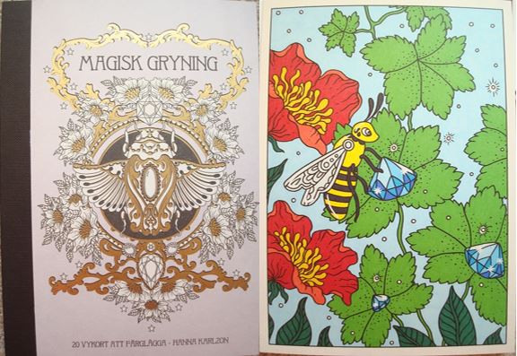
Magisk Gryning

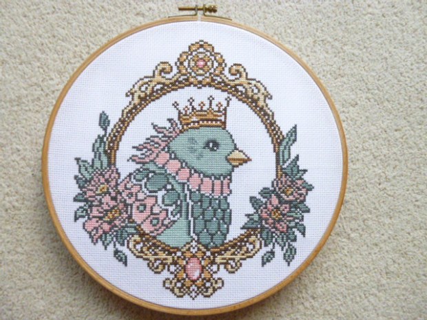
Queen of the Skies Cross Stitch Kit by Hanna Karlzon and The Folklore Company - Click through to read the review and see photos

Queen of the Skies Cross Stitch Kit – A Review

This kit was created and very kindly sent to me to review by The Folklore Company, who create fabulous embroidery and cross stitch kits. I’ve loved cross stitch since I was a child but haven’t done any in nearly 10 years but when I found out that The Folklore Company had teamed up with one of my favourite colouring book artists, Hanna Karlzon, I just knew I’d have to start up again! This design is available in two formats, the normal cross stitch format which is what I’m reviewing here or a tote bag with a special dissolvable plastic that allows you to sew on it as if it were aida fabric and then dissolve the plastic in water afterwards just leaving the stitches in place on the bag. I wish I’d asked to review that kit now because this design is beautiful and would look stunning on a bag!

The kit arrives well packed in a clear plastic packet and contains everything you need to get started apart from a small pair of scissors and an embroidery hoop, I’d personally recommend one that’s around 26cm in diameter, mine is this size and I haven’t had to move it once as the design fits within this space preventing lots of creasing and possible damage to stitching by having to move the hoop around whilst working. The kit contains Aida fabric, more than large enough to fit the design on and with plenty of space to fit whatever size hoop you have to hand, a needle (in a small plastic packet), 3 sheets of paper including the pattern and instructions, printed in colour and double-sided, and 10 different colour embroidery flosses. The instructions give clear guidelines for newbies as well as seasoned stitchers about where to begin, how to sew without using knots and handy tips about not getting show-through from dark threads and trailing colours when needed. The pattern is clear and printed just about large enough for those with most levels of visual acuity. I don’t know what everyone else’s technique whilst cross-stitching is but I always like to colour over the pattern when stitching to be sure that I know what I have and haven’t sewn which helps me avoid mistakes. I didn’t want to do this on the pattern itself so I photocopied it and have scribbled my way through that instead. The pattern is divided into 4 quarters each printed on a single piece of A4 though these are printed double-sided so unless you photocopy it, you can’t lay out the whole pattern at once and match it up. The pattern also doesn’t reach the edges of the paper which can make lining things up a little tricky, you certainly won’t want to swap quarters whilst tired or you’re likely to make mistakes. Each thread is allocated a symbol in the key and these are then shown on the pattern, all of these are well chosen and differ strongly from each other so you won’t get confused or accidentally misread the symbols and start sewing in the wrong colour. My only niggle with the symbols is the black square used for the dark grey thread as this is very difficult to colour over/around to indicate that I’ve sewn those areas and I do keep having to really study the pattern to check exactly what I have and haven’t done rather than being able to check with a glance like I’m able to with all of the other symbols and thread colours. This is a very minor criticism and will likely only affect people who cross-stitch in the same way as me. The only other difficulty is that the crossover sections on each page of the pattern aren’t totally clear, the lines for the edge of the diagram cross halfway through the symbols and these can be a little challenging to see and decipher but again, this is a minor issue and only affects the central crossing vertical and horizontal line so it is pretty minor in the grand scheme of the diagram and pattern.

All of the stitches in this pattern are full crosses, there are no quarter, half, or three-quarter cross stiches and no running/back stitch outlines either so the whole design is neatly made from full crosses which I personally prefer as I can never neatly sew partial cross stitches. The instructions suggest that you start in the very centre which is the middle of the bird and this is indeed where I started. It then suggests that you work through each quarter but I don’t work so well like that so I did the majority of the bird, then the outline of the top of the frame, then the bottom, then filled those in and then did the flowers outlining them first and then filling them in and finally finished off with the flower centres. There’s no right or wrong way of sewing, just make sure that you’ve centred the design correctly and that you double check your counting if you do separate sections to ensure that they will join up in the right places later. Having now finished the whole piece, I have a lot of thread left over so you’re given plenty of each one and don’t need to worry about running out. The darkest two colours were used by far the most and I don’t have a huge amount left but as long as you’re not very wasteful with them or trailing them across the design a lot, you definitely won’t run low on them and the others I’ve got loads left of.

In terms of mental health, cross stich generally is really good because you have to focus fully on the pattern to ensure you sew it correctly and the motion of sewing is very calming and therapeutic. This pattern is great for mental health because it’s a really good level of difficulty, it’s not so small that you can complete it in a day or two but it’s also not so big that you’ll get bored or feel like you’re not making progress. There are quite a lot of colour changes and not so many large blocks of the same colour but while this means you have to swap threads a fair bit, it also means that it keeps you interested and there isn’t lots of repetition. The colour choices are lovely and quite muted but not dull, they’re a great choice for aiding calm feelings and they’ll go nicely with lots of different décor if you want to frame and display it after you’ve finished. The design does require a pretty good level of concentration, especially the frame sections so you will need to sew on good days and those where your functioning is high. Alternatively, you could just sew for short periods of time to avoid making mistakes but still get your stitching fix. My anxiety disorders mean that I often struggle to concentrate for long periods of time and my vision is often affected which makes reading and following cross stitch patterns a real challenge, to combat this I tried to make sure not to sew when I was tired and to always sew in good light, either daylight or with a bright light near me and I double-checked all counting and regularly checked that what I’d sewn was correct with the pattern, as well as colouring over the pattern in pencil for every few stitches I’d done. This meant that I only made one mistake in the whole thing and that was just one stitch that no one would ever notice so I’m really pleased, this is the first time I’ve ever managed to do a whole project and not make a noticeable mistake!

If you photocopy the pattern before scribbling all over it like I did then it would be possible to reuse it in future and you could even change the colour scheme to create personalised projects that would match your own décor or favourite colours. Each colour only needs one skein of thread so it would be very easy to reuse the pattern and make heaps of beautiful birds if you wished. For those of you who are from the colouring community, you might be interested to know that this design isn’t an exact replica of one of Hanna’s drawings but rather a combination of two, both from a double-page spread in Magisk Gryning (Magical Dawn), her third colouring book and a photo of these can be found below. Before you ask, yes, I did spend ages trawling through all of her books to find it because I was almost certain I’d seen the image before!

Overall, I would highly recommend this cross stitch kit, it’s a beautiful design, lovely colours, and a great level of difficulty that’s not too simple or too challenging. I like it so much that I’m hoping to recreate it in future with a totally different colour scheme but for now, I’m hoping to frame this one and have it in pride of place in my flat, it’s a great reminder of what you can accomplish, even whilst very poorly. This kit would suit seasoned stitchers, as well as complete beginners who are up for a challenge!

If you’d like to purchase a kit, they’re available here: Queen of the Skies Cross Stitch Kit
Tidevarv (Seasons) Målarbok – A Review

Disclaimer – Please read this disclosure about my use of affiliate links which are contained within this post.
Tidevarv is the fourth instalment of colouring books illustrated by Hanna Karlzon and published and kindly sent to me to review by Pagina Förlag. I have previously reviewed Hanna’s first three books, Dagdrömmar (Daydreams), Sommarnatt (Summer Nights), and Magisk Gryning (Magical Dawn). The latest book is identical in format so if you already have a previous title of hers then skip to paragraph two, for those of you who are new to her work, this book is hardback and just a little smaller than A4 at 21.6 x 25.8 cm. The covers are a beautiful lemon yellow colour with a black and white design from inside the book with gold foiling accents and lettering adding a touch of luxury! The spine of the book is black with gold lettering (these books look really luxurious on the shelf and look like classic tomes). The pages are glue and string-bound and the pages are attached to a sturdy ribbon which is flexible rather than being rigidly glued to the hardback spine; the spine is durable and hard-wearing but it can be a bit difficult to get to the very centre of some of the pages though this does ease up with use. The paper is thick, cream and smooth and pencils work fairly well on it, with it being relatively easy to build up layers for blending and shading; water-based pens don’t bleed or shadow (always test somewhere inconspicuous because everyone colours differently). The illustrations are printed double-sided and consist of single and double-page spreads.

The image content is gorgeous, varied, and possibly the best yet! This time, they’re organised into four sections of season-themed images starting with Spring and ending with Winter. The vast majority of the images are heavily nature-centred and realistically drawn but with Hanna’s signature quirkiness and magic added to them with gemstone fruit, anthropomorphised animals, and hair morphing into fruit, florals and even migrating geese. This book contains the second largest number of women (18) with seasonal accessories, beautiful headdresses, piercings and tattoos, these are in my opinion, the best drawings of women that Hanna has given us so far, they’re beautiful and so inventive, and in keeping with the seasonal theme, however, if you’re not interested in colouring people then don’t despair, these are not the majority of the images and there are loads of images of animals, flowers, plants, fruit and lots of gemstones as always! There is so much content in each of these books, it’s hard to sum it all up in a written description but the book contains everything from potion bottles, birds, mushrooms, seedlings, beetles, and mice, to snakes, fish, berries, cats, candles, houses, lanterns, Christmas baubles, presents and stars, it’s absolutely jam-packed with content. The illustrations are all highly decorative and ornate, they are beautiful in black and white but they’re completely brought to life with colour! Hanna’s work has always been beautiful but the added theme of seasons is spectacular, it’s really brought a new dimension to her work and has led to some really creative and beautiful illustrations.

In terms of mental health, this book is just wonderful, it offers escapism, natural imagery and lots of whimsy and it’s perfect for distraction even just by looking through the images! The line thickness is consistent throughout and remains medium/thin so it’s definitely manageable to colour. The intricacy and detail vary throughout and mostly range from medium to high but a few have much larger open spaces. The detail is part of what makes Hanna’s work so special and beautiful, if you’re wanting to colour within each teeny tiny section then you’ll need to have very good vision and fine motor control but if you’re happy to colour over some of it and use it as texture underneath then moderate vision and fine motor control would be absolutely fine! Unlike Hanna’s first book Daydreams, this book doesn’t contain any outline images or written prompts. This may be a welcome change for those of you who don’t like to draw. A number of the images are centralised and have large surrounding spaces so there are plenty of opportunities to create your own backgrounds if you wish, though of course this isn’t a requirement! I found this book and the illustrations within it great for my mood, just looking through it and noticing all of the different details, patterns and creatures makes me feel calmer and the images are just charming so they’re sure to lift your mood and keep you distracted from any difficult thoughts or persistent symptoms. The images do vary in size and difficulty and they consist of a mixture of collections of components, portraits and scenescape images. This makes it ideal for good and bad days because you can work on one gem or potion bottle on a bad day, or a whole page on a good day so it’s ideal for those with fluctuating conditions or concentration levels.

I would highly recommend this book to anyone who loves natural images, highly ornate illustrations, and anyone who likes all things pretty or magical. Hanna’s books are genuinely stunning and some of my favourites, I love just looking through them and this is definitely my favourite with the seasonal theme, it’s added another dimension and gives the book more flow.

If you’d like to purchase a copy it’s available right now from Sweden from the site below and if you use my exclusive discount code Lucy_PW you’ll get a 10% discount on all items in the Book category until the 8th of June 2017.
www.printworksmarket.com

The image below was coloured using Holbein Artists’ Colored Pencils and Prismacolor Premier Coloured Pencils.

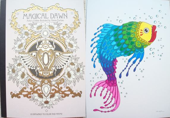
Magical Dawn Artist’s Edition (Magisk Gryning Tavelbok) – A Review

Disclaimer – Please read this disclosure about my use of affiliate links which are contained within this post.
Magical Dawn Artist’s Edition is illustrated by Hanna Karlzon and published and kindly sent to me to review by Gibbs Smith. This book was originally published in Sweden under the title Magisk Gryning Tavelbok and this book is identical, apart from the language. This Artist’s Edition is also identical in format to those published for Hanna’s other books, Daydreams, and Summer Nights and therefore my review is mostly identical apart from the content section and the photos. The book measures 29.5x21cm (A4), it’s paperback with thick but flexible card covers which are a pale mauve colour (not identical to the book which is paler and more lilac) with black and white line drawings of Hanna’s flowers and a beetle with gold foiling accents on the front and back. The book has a black tape binding meaning the pages lie completely flat when the book is open and they can be removed for framing. The pages are made of thick cream card which is lightly textured and absolutely fabulous for using pencils on as they layer really well and blend seamlessly. Water-based pens also work really well on this card and don’t bleed through or sideways and there isn’t even a hint of shadowing either. The 20 illustrations are all single-page designs and are printed single-sided so you can use whatever medium you fancy without worrying about bleed-through.

The illustrations chosen are a really good cross-section of images from the Magical Dawn colouring book, there’s a huge range of content, all with a magical theme, including moths, a regal swan, a crown, birds, potion bottles, animal portraits, lanterns, crystal mushrooms and finally, a whopping four of Hanna’s signature female illustrations, the most ever included in an Artist’s Edition. The images are all printed the same size as the original colouring book so if you’re able to colour that, you’ll also be able to colour these with no difficulty and Hanna’s chosen a lovely range that will look incredible finished and framed or gifted to others. All of the images are pictured below so you can check that you’re happy with the choices and see if your favourites are included.

In terms of mental health, this book is just wonderful, seasoned readers of my blog will know that I strongly believe that natural images, and those depicting nature are the best for mental health and calming you down and this book is no exception, the images are very relaxing as well as a little bit magical! The line thickness is consistent throughout and remains medium/thin so it’s definitely manageable to colour. The intricacy and detail vary a little throughout from medium to high and this is part of what makes Hanna’s work so special and beautiful, if you’re wanting to colour within each teeny tiny section then you’ll need to have very good vision and fine motor control but if you’re happy to colour over some of it and use it as texture underneath then moderate vision and fine motor control would be absolutely fine! I found this book and the illustrations within it great for my mood, just looking through it and noticing all of the different details, patterns and creatures makes me feel calmer and the images are just charming so they’re sure to lift your mood and keep you distracted from any difficult thoughts or persistent symptoms. The images do vary a little in size and difficulty and they mostly consist of a collection of components which is ideal for good and bad days because you can work on one tiny potion bottle or moth on a bad day, or a whole page on a good day so it’s ideal for those with fluctuating conditions or concentration levels. The fact that the pages are printed single-sided and are removable is fantastic because it means you can remove your works of art and frame them or gift them which is a great way of reminding yourself of what you can achieve and brighten up the darkest of days.

I would highly recommend this book to those of you who are already fans of Hanna’s work and have the original book, those who love to gift or frame their colouring, and those who like to use alcohol markers or wet media as there’s no worry about ruining any reverse images. The illustrations chosen are beautiful, a wonderful cross-section and very calming.

If you’d like to purchase a copy, it’s available to pre-order here:
Amazon UK – Magical Dawn Artist’s Edition
Book Depository Worldwide – https://www.bookdepository.com/Magical-Dawn-Hann-Karlzon/9781423646600/?a_aid=colouringitmom

The image below was coloured using Stabilo Point 88 Fineliners and Stabilo 68 Fibre-Tip Pens.

Magisk Gryning 20 Vykort (Magical Dawn 20 Postcards) – A Review

Disclaimer – Please read this disclosure about my use of affiliate links which are contained within this post.
Magisk Gryning 20 Vykort are illustrated by Hanna Karlzon, and published and kindly sent to me to review by Pagina Förlag. These postcards are taken from Hanna’s original colouring book Magisk Gryning/Magical Dawn (reviewed by me here), there is also an artist’s edition available. This postcard book contains 20 postcards, it’s paperback with thick card covers and a black tape binding. The cover is the same colour and design as the original book but printed on a smaller scale with the same luxurious gold foil accents. The book has a lay flat binding meaning there is no spine to contend with so you’re able to reach and colour the entirety of the image; the postcards are easy to remove if you wish so they can be sent or gifted or even framed but they’ll stay in the book as long as you’re careful not to twist the spine. The cards are a cream colour which looks quite vintage, it’s fairly smooth with a light texture and is perfect for blending and shading with pencils but pens glide over it seamlessly too. Alcohol markers won’t bleed if you’re careful and they don’t spread, they do shadow onto the reverse so bear this in mind if you’re wanting to write on the back. The postcards are printed single-sided and on the reverse are printed three address lines and space for a stamp with a little star motif within it. The drawings mostly have a small border around them but 6 are full page, they will be pretty easy to frame if you wish to do so. The illustrations are all very similar to those used in the Daydreams and Winter Dreams postcard sets in terms of intricacy level and content, none are impossible to colour and all will look beautiful when finished. The images are mostly nature-based but a number of them are magic-themed and for the second time Hanna has included female drawings, four have been included this time which is a lovely addition. There aren’t a lot of gems in this selection but the illustrations do contain a really good variety of things from birds to potion bottles, jewellery to cats, females to sand timers and beetles to flowers, this postcard set possibly contains the widest ranging content of all of Hanna’s postcards. They’ve all got a bit of added whimsy and fantasy which is a huge part of what gives Hanna’s images such charm and sets them apart from others, they’re just beautiful, even without colour added!

In terms of mental health, these postcards are just perfect! Postcards offer a smaller project which is less daunting to start and takes far less time to make progress on or finish than a full book page. The card is ideal for using any mediums and because they’re single-sided they’re perfect for framing so you can brighten up your darker days by just looking at all of the wonderful pages you’ve created, a great way of lifting your spirits. These postcards are fantasy-based which means they offer great escapism and distraction from difficult thoughts or symptoms, Hanna’s images really absorb you and transport you to far off lands and magical places. Fantasy images are great for those of you who don’t like being restricted with colour schemes and they’re a good challenge for those of you who like to colour things realistically as you can really let your hair down and use any colours you fancy for feline princesses or crystal mushrooms, there’s no right or wrong colour scheme and often the more vibrant and outlandish you go, the better the results! The line thickness is consistently thin throughout but it’s not spindly thin. The intricacy and detail levels are pretty high but none of the spaces are impossible to colour. You will need fairly good vision and fine motor control to get the most out of these postcards. As for concentration level, these pages are ideal because their smaller size means they take less concentration and you can focus on individual aspects if you prefer and colour just one gem or potion bottle rather than focusing on the whole picture at once. These postcards are ideal for good and bad days, they’re a manageable size and I personally find them very inspiring and easy to get into without having to stress over colours for hours, I can just dive right in. If you need any inspiration then just search online using Hanna’s name or the book title and you’ll find heaps of ideas to get you going!

Overall, I would highly recommend these postcards, they’re all beautifully illustrated and they’re perfect for days when you’re feeling poorly, down, or your concentration is waning. They make an ideal project to send to others, to frame, or to keep in the book and they’re truly beautiful even just to look through uncoloured! They are a great format for Hanna’s drawings and even if you have the original colouring book, it doesn’t feel samey or stale despite containing the same imagery, the change in scale somehow makes the artwork seem different and lends itself to different colour schemes and the use of different mediums and techniques.

If you’d like to purchase a set they’re available here:
Pen Store – https://www.penstore.com/art-design/magisk-gryning-20-postcards-to-color
Bokus – http://www.bokus.com/bok/9789163612831/magisk-gryning-20-vykort-att-farglagga/

Or you can pre-order the English language version, published in April, here:
Amazon UK – Magical Dawn 20 Postcards
Book Depository Worldwide – https://www.bookdepository.com/Magical-Dawn-20-Postcards-Hann-Karlzon/9781423646617/?a_aid=colouringitmom

The image below was coloured using Sharpie Fine Point Alcohol Markers and a few Promarker Alcohol Markers and the white highlights were added using a White Sakura Gelly Roll Gel Pen.

Magisk Gryning (Magical Dawn) Målarbok – A Review

Disclaimer – Please read this disclosure about my use of affiliate links which are contained within this post.
Magisk Gryning is the third instalment of colouring books illustrated by Hanna Karlzon and published and kindly sent to me to review by Pagina Förlag. I have previously reviewed Hanna’s original two books, Dagdrömmar (Daydreams) and Sommarnatt (Summer Nights). The latest book is identical in format so if you already have a previous title of hers then skip to paragraph two, for those of you who are new to her work, this book is hardback and just a little smaller than A4 at 21.6 x 25.8 cm. The covers are a very pale lilac colour with a black and white design from inside the book with gold foiling accents and lettering adding a touch of luxury! The spine of the book is black with gold lettering (these books look really luxurious on the shelf and look like classic tomes). The pages are glue and string-bound and the pages are attached to a sturdy ribbon which is flexible rather than being rigidly glued to the hardback spine; the spine is durable and hard-wearing but it can be a bit difficult to get to the very centre of some of the pages though this does ease up with use. The paper is thick, cream and smooth and pencils work fairly well on it, with it relatively easy to build up layers for blending and shading; water-based pens don’t bleed or shadow (always test somewhere inconspicuous because everyone colours differently). The illustrations are printed double-sided and consist of single and double-page spreads.

The image content is really varied and utterly beautiful! The pictures are very nature-centred as always but not all of them are realistic or as you’d find nature in real-life and this book has a good heap of magic and mystery in it too. This book contains the largest number of images of women (20) with flowing hair, floral tattoos and piercings but if you’re not interested in colouring people, don’t despair, these are not the majority and there are heaps of images of animals, flowers and plants and lots of gems for those of you who, like me, are addicted to colouring gemstones! There are also loads of potion bottles in this one. It’s hard to describe the sheer amount of content within this book but some of the pages include pictures of birds, jewellery, cats, beetles, arrows, mushrooms, butterflies, moths, sand timers, flowers, and just so much more! The illustrations are all drawn in a very ornate, highly decorative style and they’re just beautiful and they look incredible when coloured! Hanna’s books are pretty similar to each other so it’s difficult to make each review different, a few have criticised them as being same-y but this book has taken a more magical turn and is more human-centred and has lots more gems than the previous titles so those who are fans will still love it but it does also offer a little more variety compared to the first two titles.

In terms of mental health, this book is just wonderful, it offers escapism, natural imagery and lots of whimsy and it’s perfect for distraction even just by looking through the images! The line thickness is consistent throughout and remains medium/thin so it’s definitely manageable to colour. The intricacy and detail vary throughout and mostly range from medium to high but a few have much larger open spaces. The detail is part of what makes Hanna’s work so special and beautiful, if you’re wanting to colour within each teeny tiny section then you’ll need to have very good vision and fine motor control but if you’re happy to colour over some of it and use it as texture underneath then moderate vision and fine motor control would be absolutely fine! Unlike Hanna’s first book Daydreams, this book doesn’t contain any outline images or written prompts. This may be a welcome change for those of you who don’t like to draw. A number of the images are centralised and have large surrounding spaces so there are plenty of opportunities to create your own backgrounds if you wish, though of course this isn’t a requirement! I found this book and the illustrations within it great for my mood, just looking through it and noticing all of the different details, patterns and creatures makes me feel calmer and the images are just charming so they’re sure to lift your mood and keep you distracted from any difficult thoughts or persistent symptoms. The images do vary in size and difficulty and they consist of a mixture of collections of components, portraits and scenescape images. This makes it ideal for good and bad days because you can work on one gem or potion bottle on a bad day, or a whole page on a good day so it’s ideal for those with fluctuating conditions or concentration levels.

I would highly recommend this book to anyone who loves natural images, highly ornate illustrations, and anyone who likes all things pretty or magical. Hanna’s books are genuinely stunning and some of my favourites, I love just looking through them and this is possibly my favourite as it has so many gems and I can’t wait to colour it cover to cover!

If you’d like to purchase a copy it’s available right now from Sweden from the sites below:
Pen Store – https://www.penstore.com/art-design/magisk-gryning
Bokus – http://www.bokus.com/bok/9789163612688/magisk-gryning-malarbok/

Alternatively, if you’re happy to wait, you can pre-order a copy of the English language edition which will be published to the same specifications in April by Gibbs Smith.
Amazon UK – Magical Dawn
Book Depository Worldwide – https://www.bookdepository.com/Magical-Dawn-Coloring-Book-Hann-Karlzon/9781423646594/?a_aid=colouringitmom

The image below was coloured using Holbein Artists’ Colored Pencils.