Lost Ocean

Sprookjesbos vs Vilin San – A Comparison of the Dutch and Croatian Editions

Disclaimer – Please read this disclosure about my use of affiliate links which are contained within this post.
Vilin San was published in January 2018 and illustrated by Tomislav Tomic, it’s the second book he’s illustrated and one of the most beautiful colouring books I’ve ever seen. It was published in Croatia by Fokus and has been notoriously difficult to get hold of, it has almost exclusively been acquired through the publisher’s website which my Facebook fan group runs international group orders from. This is no longer necessary for this book because Sprookjesbos will be available worldwide at a really reasonable price and with much cheaper Worldwide shipping and hopefully it’ll eventually be available on Amazon UK (and possibly other places) like Dromenvanger (the Dutch edition of Zemlja Snova) is now. The artwork is the same in both books but there are a number of subtle publication differences between the two editions which I’ve listed and detailed below, there are three very large differences too which definitely affect enjoyment of the book. If you’d rather watch a video version then scroll all the way to the bottom where the video is embedded at the end of this post.

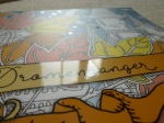
    1. Covers – Sprookjesbos also has a soft-feel cover with glossy accents on the title, artist name and publishing logo. Vilin San has a soft-feel cover with glossy accents on the title, subtext, and artist name. 
    2. Cover Image – The cover images are the same but Vilin San is printed smaller and has a little colour added to the top and bottom. Sprookjesbos has a larger, more zoomed in version of the image with a lot more colour added to it.
    3. Publishing Logo – The publishing logo is bottom centre on the cover of Sprookjesbos and at the top right on Vilin San.
    4. Cover Card – Both books are paperback and both have equally thick card covers.
    5. Back Cover – The back cover of Sprookjesbos consists of the same image as the front cover, again, partially coloured and with the blurb in a ribbon across the centre. The back cover of Vilin San is completely black and white and the blurb is bordered by a frame from the introduction page inside the book.
    6. Inside Covers – Sprookjesbos doesn’t have French Flaps, and the inside covers are blank white. Vilin San has French flaps with black and white artwork and these open out to reveal a bluey-purple and white line drawn illustration front and back.
    7. Spine – The illustrator name and book title are differently ordered on the spines of the different editions, the subtitle is added on Vilin San. They both use completely different fonts. The Publisher logos at the bottom of the spine differ too.
    8. Book Size – Vilin San is slightly wider than Sprookjesbos because of its cover but the pages themselves are exactly the same size.
    9. Thickness – Sprookjesbos is significantly thicker than Vilin San, this is partially due to having thicker paper (more on this later) but also due to much of it being printed single-sided rather than double-sided. Sprookjesbos contains 68 pages whereas Vilin San contains 40 (plus poster).
    10. Binding – Both editions are glue and string-bound.
    11. Language – Vilin san is written in Croatian and Sprookjesbos in Dutch. I don’t read either of these languages so I’m therefore unable to comment on whether the text in each book translates the same, or whether it differs in meaning.
    12. Title – Obviously the titles differ due to language but they also slightly differ in meaning. Sprookjesbos translates as Fairytale Forest and Vilin San translates as Fairy’s Dream.
    13. Publisher – Both editions have been published by different publishing companies (hence all of these subtle differences), Vilin San is published by Fokus Na Hit and Sprookjesbos is published by BBNC Uitgevers.
    14. Paper Colour – The paper in Vilin San is bright white, the paper in Sprookjesbos is cream.
    15. Paper Thickness – The paper in both is quite thick but it’s definitely thicker in Sprookjesbos. Water-based pens heavily shadow in Vilin San but don’t shadow at all in Sprookjesbos. The paper used in Sprookjesbos is, as far as I’m aware, the same paper that BBNC Uitgevers use in all of their colouring books, it’s a little temperamental with oil-based pencils (though others have had great results with these so it may well be my technique or lack of patience) and beautiful for pens and soft pencils like Prismacolor Premiers.
    16. Copyright Page – The information is much more spread out on the page in Vilin San and is contained to the bottom half of the page in Sprookjesbos. The page is at the front, as usual, in Vilin San, but it’s the last page at the back of the book in Sprookjesbos.
    17. Image Order – The images in Sprookjesbos are printed in exactly the same order as Vilin San apart from one double-page spread containing a flying bird which has been moved from very near the end to the centre of the book, all other pages are in the same order. This doesn’t remotely affect the enjoyment or cohesion of the book.
    18. Image Size – The images in both books are exactly the same size throughout.
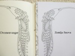
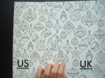
    19. Image Orientation – The images are spaced slightly differently between the books with a little more or less of the image shown at some edges on some pages when compared to each other, see photos for clarification.
    20. Weight – Vilin San weighs less than Sprookjesbos, it weighs 317g compared to 463g.
    21. Availability – Vilin San is extremely difficult to get hold of outside Croatia and is one of the hardest colouring books on the market to obtain. We have run international group orders through the publisher’s site for the last 9 months but this isn’t easy and has all but dried up recently. Sprookjesbos is easier to get hold of with cheaper shipping from the sites below and hopefully it’ll become easier still if it makes its way to Amazon UK like Dromenvanger has. It’s likely to take weeks or even months to get there but hopefully, eventually, it’ll be easier to purchase.
    22. Poster – Vilin San contains a beautiful 4-page poster that opens out into a huge scene. Sprookjesbos doesn’t include this or the imagery so sadly, you can only get that with Vilin San.
      Vilin San (Fairy's Dream) by Tomislav Tomic click through to read my review, see photos, see my video flip through and enter a giveaway for a copy!Vilin San (Fairy's Dream) by Tomislav Tomic click through to read my review, see photos, see my video flip through and enter a giveaway for a copy!Vilin San (Fairy's Dream) by Tomislav Tomic click through to read my review, see photos, see my video flip through and enter a giveaway for a copy!
    23. Book Layout – Vilin San is entirely printed double-sided. Sprookjesbos is printed single-sided for the majority of the book.

As you’ll have seen, there are a lot of subtle differences between the editions but hardly any of them affect use, in fact the only three that really do are the paper, the printing being single or double-sided and the lack of poster in Sprookjesbos. The single-sided printing really opens up your options for colouring because you can use so many different mediums that can’t be used when printing is double-sided. Although it’s a real shame that the poster artwork isn’t included in Sprookjesbos, and it’s a shame in some ways that the paper is cream, I know a lot of people love crisp, white paper, but this paper is thicker and ideal for water-based pens and pencils and with the (hopefully) increased accessibility, I will now forever be suggesting that people get a copy of Sprookjesbos. This new edition is beautiful and for those of you who already have Vilin San and are wondering about getting this new edition, or a second copy, I’d say definitely get a copy of Sprookjesbos, it’s beautifully produced, the illustrations look lovely on the new paper and it’s so much easier to get hold of and if you’re anything like me, you’ll want a copy of the new edition just because it’s a bit different, I truly am a colouring book hoarder!

If you’d like to purchase a copy of Sprookjesbos, it can be found at these sites:

Amazon UK – Sprookjesbos
https://www.bbnc.nl/sprookjesbos?search=sprookjesbos
https://www.bol.com/nl/p/sprookjesbos/9200000095550239/?suggestionType=browse&bltgh=imC0m1ReS55T4YWuif5OWg.1.2.ProductTitle
https://www.bookspot.nl/boeken/sprookjesbos-tomislav-tomic-9789045323527
https://www.boekhandelsmit.nl/9789045323527/tomic-tomislav/sprookjesbos/
https://www.libris.nl/boek/?authortitle=tomislav-tomic/sprookjesbos–9789045323527/
http://www.dinternet.nl/Boek/Tomislav–Tomic/Sprookjesbos/9789045323527.html

Video Comparison Post

Dromenvanger and Zemlja Snova, a Comparison of the Dutch and Croatian editions, click through to see photos and read about the differences!

Dromenvanger vs Zemlja Snova – A Comparison of the Dutch and Croatian Editions

Disclaimer – Please read this disclosure about my use of affiliate links which are contained within this post.
Zemlja Snova was published in 2016 and illustrated by Tomislav Tomic, it’s one of the most beautiful colouring books I’ve ever seen and still vies for the title of my most favourite colouring book ever. It was published in Croatia by Fokus and has been notoriously difficult to get hold of after it was quickly taken off Amazon and has almost exclusively been acquired since then through the publisher’s website which my Facebook fan group runs international group orders from. This is no longer necessary for this book because Dromenvanger will (hopefully) be available worldwide at a really reasonable price (around £12 or $15) with free worldwide delivery from Book Depository, when I originally wrote this post two days ago it was available for pre-order there, it’s currently showing as unavailable however, I’m hoping that this might just be a stock issue and that it will be rectified soon. The website allows you to sign up for email alerts of stock so do click through and sign up to be the first to hear when it’s available to order. The artwork is the same in both books but there are a number of subtle publication differences between the two editions which I’ve listed and detailed below. If you’d rather watch a video version then scroll all the way to the bottom where the video is embedded at the end of this post. This is a long post because there are so many pictures included to illustrate each point but please bear with me because a lot of time and effort has gone into being as thorough as possible. Most of the things I’ve noticed don’t affect the enjoyment or use of the book, they’re just differences but there are a few items that are fundamentally different and do affect use so keep an eye out for those. The publisher has very kindly provided me with an extra copy of Dromenvanger which I’m currently running a Worldwide giveaway for on my blog until 23.59 GMT on the 31st of October, to enter please click here.

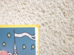
  1. Covers – Zemlja Snova has a soft-feel cover with glossy accents on the title and subtext. Dromenvanger also has a soft-feel cover with glossy accents on the title and all of the stars.
    Dromenvanger and Zemlja Snova, a Comparison of the Dutch and Croatian editions, click through to see photos and read about the differences!Dromenvanger and Zemlja Snova, a Comparison of the Dutch and Croatian editions, click through to see photos and read about the differences!
  2. Cover Image – The cover images are totally different, Zemlja Snova has a partially coloured image on the front that is similar to the art in the book but isn’t a direct copy of a page. Dromenvanger has a partially coloured image from inside the book.
    Dromenvanger and Zemlja Snova, a Comparison of the Dutch and Croatian editions, click through to see photos and read about the differences!
  3. Publishing Logo – The publishing logo is bottom centre on the cover of Dromenvanger and at the bottom right on Zemlja Snova.
    Dromenvanger and Zemlja Snova, a Comparison of the Dutch and Croatian editions, click through to see photos and read about the differences!Dromenvanger and Zemlja Snova, a Comparison of the Dutch and Croatian editions, click through to see photos and read about the differences!
  4. Cover Card – Both books are paperback and both have equally thick card covers.
    Dromenvanger and Zemlja Snova, a Comparison of the Dutch and Croatian editions, click through to see photos and read about the differences!
  5. Inside Covers – Zemlja Snova has French Flaps with black and white artwork and these open out to reveal a purple and white line drawn illustration front and back. Dromenvanger doesn’t have French Flaps, and the inside covers are blank white.
    Dromenvanger and Zemlja Snova, a Comparison of the Dutch and Croatian editions, click through to see photos and read about the differences!Dromenvanger and Zemlja Snova, a Comparison of the Dutch and Croatian editions, click through to see photos and read about the differences!
  6. Back Cover – The back cover of Dromenvanger is partially coloured and shows a reverse version of the front cover image. The back cover of Zemlja Snova is completely black and white and the blurb is bordered by a frame from inside the book.
    Dromenvanger and Zemlja Snova, a Comparison of the Dutch and Croatian editions, click through to see photos and read about the differences!
  7. Spine – The illustrator name and book title are differently ordered on the spines of the different editions. They both use completely different fonts. The Publisher logos at the bottom of the spine differ too.
    Dromenvanger and Zemlja Snova, a Comparison of the Dutch and Croatian editions, click through to see photos and read about the differences! Dromenvanger and Zemlja Snova, a Comparison of the Dutch and Croatian editions, click through to see photos and read about the differences!
  8. Book Size – Dromenvanger is slightly smaller than Zemlja Snova. The pages in both copies are the same width (the Zemlja Snova covers extend further), but not the same height with Dromenvanger being approximately 5mm shorter, possibly less.
    Dromenvanger and Zemlja Snova, a Comparison of the Dutch and Croatian editions, click through to see photos and read about the differences! Dromenvanger and Zemlja Snova, a Comparison of the Dutch and Croatian editions, click through to see photos and read about the differences!
  9. Thickness – Dromenvanger is thicker than Zemlja Snova due to having thicker paper (more on this later).
    Dromenvanger and Zemlja Snova, a Comparison of the Dutch and Croatian editions, click through to see photos and read about the differences!
  10. Binding – Both editions are glue and string-bound, Zemlja Snova is more heavily glued than Dromenvanger.
    Dromenvanger and Zemlja Snova, a Comparison of the Dutch and Croatian editions, click through to see photos and read about the differences!
  11. Language – Zemlja Snova is written in Croatian and Dromenvanger in Dutch. I don’t read either of these languages so I’m therefore unable to comment on whether the text in each book translates the same, or whether it differs in meaning.
    Dromenvanger and Zemlja Snova, a Comparison of the Dutch and Croatian editions, click through to see photos and read about the differences!Dromenvanger and Zemlja Snova, a Comparison of the Dutch and Croatian editions, click through to see photos and read about the differences!
  12. Title – Obviously the titles differ due to language but they also slightly differ in meaning. Dromenvanger translates as Dream Catcher and Zemlja Snova translates as Dreamland or Land of Dreams.
    Dromenvanger and Zemlja Snova, a Comparison of the Dutch and Croatian editions, click through to see photos and read about the differences!Dromenvanger and Zemlja Snova, a Comparison of the Dutch and Croatian editions, click through to see photos and read about the differences!
  13. Publisher – Both editions have been published by different publishing companies (hence all of these subtle differences), Zemlja Snova is published by Fokus Na Hit and Dromenvanger is published by BBNC Utigevers.
    Dromenvanger and Zemlja Snova, a Comparison of the Dutch and Croatian editions, click through to see photos and read about the differences!Dromenvanger and Zemlja Snova, a Comparison of the Dutch and Croatian editions, click through to see photos and read about the differences!
  14. Paper Colour – The paper in Zemlja Snova is bright white, the paper in Dromenvanger is cream.
    Dromenvanger and Zemlja Snova, a Comparison of the Dutch and Croatian editions, click through to see photos and read about the differences!
  15. Paper Thickness – The paper in both is quite thick but it’s definitely thicker in Dromenvanger. Water-based pens heavily shadow in Zemlja Snova but don’t shadow at all in Dromenvanger. The paper used in Dromenvanger is, as far as I’m aware, the same paper that BBNC Utigevers use in all of their colouring books, it’s a little temperamental with oil-based pencils (though others have had great results with these so it may well be my technique or lack of patience) and beautiful for pens and soft pencils like Prismacolor Premiers.
    Dromenvanger and Zemlja Snova, a Comparison of the Dutch and Croatian editions, click through to see photos and read about the differences!Dromenvanger and Zemlja Snova, a Comparison of the Dutch and Croatian editions, click through to see photos and read about the differences!
  16. Copyright Page – The information is much more spread out on the page in Zemlja Snova and is contained to the bottom half of the page in Dromenvanger.
    Dromenvanger and Zemlja Snova, a Comparison of the Dutch and Croatian editions, click through to see photos and read about the differences!
  17. Image Order – The pages in Dromenvanger are identically ordered to the correct, later editions of Zemlja Snova, the original editions had three double-page spreads that were split in the book, this issue has been rectified in later printings and in Dromenvanger.
    Dromenvanger and Zemlja Snova, a Comparison of the Dutch and Croatian editions, click through to see photos and read about the differences!Dromenvanger and Zemlja Snova, a Comparison of the Dutch and Croatian editions, click through to see photos and read about the differences!Dromenvanger and Zemlja Snova, a Comparison of the Dutch and Croatian editions, click through to see photos and read about the differences!
  18. Image Size – Oddly, the first few frames on the ancillary pages at the beginning are larger in Zemlja Snova than Dromenvanger but the actual illustrations of the book are identical sizes on the many images I measured to check.
    Dromenvanger and Zemlja Snova, a Comparison of the Dutch and Croatian editions, click through to see photos and read about the differences!Dromenvanger and Zemlja Snova, a Comparison of the Dutch and Croatian editions, click through to see photos and read about the differences!Dromenvanger and Zemlja Snova, a Comparison of the Dutch and Croatian editions, click through to see photos and read about the differences!Dromenvanger and Zemlja Snova, a Comparison of the Dutch and Croatian editions, click through to see photos and read about the differences!Dromenvanger and Zemlja Snova, a Comparison of the Dutch and Croatian editions, click through to see photos and read about the differences!Dromenvanger and Zemlja Snova, a Comparison of the Dutch and Croatian editions, click through to see photos and read about the differences!
  19. Image Orientation – The images are spaced slightly differently between the books with a little more or less of the image shown at some edges on some pages when compared to each other, see photos for clarification.
    Dromenvanger and Zemlja Snova, a Comparison of the Dutch and Croatian editions, click through to see photos and read about the differences!Dromenvanger and Zemlja Snova, a Comparison of the Dutch and Croatian editions, click through to see photos and read about the differences!
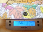
  20. Weight – Zemlja Snova weighs less than Dromenvanger, it weighs 527g compared to 561g (ish, one of my copies was 565g).
    Dromenvanger and Zemlja Snova, a Comparison of the Dutch and Croatian editions, click through to see photos and read about the differences!Dromenvanger and Zemlja Snova, a Comparison of the Dutch and Croatian editions, click through to see photos and read about the differences!Dromenvanger and Zemlja Snova, a Comparison of the Dutch and Croatian editions, click through to see photos and read about the differences!
  21. Availability – Zemlja Snova is extremely difficult to get hold of outside Croatia and is one of the hardest colouring books on the market to obtain. We have run international group orders through the publisher’s site for the last year but this isn’t easy. It was looking very hopeful that Dromenvanger was going to be much easier to access because it was listed on Book Depository, however, yesterday it changed to saying it was currently unavailable and some people who’ve pre-ordered it have been given refunds because Book Depository don’t know when they’ll get stock in. I’m really hoping that this issue will be resolved quickly and I will be sure to update this post asap when I know more. You can sign up for email updates about stock at the link below to book depository so that you’re the first to know when it’s back and if you can’t wait it’s available from Dutch site Bol. It’s definitely worth the wait for a copy because Book Depository will have free worldwide delivery and were charging a fraction of the price compared to getting a copy of Zelmja Snova out of Croatia and to your front door. We will still be running group orders for the new book (title unknown currently) and if you’d like to join these and know more then please do join my FB fan group where we will post any information as soon as we know it.

As you’ll have seen, there are a lot of subtle differences between the editions but hardly any of them affect use, in fact the only one that really does is the paper. It’s a shame in some ways that it’s cream, I know a lot of people love crisp, white paper, but this paper is thicker and ideal for water-based pens and pencils and with the (hopefully) increased accessibility, I will now forever be suggesting that people get a copy of Dromenvanger. My fingers are now very tightly crossed hoping that BBNC Utigevers will acquire the rights to the next book by Tomislav Tomic so that it too becomes easily accessible. This new edition is beautiful and for those of you who already have Zemlja Snova and are wondering about getting this new edition, or a second copy, I’d say definitely get a copy of Dromenvanger, it’s beautifully produced, the illustrations look lovely on the new paper and it’s so much easier to get hold of and if you’re anything like me, you’ll want a copy of the new edition just because it’s a bit different, I truly am a colouring book hoarder!

Amazon UK – Dromenvanger 
Book Depository Worldwide – https://www.bookdepository.com/book/9789045321868/?a_aid=colouringitmom
Bol.com – https://www.bol.com/nl/p/dromenvanger/9200000080026444/?suggestionType=typedsearch#modal_open

You can see my videos of unboxing the book, and a silent flick-through of the book if you click on the relevant words.

Don’t forget, I’m running a Worldwide giveaway to win a copy of Dromenvanger by Tomislav Tomic, to enter click here by 23.59 GMT on October the 31st.

Johanna’s Christmas: A comparison between the UK and US editions

Disclaimer – Please read this disclosure about my use of affiliate links which are contained within this post.
Johanna’s Christmas was released in the UK and US last week and after the huge online debates surrounding the differences between the UK and US editions of her previous books I thought I’d do a comparison of them both as my previous comparisons of Lost Ocean and Magical Jungle were very successful. I was unable to get review copies so I have purchased the US edition from Book Depository and the UK edition from Amazon UK (purchase links below). I have heard that there are issues with some UK editions which have been printed in China, my copy was printed in Italy (more info below).

This is a long post because there are so many pictures included to illustrate each point but please bear with me because a lot of time and effort has gone into being as thorough as possible. Most of the things I’ve noticed don’t affect the enjoyment or use of the book, they’re just differences but there are a few items that are fundamentally different and do affect use so keep an eye out for those, they’re summarised at the bottom. Some of the very noticeable differences include size and paper type so here goes with the most comprehensive list of similarities and differences that you’re likely to find online!

  1. Dust Jacket – This is usually one of the biggest differences between the editions, with the UK version usually having a removable dust jacket and the US edition having it attached. This time we have a break in convention and both the UK and US edition have attached covers, with no removable dust jacket. I think this is a shame as I’ve loved the removable dust jackets but there you go, neither has them.
    johannas-christmas-1-dust-jacket-1 johannas-christmas-1-dust-jacket-2 johannas-christmas-1-dust-jacket-3 johannas-christmas-1-dust-jacket-4 johannas-christmas-1-dust-jacket-5
  2. French Flaps – The inside flaps of the cover are larger in the UK edition. Both editions have a white line-drawn bauble pattern but the UK edition has more baubles printed smaller, the US edition has them cut off a little and printed larger, and the image on the UK front flap is on the back one in the US and vice versa.
    johannas-christmas-2-french-flaps-1 johannas-christmas-2-french-flaps-2 johannas-christmas-2-french-flaps-3
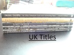
  3. Spine – The UK edition has a black spine with white writing (the same as Secret Garden and UK Lost Ocean and Magical Jungle) and the Virgin books symbol. The US edition has a white spine with black writing and the Penguin books symbol (the same as US Lost Ocean and Magical Jungle).
    johannas-christmas-3-spine-1 johannas-christmas-3-spine-2 johannas-christmas-3-spine-3
  4. Book size – The UK edition is exactly the same size as Johanna Basford’s first two titles (and the same as the UK editions of Lost Ocean and Magical Jungle) – 25cm square, the US edition is slightly larger at around 25.5cm square making it about half a centimetre taller and wider (this is the same size as the US editions of Lost Ocean and Magical Jungle).
    johannas-christmas-4-book-size-1 johannas-christmas-4-book-size-2
  5. Cover colour – The UK cover is bright white, the US cover is ever so slightly off-white though this is only noticeable when placed next to something truly white.
    johannas-christmas-5-cover-colour
  6. Foiling – This is one of the most noticeable differences. The UK edition has stuck with tradition and has gold foiling accents, these are smooth and very shiny and a yellower gold than the UK Magical Jungle foil (this didn’t show up well in photos). Most of the title and lots of aspects of the cover design are foiled. The sheer amount of foiling on the UK edition means that I feel it looks quite tacky and gaudy. The US edition is much more subtle and classy and has a fully foiled title in gold but brand new red and green foiling on the wreath which looks really beautiful!
    johannas-christmas-6-foiling-1 johannas-christmas-6-foiling-2 johannas-christmas-6-foiling-3 johannas-christmas-6-foiling-4 johannas-christmas-6-foiling-5 johannas-christmas-6-foiling-6 johannas-christmas-6-foiling-7 johannas-christmas-6-foiling-8
  7. Spelling differences – As you’d expect, the UK edition has the British spellings throughout of colour etc, the US edition has color (always check your cover as it’s the easiest way of telling if you have a UK or US edition by the spelling of “colouring book”).
    johannas-christmas-7-spelling-differences-1 johannas-christmas-7-spelling-differences-2
  8. Cover design – The image on the cover of the UK edition is ever so slightly smaller and shows a little less all the way around than the US edition, it is not shifted at all like previous covers have been.
    johannas-christmas-8-cover-design-1 johannas-christmas-8-cover-design-2
  9. Blurb – The UK and US editions have completely different blurbs.
    johannas-christmas-9-blurb-1 johannas-christmas-9-blurb-2
  10. Back cover design – The back of the UK edition is identical to the front, minus the foiling. The US edition also has no foiling on the back but the design is printed in a mirror image compared to the front.
    johannas-christmas-10-back-cover-design
  11. Inside covers – On opening out the French flaps, both editions have the same bauble design printed front and back, however the baubles are printed much larger in the UK edition.
    johannas-christmas-11-inside-covers-1 johannas-christmas-11-inside-covers-2
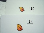
  12. Paper quality – This is one of the biggest differences between the two editions. The paper in each edition is the same as the paper used in that edition of Magical Jungle but they’re not the same as each other. The colour is different, the thickness is different and the surface texture is different. The UK paper is ivory and a much whiter hue, it is a little thinner but feels equally thick as Secret Garden and Enchanted Forest and significantly thicker than Lost Ocean. There is a little tooth but the paper does burnish after a few layers when tested with Polychromos and Prismacolor pencils. The US paper is ivory but a more cream colour though it’s still paler than the cream colour of Secret Garden and Enchanted Forest. The paper is the thickest yet and has a more visible tooth, it took far more layers for blending (see direct comparison below with identical numbers of layers with two polychromos pencils on the red and yellow leaf) and still isn’t totally burnished. In both editions water-based pens behave the same way and the paper in both is beautiful to colour on with pens as they glide really well with no feathering or spreading at all. The UK paper seems like it will shadow faster and more easily than the US edition and while I didn’t experience any shadowing in either, the UK paper did seem like it might with very dark colours if not using a light touch. The US paper is the ‘Johanna Basford’ paper which was created for her books and the UK paper was found by Johanna and her team in a global search for a suitable ivory paper. I personally prefer the colour of the UK edition but the US paper is much easier to use pencils on and is less likely to bleed with water-based pens so I have to recommend that one.
    johannas-christmas-12-paper-quality-1 johannas-christmas-12-paper-quality-2 johannas-christmas-12-paper-quality-3 johannas-christmas-12-paper-quality-4 johannas-christmas-12-paper-quality-5
  13. Page ink quality – Both books have equally permanent ink when tested with Derwent blender and burnishing pencils. Both smudged ever so slightly but I was pressing hard. I haven’t coloured an image in each with pencil yet to be able to state much about ink transfer, however, my US copy arrived with little bits of print transferred onto the opposite page, presumably just from the weight of being in a stack of books so I’d guess it’s not hugely permanent, my suggestion would be to use a scrap piece of paper behind your colouring in either edition of the book just to be safe, especially between the double page spreads.
    johannas-christmas-13-page-ink-quality-1 johannas-christmas-13-page-ink-quality-2 johannas-christmas-13-page-ink-quality-3 johannas-christmas-13-page-ink-quality-4
  14. Image size – The images in the UK edition are printed a fair bit smaller than the US edition (up to 1.5cm overall and yes I measured a number of them with a ruler to check) meaning there is a larger white border around the images in the UK book compared to the US book. This difference hasn’t been especially noticeable in previous books but is visibly different in most images in these editions. Those of you with poorer vision or fine motor control would be best purchasing the US edition as the images are larger throughout, those who prefer intricacy should opt for the UK edition.
    johannas-christmas-14-image-size-1 johannas-christmas-14-image-size-2 johannas-christmas-14-image-size-3 johannas-christmas-14-image-size-4 johannas-christmas-14-image-size-5 johannas-christmas-14-image-size-6 johannas-christmas-14-image-size-7 johannas-christmas-14-image-size-8 johannas-christmas-14-image-size-9 johannas-christmas-14-image-size-10 johannas-christmas-14-image-size-11 johannas-christmas-14-image-size-12 johannas-christmas-14-image-size-13 johannas-christmas-14-image-size-14 johannas-christmas-14-image-size-15
  15. Printing – The UK edition is printed in Italy (predominantly, some much whiter versions seem to be appearing and these have apparently been published in China) and the US edition is printed in the US.
    johannas-christmas-15-printing-1 johannas-christmas-15-printing-2
  16. Image Quality – There was a major issue with pixelation in the UK edition of Magical Jungle, I’m pleased to state that at least in my copy there are no printing issues at all and image quality is equally good in the UK and US editions.
    johannas-christmas-16-image-quality-1 johannas-christmas-16-image-quality-2
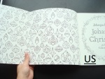
  17. Introduction page – The text on both editions is laid out and justified differently.
    johannas-christmas-17-introduction-page-1 johannas-christmas-17-introduction-page-2
  18. Binding – The UK edition is stitched and lightly glue-bound whereas the US edition is only glue-bound which will make it less durable and can lead to pages falling out.
    johannas-christmas-18-binding
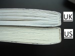
  19. Thickness – The UK edition is noticeably thinner than the US edition, this will be because the paper is thinner in the UK edition. This also makes the UK edition much bendier than the US edition.
    johannas-christmas-19-thickness-1 johannas-christmas-19-thickness-2 johannas-christmas-19-thickness-3 johannas-christmas-19-thickness-4
  20. Weight – The UK edition is also lighter in weight than the US edition. I have weighed them both and the UK edition weighs 488g and the US edition 514g.
    johannas-christmas-20-weight-1 johannas-christmas-20-weight-2
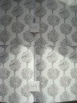
  21. Backing wallpaper colour – Each single-sided design has one of three festive wallpaper designs on the back because Johanna didn’t want the pages to just be blank. In the UK edition these are printed in a darker grey line than the fainter US edition.
    johannas-christmas-21-backing-wallpaper-colour
  22. Backing wallpaper order – The images are single-sided but 5 are arranged into double-page spreads meaning that the preceding double-page is wallpaper. In the UK edition both sides of the spread are the same wallpaper pattern, in the US edition they are each different though the order throughout on the single pages is the same.
    johannas-christmas-22-backing-wallpaper-order-1 johannas-christmas-22-backing-wallpaper-order-2
  23. Perforations – The perforations are better cut and more obvious in the UK edition and the pages are easier to tear out, they are less visible in the US edition and harder to pull out the pages. Both editions are quite difficult to remove the pages from and the section of the page that is left tends to rip as you’re pulling it out so do be very careful when removing pages to avoid any rips to the pages themselves.
    johannas-christmas-23-perforations-1 johannas-christmas-23-perforations-2 johannas-christmas-23-perforations-3 johannas-christmas-23-perforations-4
  24. Page size – The size of the perforated section of the page is different in each edition and actually neither are square which will making framing them a little bit challenging as they’re not a standard shape or size. You’ll either have to matt and layer in a larger frame or cut off some of the edge of the page on the centralised images to make them a standard size. The UK pages measure approximately 23.4cm x 24.9cm. The US pages measure approximately 24.1cm x 25.2cm.
    johannas-christmas-24-page-size-1 johannas-christmas-24-page-size-2 johannas-christmas-24-page-size-3 johannas-christmas-24-page-size-4

To sum up, if you’ve managed to make it this far, the two biggest factors affecting your decisions are these:

  1. Matching set – If you want your copy of Johanna’s Christmas to match Secret Garden, Enchanted Forest and the UK editions of Lost Ocean and Magical Jungle as much as is currently possible (bearing in mind the difference in paper colour, thickness and level of intricacy), then you want the UK edition because it is exactly the same size but it doesn’t have a removable dust jacket. This is also the best copy to purchase if you prefer higher levels of intricacy or more space to add your own drawings and backgrounds.
  2. Larger, easier to colour images and thicker paper– If your vision or fine motor control aren’t perfect then I’d definitely advise purchasing the US edition of Johanna’s Christmas because the extra (up to) 1.5cm in the images will be useful. The paper is thicker and toothier making it best for pen and pencil users, the US edition is superior in almost every way.

Everything else I’ve listed is not a criticism and doesn’t impact use or enjoyment, I’ve just listed all of the differences to make people aware of what they are and to make it easy to identify which copy is which when looking at pictures of it online and elsewhere. In my opinion, the US edition offers a superior colouring experience to the UK edition and if you’re going to purchase just one copy then I’d suggest it be that one. If you notice any other differences then please do get in touch and I’ll add them to the list! Happy Colouring – You’ve definitely earnt it!

You can read my review of the contents of Johanna’s Christmas, including my mental health recommendations here for the UK and here for the US edition. My comparisons of the UK and US editions of Johanna’s other books can be found here – Lost Ocean & Magical Jungle.

If you’d like to purchase a copy of Johanna’s Christmas it’s available here:
UK Edition
Amazon UK – Johanna’s Christmas
Book Depository Worldwide – http://www.bookdepository.com/Johanns-Christmas-Johann-Basford/9780753557563/?a_aid=colouringitmom
US Edition
Amazon UK – Johanna’s Christmas
Book Depository Worldwide – http://www.bookdepository.com/Johanns-Christmas-Johann-Basford/9780143129301/?a_aid=colouringitmom


Magical Jungle: A comparison between the UK and US editions

Disclaimer – Please read this disclosure about my use of affiliate links which are contained within this post.
Magical Jungle was released in the UK and US last week and after the huge online debates surrounding the differences between the UK and US editions of Lost Ocean last year and the popularity of my comparison post of that (found here), I thought I’d do the same for Magical Jungle. I was unable to get review copies so I have purchased the US edition from Book Depository and the UK edition from Amazon UK (purchase links below). I have heard that there are issues with some UK editions which have been printed in China, my copy was printed in Italy (more info below). You can find my review of the UK edition, including the image content etc here.

This is a long post because there are so many pictures included to illustrate each point but please bear with me because a lot of time and effort has gone into being as thorough as possible. Most of the things I’ve noticed don’t affect the enjoyment or use of the book, they’re just differences but there are a few items that are fundamentally different and do affect use so keep an eye out for those, they’re summarised at the bottom. Some of the very noticeable differences include size, print quality and paper type so here goes with the most comprehensive list of similarities and differences that you’re likely to find online!

  1. Dust Jacket –  This is one of the biggest differences between the editions. The UK edition has a removable dust jacket just like the UK editions of the first three books by Johanna Basford. It is a little looser fitting than the first two books and is ivory and a little thinner too (very similar to Lost Ocean but not white like that was). The book itself has bright grass green card covers with a black orchid and leaf design on the outside and inside covers. The US edition has a fully attached white cover made of card which has half size flaps inside that open out revealing the foliage design that is also on the inside of the UK dust jacket. The covers on both editions are fully colourable and matte in texture apart from the inside of the UK dust jacket which is waxy to the touch, this can be coloured with alcohol markers but water-based pens are repelled.
    Magical Jungle 1 Dust Jacket (1) US Magical Jungle 1 Dust Jacket (2) US Magical Jungle 1 Dust Jacket (3) UK Magical Jungle 1 Dust Jacket (4) UK Magical Jungle 1 Dust Jacket (5) UK
  2. French Flaps – The inside flaps of the dust jacket of the UK edition and the cover of the US edition have the same white line foliage drawing but this is printed much larger on the US edition than the UK edition.
    Magical Jungle 2 French Flaps
  3. Spine – The UK edition has a black spine with white writing (the same as Secret Garden and UK Lost Ocean) and the Virgin books symbol. The US edition has a white spine with black writing and the Penguin books symbol.
    Magical Jungle 3 Spine
  4. Book size – The UK edition is exactly the same size as Johanna Basford’s first three UK titles – 25cm square, the US edition is slightly larger (just like the US Lost Ocean) at around 25.5cm square making it about half a centimetre taller and wider.
    Magical Jungle 4 Book Size (1) Magical Jungle 4 Book Size (2) Magical Jungle 4 Book Size (3)
  5. Foil on cover – Both editions have gold foiling on the front but both have different aspects foiled. The UK edition has the tiger, chameleon, orchid and aspects of all three birds covered in foil, the title is partially foiled; the US edition has a few leaves, flowers and the whole toucan foiled instead and the title is fully foiled.
    Magical Jungle 5 Foil on Cover (1) US Magical Jungle 5 Foil on Cover (2) UK Magical Jungle 5 Foil on Cover (3) Magical Jungle 5 Foil on Cover (4) Magical Jungle 5 Foil on Cover (5)
  6. Foiling colour – The foiling is also a different colour and texture – the UK edition has gold foiling that is a darker colour, it’s difficult to describe but it’s more silver and bronze than specifically gold and is smoother to the touch, the US edition has much yellower gold foiling that is slightly rough to the touch.
    Magical Jungle 6 Foiling Colour (1) Magical Jungle 6 Foiling Colour (2)
  7. Spelling differences – As you’d expect, the UK edition has the British spellings throughout of colour etc, the US edition has color (always check your cover as it’s the easiest way of telling if you have a UK or US edition by the spelling of “colouring book”).
    Magical Jungle 7 Spelling Differences
  8. Cover design – The image on the cover of the UK edition is shifted up approximately half a centimetre compared to the US edition.
    Magical Jungle 8 Cover Design (1) Magical Jungle 8 Cover Design (2) Magical Jungle 8 Cover Design (3)
  9. Blurb – The UK and US editions have completely different blurbs.
    Magical Jungle 9 Blurb
  10. Paper quality – This is one of the biggest differences between the two editions. The paper in each edition is different from previous books and different from each other. The colour is different, the thickness is different and the surface texture is different. The UK paper is ivory and a much whiter hue, it is a little thinner but feels equally thick as Secret Garden and Enchanted Forest and significantly thicker than Lost Ocean. There is a little tooth but the paper does burnish after a few layers when tested with Polychromos and Prismacolor pencils. The US paper is ivory but a more cream colour though it’s still paler than the cream colour of Secret Garden and Enchanted Forest. The paper is the thickest yet and has a more visible tooth, it took far more layers for blending (see direct comparison below with identical numbers of layers with two polychromos pencils on the red and yellow leaf) and still isn’t totally burnished. In both editions water-based pens behave the same way and the paper in both is beautiful to colour on with pens as they glide really well with no feathering or spreading at all. The UK paper seems like it will shadow faster and more easily than the US edition and while I didn’t experience any shadowing in either, the UK paper did seem like it might with very dark colours if not using a light touch. The US paper is the ‘Johanna Basford’ paper which was created for her books and the UK paper was found by Johanna and her team in a global search for a suitable ivory paper. I personally prefer the colour of the UK edition but the US paper is much easier to use pencils on and is less likely to bleed with water-based pens so I have to recommend that one.
    Magical Jungle 10 Paper Quality (1) Magical Jungle 10 Paper Quality (2) Magical Jungle 10 Paper Quality (3) Magical Jungle 10 Paper Quality (4) Magical Jungle 10 Paper Quality (5) Magical Jungle 10 Paper Quality (6)
  11. Page ink quality – Both books have equally permanent ink when tested with Derwent blender and burnishing pencils. Both smudged ever so slightly but I was pressing hard and there was very little ink transfer behind the image I fully coloured in the UK edition. My suggestion would be to use a scrap piece of paper behind your colouring in either edition of the book just to be safe.
    Magical Jungle 11 Page Ink Quality (1) Magical Jungle 11 Page Ink Quality (2) Magical Jungle 11 Page Ink Quality (3)
  12. Image size – The images in the UK edition are printed a little smaller than the US edition (up to 1cm overall and yes I measured a number of them with a ruler to check) meaning there is a larger white border around the images in the UK book compared to the US book. This difference isn’t especially noticeable but those of you with poorer vision or fine motor control would be best purchasing the US edition as the images are slightly larger throughout.
    Magical Jungle 12 Image Size (1) Magical Jungle 12 Image Size (2) Magical Jungle 12 Image Size (3) Magical Jungle 12 Image Size (4)
  13. Image orientation – The images in the UK edition are shifted upwards slightly when compared to the US edition, it looks as if both have had a section taken from a slightly larger original image and the UK edition takes the upper part and the US edition takes the lower part, this is very marginal, up to half a centimetre difference, but I noticed it and felt it worth mentioning. This only affects full page designs not any of the centralised images.
    Magical Jungle 13 Image Orientation (1) Magical Jungle 13 Image Orientation (2)
  14. Printing – The UK edition is printed in Italy (predominantly, some much whiter versions seem to be appearing and these have apparently been published in China) and the US edition is printed in the US.
    Magical Jungle 14 Printing (1) Magical Jungle 14 Printing (2)
  15. Image Quality – This is another major difference and issue between the two editions. The US edition has beautifully printed smooth lines which look as crisp as I imagine Johanna’s original drawings look. Sadly, the same can’t be said for the UK edition and before you ask, no I don’t have a bad copy, I’ve checked with a couple of friends and they have the same issues as I do in their UK edition. The lines are slightly pixelated and not smooth. This is the case throughout the book. A relative of mine has a history in book printing and after looking at the two books he said that this difference in print quality is because of the printing method used for the two books. The UK edition has been printed lithographically which often causes slight pixelation and this is present throughout and while it’s not noticeable from a distance (you may not have even noticed it yet in your copy, sorry if I’ve just ruined your enjoyment of it), it does become noticeable when you get closer to the page. It’s a real shame that Johanna’s images haven’t been printed with a completely crisp line. I’ve now looked through my copies of her other titles and this was also present on a few pages in Enchanted forest. This would again lead me to advise purchasing the US edition.
    Magical Jungle 15 Image Quality (1) Magical Jungle 15 Image Quality (2) Magical Jungle 15 Image Quality (3) Magical Jungle 15 Image Quality (4) Magical Jungle 15 Image Quality (5) Magical Jungle 15 Image Quality (6)
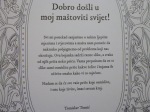
  16. Introduction page – The text on both editions is justified ever so slightly differently and there is an extra comma in the US text.
    Magical Jungle 16 Introduction Page
  17. Binding – The UK edition is stitched and lightly glue-bound whereas the US edition is only glue-bound and because of the fixed cover the binding is much tighter in the US edition. This will ease up with use, especially if you crack or break the spine (I always find this heartbreaking to do), but initially the US edition is much tighter and opens less flat than the UK edition.
    Magical Jungle 17 Binding
  18. Images in key – The key gives the locations of all of the hidden items throughout the book, these are listed in a completely random order in the US edition but in the UK edition they are listed numerically (from largest to smallest number) and alphabetically.
    Magical Jungle 18 Images in Key (1) Magical Jungle 18 Images in Key (2)
  19. Perforated Pages – The four perforated pages at the back of the book are 1cm wider in the US edition than the UK edition.
    Magical Jungle 19 Perforated Pages (1) Magical Jungle 19 Perforated Pages (2)

To sum up, if you’ve managed to make it this far, the two biggest factors affecting your decisions are these:

  1. Matching set – If you want your copy of Magical Jungle to match Secret Garden, Enchanted Forest and the UK edition of Lost Ocean as much as is currently possible (bearing in mind the difference in paper colour and thickness and level of intricacy), then you want the UK edition because it is exactly the same size and also has the distinctive removable dust jacket that we all know and love.
  2. Larger, easier to colour images, thicker paper and crisp linework – If your vision or fine motor control aren’t perfect then I’d definitely advise purchasing the US edition of Magical Jungle because the extra (up to) 1cm in the images will be useful. The paper is thicker and toothier making it best for pen and pencil users and the linework is printed more crisply and neatly so overall, apart from the dust jacket and slight difference in book size, the US edition is superior in almost every way.

Everything else I’ve listed is not a criticism and doesn’t impact use or enjoyment, I’ve just listed all of the differences to make people aware of what they are and to make it easy to identify which copy is which when looking at pictures of it online and elsewhere. In my opinion, the US edition offers a superior colouring experience to the UK edition and if you’re going to purchase just one copy then I’d suggest it be that one. If you notice any other differences then please do get in touch and I’ll add them to the list! Happy Colouring – You’ve definitely earnt it!

You can read my review of the contents of Magical Jungle, including my mental health recommendations here.

If you’d like to purchase a copy of Magical Jungle it’s available here:
UK Edition
Amazon UK – Magical Jungle
Book Depository Worldwide – http://www.bookdepository.com/Magical-Jungle-Johann-Basford/9780753557167/?a_aid=colouringitmom
US Edition
Amazon UK – Magical Jungle
Book Depository Worldwide – http://www.bookdepository.com/Magical-Jungle-Johann-Basford/9780143109006/?a_aid=colouringitmom


Lost Ocean: A comparison of the UK and US editions

Disclaimer – Please read this disclosure about my use of affiliate links which are contained within this post.
Lost Ocean was released worldwide last month and there have been huge online debates about the differences between the UK and US editions and which has the best paper quality, the size of the images, the colour of the paper etc. So, as a reviewer, I thought it best to purchase a copy of each so that I could compare and contrast and give you the ultimate guide to each edition so you can purchase the copy that best suits you. For my review of the content of the book and lots of images from inside please click here. This is a long post because there are so many pictures included to illustrate each point but please bear with me because a lot of time and effort has gone into being as thorough as possible. Most of the things I’ve noticed don’t affect the enjoyment or use of the book, they’re just differences but there are a few items that are fundamentally different and do affect use so keep an eye out for those, they’re summarised at the bottom. When I first flicked through my US edition it looked exactly the same as my UK edition but the closer I looked, the more differences I found (24 in fact) so here goes with the most comprehensive list of similarities and differences that you’re likely to find online!

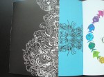
  1. Dust Jacket – This is by far the biggest difference between the editions. The UK edition has a removable dust jacket just like the first two books by Johanna Basford. It is a little looser fitting than the first two books and is bright white and a little thinner too. The book itself has bright blue card covers with a black coral and seaweed design on the outside and inside covers. The US edition has a fully attached white cover made of card which has half size flaps inside that open out revealing the fish design that is also on the inside of the UK dust jacket. The covers on both editions are fully colourable and matte in texture apart from the inside of the UK dust jacket which is waxy to the touch.
    Lost Ocean 1 dust jacket 1Lost Ocean 1 dust jacket 2Lost Ocean 1 dust jacket 4Lost Ocean 1 dust jacket 4
  2. Spine – The UK edition has a black spine with white writing (the same as Secret Garden) and the Virgin books symbol. The US edition has a white spine with black writing and the Penguin books symbol.
    Lost Ocean 2 Spine 1Lost Ocean 2 Spine 2
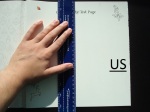
  3. Book size – The UK edition is exactly the same size as Johanna Basford’s first two titles and the US edition is slightly larger all the way around by approximately 5mm in each direction.
    Lost Ocean 3 Book size
  4. Foil on cover – Both editions have gold foiling on the front but both have different aspects foiled. The UK edition has the turtle and seahorse foiled and the US edition has more small fish foiled instead. The foiling is also a different colour and texture – the UK edition has gold foiling that is smooth to the touch and very shiny, the US edition has much yellower gold foiling that is rough to the touch and quite dull. (Please ignore the colour difference of the paper, the photos were taken in different weather and edited to sit next to each other, the covers are the same colour, the foil is different).
    Lost Ocean 4 Foil on cover 1Lost Ocean 4 Foil on cover 2
  5. Foiling continued – The UK edition has foiling on the front and back cover, the US edition only has foiling on the front cover, none on the back.
    Lost Ocean 5 Foil continued
  6. Spelling differences – As you’d expect, the UK edition has the British spellings throughout of colour etc, the US edition has the US spelling, color (always check your cover as it’s the easiest way of telling if you have a UK or US edition).
    Lost Ocean 6 Spelling differences
  7. Cover design – Because the UK edition is slightly smaller, some of the edges of the cover image are cut off in comparison to the US edition which shows the whole design.
    Lost Ocean 7 Cover design
  8. Blurb – The UK and US editions have completely different blurbs.
    Lost Ocean 8 Blurb
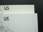
  9. Paper quality – There has been debate about this but in my copies the paper is ever so slightly different with the UK copy having slightly brighter white paper, however, this varies in different lights and is really marginal! The paper is the same thickness in both editions. The quality is also the same having tested water-based fineliners and pencils on it. I found pencils more difficult to blend on this paper than Johanna’s first two books but it’s the same on both editions of Lost Ocean. The amount of shadowing from water-based fineliners is also exactly the same and neither book had any bleed-through from these. Both also have the same amount of tooth.
    Lost Ocean 9 Paper quality 1Lost Ocean 9 Paper quality 2
  10. Page ink quality – Both books unfortunately do not have permanent ink meaning that when you use a blending pencil, some of the ink is moved with it and smudges. I tested the same section in both books and found that both smudge but there is more smudging in the US edition than the UK edition. Also, when using pencils and pressing hard, ink from the page behind does transfer to the back of the image you’re colouring so make sure you put scrap paper in behind your work when using pencils. I found transfer levels to be equal between the copies.
    Lost Ocean 10 Page ink quality 1Lost Ocean 10 Page ink quality 2Lost Ocean 10 Page ink quality 3
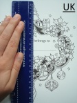
  11. Image size – The images in the UK edition are printed a little smaller than the US edition (up to 1cm overall and yes I measured a number of them with a ruler to check) meaning there is a larger white border around the images in the UK book compared to the US book. This difference isn’t especially noticeable but in the most intricate of images an extra millimetre or two does make a difference so if your vision is poor you may want a US copy rather than a UK copy.
    Lost Ocean 11 Image size
  12. Publishing page – There are more drawings of fish on the US publishing page than on the UK edition.
    Lost Ocean 12 Publishing page
  13. Printing – The UK edition is printed in Italy and the US edition is printed in the US (this can be seen in the photo above).
  14. Name page – The whole design of the name page is over 1cm larger in the US edition than the UK edition and is also differently centred on the page.
    Lost Ocean 14 Name page
  15. Introduction page – The UK edition’s introduction page is not titled and the text is not justified, in the US edition the introduction is titled and the text justified.
    Lost Ocean 15 Introduction page
  16. Binding – The UK edition is stitched and lightly glue-bound whereas the US edition is only glue-bound and because of the fixed cover the binding is much tighter in the US edition. This will ease up with use, especially if you crack or break the spine (I always find this heartbreaking to do), but initially the US edition is much tighter and opens less flat than the UK edition.
    Lost Ocean 16 Binding
  17. Boat and lighthouse double-page spread – The design on this double-page spread is orientated completely differently in the two editions with it being much higher up on the page in the UK edition than the US edition.
    Lost Ocean 17 Boat and lighthouse double-page spread 1Lost Ocean 17 Boat and lighthouse double-page spread 2
  18. Fish, seahorse and jellyfish pattern double-page spread – This image is centred differently in both editions and enters the spine in the UK edition and doesn’t in the US edition (Please excuse the terrible lighting and shadow in the picture).
    Lost Ocean 18 Fish, seahorse, jellyfish spread
  19. Starfish and anchor motif – The design on this page is printed significantly larger in the US edition than the UK edition.
    Lost Ocean 19 Starfish and sword motif
  20. Whale – The whale in the UK edition faces left and in the US edition faces right. It’s almost as if they’re looking at each other across the ocean between the countries they’re published in.
    Lost Ocean 20 Whale
  21. Images in key – The images in the key of the UK edition all have black lines down the middle indicating the spine of the book, in the US edition there is no black line indicating the spine on the images of the double-page spreads.
    Lost Ocean 21 Images in key

SPOILER ALERT: If you don’t want to see images or descriptions of the large 4-page pull out spread then stop reading now. For those of you that do, continue on!

  1. Pull-out spread – The pull-out spread is folded differently in each edition, the UK edition is folded in half and then half again whereas the US edition is folded so that it continually opens outwards to the right.
    Lost Ocean 22 Pull-out spread 1Lost Ocean 22 Pull-out spread 2
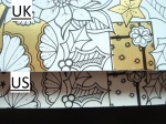
  2. Back image of pull-out spread – This image is centred differently on each edition and is smaller and shorter on the UK edition and larger and taller on the US edition. UK is above in the photo and US is below.
    Lost Ocean 23
  3. Front image of pull-out spread – This image is very different in both editions, despite being the same illustration. The UK edition has a significant strip of the image at each end missing and it is printed all the way up to both end edges. The US edition has the full image printed with a white edge at both ends. UK is above in the photo and US is below.
    Lost Ocean 24

To sum up, if you’ve managed to make it this far, the two biggest factors affecting your decisions are these:

  1. Matching set – If you want your copy of Lost Ocean to match Secret Garden and Enchanted Forest as much as is currently possible (bearing in mind the difference in paper colour, thickness and level of intricacy), then you want the UK edition because it is exactly the same size and also has the distinctive removable dust jacket that we all know and love.
  2. Larger, easier to colour images – If your vision or fine motor control aren’t perfect then I’d definitely advise purchasing the US edition of Lost Ocean because that extra 1cm in most of the images could make the difference to you going over the lines or not.

Everything else I’ve listed is not a criticism and I have no view on which is better or worse, I’ve just listed all of the differences to make people aware of what they are and to make it easy to identify which copy is which when looking at pictures of it online and elsewhere. If you notice any other differences then please do get in touch and I’ll add them to the list! Happy Colouring – You’ve definitely earnt it!

You can read my review of the contents of Lost Ocean, including my mental health recommendations here.

If you’d like to purchase a copy of Lost Ocean it can be found here:
UK
Amazon UK – Lost Ocean: An Inky Adventure & Colouring Book
Book Depository Worldwide – http://www.bookdepository.com/Lost-Ocean-Johann-Basford/9780753557150/?a_aid=colouringitmom

US
Book Depository Worldwide – http://www.bookdepository.com/Lost-Ocean-Johann-Basford/9780143108993/?a_aid=colouringitmom

SPOILER ALERT: 4 Page Spread from Lost Ocean WITH photos – Do Not Open if you don’t want Spoilers!

Disclaimer – Please read this disclosure about my use of affiliate links which are contained within this post.

DO NOT READ IF YOU DON’T WANT SPOILERS!

Following on from my review of the newly published Lost Ocean by Johanna Basford. I’m showing those of you that want to see it, the 4 page spread at the end of the book. This tradition was started in Enchanted Forest with a pair of double-page spreads at the back with a wonderful mirror image picture of a mythical creature on each. This feature was hotly anticipated in the newly published Lost Ocean and many of us die-hard Johanna Basford fans were trying to guess what it might be. I found the reveal a little disappointing. It’s not a pair of double-page spreads, it’s one 4 page length spread which unfolds to the right of the book and can be carefully removed if desired. On the back of it is a fishy, seaweedy pattern which would look beautiful coloured and you could easily add your own details and background as it only goes across the middle of the pages. On the front is a scene depicting fish, seahorses, turtles, jellyfish and even a ray. It is sure to look stunning once coloured but it is very different in style from the end pages in Enchanted Forest as you’ll see in the photos below.

You can read my Lost Ocean review here. Or purchase a copy of it here Lost Ocean: An Inky Adventure & Colouring Book