
Disclaimer – Please read this disclosure about my use of affiliate links which are contained within this post.
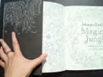
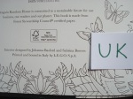
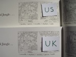
Magical Jungle was released in the UK and US last week and after the huge online debates surrounding the differences between the UK and US editions of Lost Ocean last year and the popularity of my comparison post of that (found here), I thought I’d do the same for Magical Jungle. I was unable to get review copies so I have purchased the US edition from Book Depository and the UK edition from Amazon UK (purchase links below). I have heard that there are issues with some UK editions which have been printed in China, my copy was printed in Italy (more info below). You can find my review of the UK edition, including the image content etc here.
This is a long post because there are so many pictures included to illustrate each point but please bear with me because a lot of time and effort has gone into being as thorough as possible. Most of the things I’ve noticed don’t affect the enjoyment or use of the book, they’re just differences but there are a few items that are fundamentally different and do affect use so keep an eye out for those, they’re summarised at the bottom. Some of the very noticeable differences include size, print quality and paper type so here goes with the most comprehensive list of similarities and differences that you’re likely to find online!
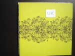
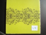
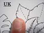
- Dust Jacket – This is one of the biggest differences between the editions. The UK edition has a removable dust jacket just like the UK editions of the first three books by Johanna Basford. It is a little looser fitting than the first two books and is ivory and a little thinner too (very similar to Lost Ocean but not white like that was). The book itself has bright grass green card covers with a black orchid and leaf design on the outside and inside covers. The US edition has a fully attached white cover made of card which has half size flaps inside that open out revealing the foliage design that is also on the inside of the UK dust jacket. The covers on both editions are fully colourable and matte in texture apart from the inside of the UK dust jacket which is waxy to the touch, this can be coloured with alcohol markers but water-based pens are repelled.
- French Flaps – The inside flaps of the dust jacket of the UK edition and the cover of the US edition have the same white line foliage drawing but this is printed much larger on the US edition than the UK edition.
- Spine – The UK edition has a black spine with white writing (the same as Secret Garden and UK Lost Ocean) and the Virgin books symbol. The US edition has a white spine with black writing and the Penguin books symbol.
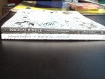
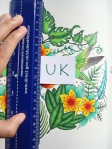
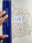
- Book size – The UK edition is exactly the same size as Johanna Basford’s first three UK titles – 25cm square, the US edition is slightly larger (just like the US Lost Ocean) at around 25.5cm square making it about half a centimetre taller and wider.

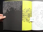
- Foil on cover – Both editions have gold foiling on the front but both have different aspects foiled. The UK edition has the tiger, chameleon, orchid and aspects of all three birds covered in foil, the title is partially foiled; the US edition has a few leaves, flowers and the whole toucan foiled instead and the title is fully foiled.


- Foiling colour – The foiling is also a different colour and texture – the UK edition has gold foiling that is a darker colour, it’s difficult to describe but it’s more silver and bronze than specifically gold and is smoother to the touch, the US edition has much yellower gold foiling that is slightly rough to the touch.

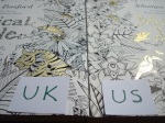
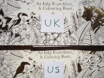
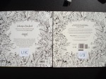
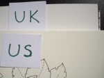
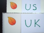
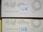
- Spelling differences – As you’d expect, the UK edition has the British spellings throughout of colour etc, the US edition has color (always check your cover as it’s the easiest way of telling if you have a UK or US edition by the spelling of “colouring book”).
- Cover design – The image on the cover of the UK edition is shifted up approximately half a centimetre compared to the US edition.


- Blurb – The UK and US editions have completely different blurbs.
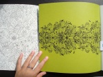
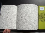
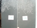
- Paper quality – This is one of the biggest differences between the two editions. The paper in each edition is different from previous books and different from each other. The colour is different, the thickness is different and the surface texture is different. The UK paper is ivory and a much whiter hue, it is a little thinner but feels equally thick as Secret Garden and Enchanted Forest and significantly thicker than Lost Ocean. There is a little tooth but the paper does burnish after a few layers when tested with Polychromos and Prismacolor pencils. The US paper is ivory but a more cream colour though it’s still paler than the cream colour of Secret Garden and Enchanted Forest. The paper is the thickest yet and has a more visible tooth, it took far more layers for blending (see direct comparison below with identical numbers of layers with two polychromos pencils on the red and yellow leaf) and still isn’t totally burnished. In both editions water-based pens behave the same way and the paper in both is beautiful to colour on with pens as they glide really well with no feathering or spreading at all. The UK paper seems like it will shadow faster and more easily than the US edition and while I didn’t experience any shadowing in either, the UK paper did seem like it might with very dark colours if not using a light touch. The US paper is the ‘Johanna Basford’ paper which was created for her books and the UK paper was found by Johanna and her team in a global search for a suitable ivory paper. I personally prefer the colour of the UK edition but the US paper is much easier to use pencils on and is less likely to bleed with water-based pens so I have to recommend that one.


- Page ink quality – Both books have equally permanent ink when tested with Derwent blender and burnishing pencils. Both smudged ever so slightly but I was pressing hard and there was very little ink transfer behind the image I fully coloured in the UK edition. My suggestion would be to use a scrap piece of paper behind your colouring in either edition of the book just to be safe.
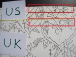
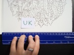
- Image size – The images in the UK edition are printed a little smaller than the US edition (up to 1cm overall and yes I measured a number of them with a ruler to check) meaning there is a larger white border around the images in the UK book compared to the US book. This difference isn’t especially noticeable but those of you with poorer vision or fine motor control would be best purchasing the US edition as the images are slightly larger throughout.
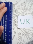

- Image orientation – The images in the UK edition are shifted upwards slightly when compared to the US edition, it looks as if both have had a section taken from a slightly larger original image and the UK edition takes the upper part and the US edition takes the lower part, this is very marginal, up to half a centimetre difference, but I noticed it and felt it worth mentioning. This only affects full page designs not any of the centralised images.
- Printing – The UK edition is printed in Italy (predominantly, some much whiter versions seem to be appearing and these have apparently been published in China) and the US edition is printed in the US.
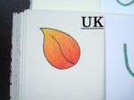
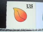
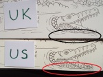
- Image Quality – This is another major difference and issue between the two editions. The US edition has beautifully printed smooth lines which look as crisp as I imagine Johanna’s original drawings look. Sadly, the same can’t be said for the UK edition and before you ask, no I don’t have a bad copy, I’ve checked with a couple of friends and they have the same issues as I do in their UK edition. The lines are slightly pixelated and not smooth. This is the case throughout the book. A relative of mine has a history in book printing and after looking at the two books he said that this difference in print quality is because of the printing method used for the two books. The UK edition has been printed lithographically which often causes slight pixelation and this is present throughout and while it’s not noticeable from a distance (you may not have even noticed it yet in your copy, sorry if I’ve just ruined your enjoyment of it), it does become noticeable when you get closer to the page. It’s a real shame that Johanna’s images haven’t been printed with a completely crisp line. I’ve now looked through my copies of her other titles and this was also present on a few pages in Enchanted forest. This would again lead me to advise purchasing the US edition.


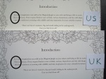
- Introduction page – The text on both editions is justified ever so slightly differently and there is an extra comma in the US text.
- Binding – The UK edition is stitched and lightly glue-bound whereas the US edition is only glue-bound and because of the fixed cover the binding is much tighter in the US edition. This will ease up with use, especially if you crack or break the spine (I always find this heartbreaking to do), but initially the US edition is much tighter and opens less flat than the UK edition.

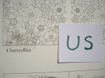
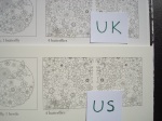
- Images in key – The key gives the locations of all of the hidden items throughout the book, these are listed in a completely random order in the US edition but in the UK edition they are listed numerically (from largest to smallest number) and alphabetically.
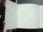
- Perforated Pages – The four perforated pages at the back of the book are 1cm wider in the US edition than the UK edition.


To sum up, if you’ve managed to make it this far, the two biggest factors affecting your decisions are these:
- Matching set – If you want your copy of Magical Jungle to match Secret Garden, Enchanted Forest and the UK edition of Lost Ocean as much as is currently possible (bearing in mind the difference in paper colour and thickness and level of intricacy), then you want the UK edition because it is exactly the same size and also has the distinctive removable dust jacket that we all know and love.
- Larger, easier to colour images, thicker paper and crisp linework – If your vision or fine motor control aren’t perfect then I’d definitely advise purchasing the US edition of Magical Jungle because the extra (up to) 1cm in the images will be useful. The paper is thicker and toothier making it best for pen and pencil users and the linework is printed more crisply and neatly so overall, apart from the dust jacket and slight difference in book size, the US edition is superior in almost every way.
Everything else I’ve listed is not a criticism and doesn’t impact use or enjoyment, I’ve just listed all of the differences to make people aware of what they are and to make it easy to identify which copy is which when looking at pictures of it online and elsewhere. In my opinion, the US edition offers a superior colouring experience to the UK edition and if you’re going to purchase just one copy then I’d suggest it be that one. If you notice any other differences then please do get in touch and I’ll add them to the list! Happy Colouring – You’ve definitely earnt it!
You can read my review of the contents of Magical Jungle, including my mental health recommendations here.
If you’d like to purchase a copy of Magical Jungle it’s available here:
UK Edition
Amazon UK – Magical Jungle
Book Depository Worldwide – http://www.bookdepository.com/Magical-Jungle-Johann-Basford/9780753557167/?a_aid=colouringitmom
US Edition
Amazon UK – Magical Jungle
Book Depository Worldwide – http://www.bookdepository.com/Magical-Jungle-Johann-Basford/9780143109006/?a_aid=colouringitmom

Fantastic review! It is amazing how many differences there are between the editions. But, why? I will get the US version based on the print quality, but why can’t both be exactly the same? Any insight from the publishers?
LikeLike
Thank you so much! It is amazing and I have no idea why there are so many differences. I think they each like to put their own spin on things and have their own little quirks, it certainly makes it more interesting for the collectors. The print quality difference will be because of the different types of printing, they both have the original image files but different printers then have different quality print.
LikeLike
I have the US edition because this is were I live, but I wanted to comment and thank you for the thoroughness of this review. I am sure it will be helpful to the coloring community. As for me, I find publishing choices and processes fascinating, so this was very interesting to read!
LikeLike
Thank you so much for taking the time to comment! I’m so glad you found it interesting and I’m with you, I find it fascinating seeing the differences in choices and processes, I always want to know why it was done a certain way though!
LikeLike
I think it’s absolutely amazing that you put this much time into creating this review, with the pictures and measuring – we all appreciate it!! My friends think I’m crazy because we can go into Barnes and Noble and I can tell them where a coloring book is from and if it’s any good at not from the paper and country, etc. (like Animorphia), but I keep telling them it’s not weird I know that…. It’s all thanks to people like you!
LikeLike
Thank you so much! I’m so glad it’s been helpful and is appreciated. It’s not weird at all, unusual perhaps but not weird, it’s a really good skill to have! Very useful for stopping you wasting your money and making sure you always get great quality books. I’m sure some people must think I’m mad to notice differences in the justification of text or different orders of things but once I get into it it’s a real challenge to find as many differences I can and hope I find them all, I’d be a little bit heartbroken if someone found one I’d missed but obviously I’d want to know so I could amend my post. Hopefully I caught them all! 😀
LikeLike
I also thank you for your effort in mentioning the differences. In my case I will go for the US edition because I have problems with my sight and I am still in the process of learning to layer lightly so the US edition will be more helpful. Thank you,
LikeLike
You’re so welcome! I’m so glad you found it helpful! The US edition will definitely be best for you and I’m sure it’ll help with learning to layer because the paper takes loads of layers, you’ll be at it for days! 😀 Enjoy! 🙂
LikeLike
Thank you so much for this! I received my two UK copies this week and noticed the pixels when I started colouring. Thought it was mine but both books had the same issue.
Luckily after calling Amazon I’m getting the books refunded and ordered new versions, this time from the States. I’ll have to wait again but smooth lines will be worth it.
Your review helped to make me feel like I’m not crazy!! I actually messaged Johannas team to ask about it as well, do you think she/they know about the pixel issue?
My previous books are all perfect , but a friend said her enchanted forest was just as pixely.
Thank you so much for researching all of this!
LikeLike
Ah fantastic! I’m glad Amazon were helpful and that you can get the US edition, the print quality is much better in that. The smooth lines are definitely worth the wait! I don’t know if they know, they will in a couple of days because I’ll be sending them my review and comparison post and raising the issue of the pixelation and the paper differences as I really want to know which paper is the official JB paper and which isn’t. Some images in my Italian printed UK editions of Enchanted Forest are also pixelated but oddly it’s not all of them which is very strange!
LikeLike
Compliments for your review! I have the two versions and recognize a lot what you mention. Unfortunately we have also a Dutch version in the Netherlands with very bad paper! I prefer the uk edition after testing a bit on the testing page. For me it seems smoother coloring.
LikeLike
Thank you very much! The UK version is smoother for colouring as it has less tooth so you need fewer layers to get rid of all of the white gaps. What a shame the Dutch version has such bad paper! I’m glad you were able to get the other editions!
LikeLike
Thank you for your review! I grabbed my US copy while reading and found one difference My blurb page does NOT look like the one you picture for your US edition. Mine has less text and a slightly different arrangement of the text. Interesting.
LikeLike
Oh wow! I wonder why! Is yours printed in the US and were all of the other things I mentioned the same? That’s so strange! I’m fascinated by all of these differences in publishing.
LikeLike
Oh never mind!!! I was looking at the INTERIOR blurb–not the back cover! My mistake!
LikeLike
Oh that makes much more sense, I was a little worried that there were multiple US editions and then I was going to cry in a little heap! Thanks for clearing it up and commenting again! 🙂
LikeLike
What a pity I didn’t see this before I purchased my copy. I would definitely have gone for the US copy instead of the UK copy I got, which unfortunately was one of the ones printed in China.
LikeLike
Oh no! What a shame! I hope you’ve been able to return it for a refund and get a better copy. The US edition is very lovely, I hope you can get a copy soon! 🙂
LikeLike
Lucy,
Have you found out yet which is the “Johanna pick” paper? I’m just as curious as you seem to be. Awesome reviews, as always! 🙂
LikeLike
Not yet, I’ve been so snowed under that I totally forgot to email the publishers so I’ll do that today and will be sure to update if I get a response. I’m glad you liked the comparison! 🙂
LikeLike
I am leaning towards the US because I like to use watercolour (inktense) – do you think the US will be better for watercolour as well?
LikeLiked by 1 person
Yes I think the US version would be better for watercolour as the paper is thicker. I know a few people have used inktense pencils on it very successfully but they do advise using as little water as possible or the paper will wrinkle. Good luck!
LikeLiked by 1 person
Thanks Lucy, for doing such an amazing and detailed job comparing and contrasting the two versions. Based on other recommendations of yours, I have sometimes bought the UK version through the Book Depository. With Magical Jungle, I bought the US version (where I live) because Johanna said we could expect the paper to be the same. I was so surprised at the differences you found. My only disappointment is that it is lacking the book cover jacket. Oh well, based on what you revealed about the paper quality, I am over all satisfied. Furthermore, getting the US version from Amazon allowed me to get the book on release day, that was fun.
LikeLike
You’re so welcome! I was very surprised by all of the differences too, especially the paper which I’m still waiting for an answer about from Virgin Books. It is a shame the US version doesn’t have the cover but I promise the better paper quality in it is worth it! I’m glad you were able to get it that day too, us colourers are terrible at waiting, even just a few days! 😀
LikeLike