
Disclaimer – Please read this disclosure about my use of affiliate links which are contained within this post.
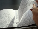
Lost Ocean was released worldwide last month and there have been huge online debates about the differences between the UK and US editions and which has the best paper quality, the size of the images, the colour of the paper etc. So, as a reviewer, I thought it best to purchase a copy of each so that I could compare and contrast and give you the ultimate guide to each edition so you can purchase the copy that best suits you. For my review of the content of the book and lots of images from inside please click here. This is a long post because there are so many pictures included to illustrate each point but please bear with me because a lot of time and effort has gone into being as thorough as possible. Most of the things I’ve noticed don’t affect the enjoyment or use of the book, they’re just differences but there are a few items that are fundamentally different and do affect use so keep an eye out for those, they’re summarised at the bottom. When I first flicked through my US edition it looked exactly the same as my UK edition but the closer I looked, the more differences I found (24 in fact) so here goes with the most comprehensive list of similarities and differences that you’re likely to find online!
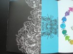
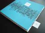
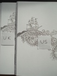
- Dust Jacket – This is by far the biggest difference between the editions. The UK edition has a removable dust jacket just like the first two books by Johanna Basford. It is a little looser fitting than the first two books and is bright white and a little thinner too. The book itself has bright blue card covers with a black coral and seaweed design on the outside and inside covers. The US edition has a fully attached white cover made of card which has half size flaps inside that open out revealing the fish design that is also on the inside of the UK dust jacket. The covers on both editions are fully colourable and matte in texture apart from the inside of the UK dust jacket which is waxy to the touch.
- Spine – The UK edition has a black spine with white writing (the same as Secret Garden) and the Virgin books symbol. The US edition has a white spine with black writing and the Penguin books symbol.


- Book size – The UK edition is exactly the same size as Johanna Basford’s first two titles and the US edition is slightly larger all the way around by approximately 5mm in each direction.
- Foil on cover – Both editions have gold foiling on the front but both have different aspects foiled. The UK edition has the turtle and seahorse foiled and the US edition has more small fish foiled instead. The foiling is also a different colour and texture – the UK edition has gold foiling that is smooth to the touch and very shiny, the US edition has much yellower gold foiling that is rough to the touch and quite dull. (Please ignore the colour difference of the paper, the photos were taken in different weather and edited to sit next to each other, the covers are the same colour, the foil is different).
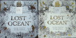

- Foiling continued – The UK edition has foiling on the front and back cover, the US edition only has foiling on the front cover, none on the back.
- Spelling differences – As you’d expect, the UK edition has the British spellings throughout of colour etc, the US edition has the US spelling, color (always check your cover as it’s the easiest way of telling if you have a UK or US edition).

- Cover design – Because the UK edition is slightly smaller, some of the edges of the cover image are cut off in comparison to the US edition which shows the whole design.

- Blurb – The UK and US editions have completely different blurbs.

- Paper quality – There has been debate about this but in my copies the paper is ever so slightly different with the UK copy having slightly brighter white paper, however, this varies in different lights and is really marginal! The paper is the same thickness in both editions. The quality is also the same having tested water-based fineliners and pencils on it. I found pencils more difficult to blend on this paper than Johanna’s first two books but it’s the same on both editions of Lost Ocean. The amount of shadowing from water-based fineliners is also exactly the same and neither book had any bleed-through from these. Both also have the same amount of tooth.

- Page ink quality – Both books unfortunately do not have permanent ink meaning that when you use a blending pencil, some of the ink is moved with it and smudges. I tested the same section in both books and found that both smudge but there is more smudging in the US edition than the UK edition. Also, when using pencils and pressing hard, ink from the page behind does transfer to the back of the image you’re colouring so make sure you put scrap paper in behind your work when using pencils. I found transfer levels to be equal between the copies.

- Image size – The images in the UK edition are printed a little smaller than the US edition (up to 1cm overall and yes I measured a number of them with a ruler to check) meaning there is a larger white border around the images in the UK book compared to the US book. This difference isn’t especially noticeable but in the most intricate of images an extra millimetre or two does make a difference so if your vision is poor you may want a US copy rather than a UK copy.
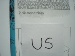
- Publishing page – There are more drawings of fish on the US publishing page than on the UK edition.
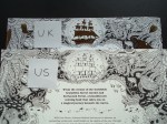
- Printing – The UK edition is printed in Italy and the US edition is printed in the US (this can be seen in the photo above).
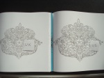
- Name page – The whole design of the name page is over 1cm larger in the US edition than the UK edition and is also differently centred on the page.
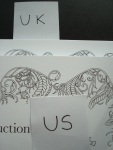
- Introduction page – The UK edition’s introduction page is not titled and the text is not justified, in the US edition the introduction is titled and the text justified.

- Binding – The UK edition is stitched and lightly glue-bound whereas the US edition is only glue-bound and because of the fixed cover the binding is much tighter in the US edition. This will ease up with use, especially if you crack or break the spine (I always find this heartbreaking to do), but initially the US edition is much tighter and opens less flat than the UK edition.

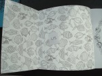
- Boat and lighthouse double-page spread – The design on this double-page spread is orientated completely differently in the two editions with it being much higher up on the page in the UK edition than the US edition.

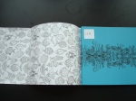
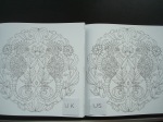
- Fish, seahorse and jellyfish pattern double-page spread – This image is centred differently in both editions and enters the spine in the UK edition and doesn’t in the US edition (Please excuse the terrible lighting and shadow in the picture).

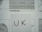
- Starfish and anchor motif – The design on this page is printed significantly larger in the US edition than the UK edition.
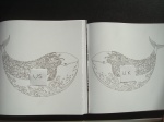
- Whale – The whale in the UK edition faces left and in the US edition faces right. It’s almost as if they’re looking at each other across the ocean between the countries they’re published in.
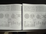
- Images in key – The images in the key of the UK edition all have black lines down the middle indicating the spine of the book, in the US edition there is no black line indicating the spine on the images of the double-page spreads.


SPOILER ALERT: If you don’t want to see images or descriptions of the large 4-page pull out spread then stop reading now. For those of you that do, continue on!
- Pull-out spread – The pull-out spread is folded differently in each edition, the UK edition is folded in half and then half again whereas the US edition is folded so that it continually opens outwards to the right.

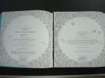
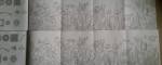
- Back image of pull-out spread – This image is centred differently on each edition and is smaller and shorter on the UK edition and larger and taller on the US edition. UK is above in the photo and US is below.

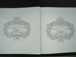
- Front image of pull-out spread – This image is very different in both editions, despite being the same illustration. The UK edition has a significant strip of the image at each end missing and it is printed all the way up to both end edges. The US edition has the full image printed with a white edge at both ends. UK is above in the photo and US is below.


To sum up, if you’ve managed to make it this far, the two biggest factors affecting your decisions are these:
- Matching set – If you want your copy of Lost Ocean to match Secret Garden and Enchanted Forest as much as is currently possible (bearing in mind the difference in paper colour, thickness and level of intricacy), then you want the UK edition because it is exactly the same size and also has the distinctive removable dust jacket that we all know and love.
- Larger, easier to colour images – If your vision or fine motor control aren’t perfect then I’d definitely advise purchasing the US edition of Lost Ocean because that extra 1cm in most of the images could make the difference to you going over the lines or not.
Everything else I’ve listed is not a criticism and I have no view on which is better or worse, I’ve just listed all of the differences to make people aware of what they are and to make it easy to identify which copy is which when looking at pictures of it online and elsewhere. If you notice any other differences then please do get in touch and I’ll add them to the list! Happy Colouring – You’ve definitely earnt it!
You can read my review of the contents of Lost Ocean, including my mental health recommendations here.
If you’d like to purchase a copy of Lost Ocean it can be found here:
UK
Amazon UK – Lost Ocean: An Inky Adventure & Colouring Book
Book Depository Worldwide – http://www.bookdepository.com/Lost-Ocean-Johann-Basford/9780753557150/?a_aid=colouringitmom
US
Book Depository Worldwide – http://www.bookdepository.com/Lost-Ocean-Johann-Basford/9780143108993/?a_aid=colouringitmom

Reblogged this on In The Midst Of Madness and commented:
Lost Ocean: A Comparison of the UK and US Editions
LikeLike
Awesome article! Thank you!
Will you be doing one for magical jungle? 🙂
LikeLike
Hi Pippa, thank you so much, I published my Magical Jungle comparison post yesterday. Here’s the link – https://colouringinthemidstofmadness.wordpress.com/2016/08/19/magical-jungle-a-comparison-between-the-uk-and-us-editions/
LikeLike
Thank you! I was looking for a comparison like that, because I’m trying to decide which version to buy.
LikeLike
You’re welcome! I’m so glad I could help! 🙂
LikeLike
Thank you so much for your comparisons! They really helped me a lot!
LikeLike
You’re very welcome, I’m glad I could help! 🙂
LikeLike
Thank you so much, this was so thorough and detailed. Not that I have much of an option because my local bookstores carry the US version. But it was still interesting to learn all the differences 🙂 I am sure you are a champ at all those “Spot The Difference” games! Stay safe and thank you again! I won’t comment again later but am planning to read up on your other posts as well! xoxo
LikeLike